Work with Color in the Document
Lesson 7 from: Design Your First Newsletter with Adobe InDesign CCErica Gamet
Work with Color in the Document
Lesson 7 from: Design Your First Newsletter with Adobe InDesign CCErica Gamet
Lessons
Class Introduction
03:41 2Set up the Document
12:15 3Add Structure with Guides to the Document
11:14 4Edit Master Page for the Document
15:41 5Add Text to the Document
15:43 6Add Text Styles to the Document
17:29 7Work with Color in the Document
18:12 8Edit the Header, Footer & Columns
16:03Lesson Info
Work with Color in the Document
What we're going to do is we're going to switch gears slightly. We're going to look at the finished piece and then we can look at each of the elements that I've put into that finished piece and I'm going to build those each individually. So I think everybody probably has an idea of how I work with the structure. Again, structure the pages then the content is going to kind of flow again depending on either the structure that you have of your pages or the amount of content that's coming in that you have to make it fit. So let's go ahead and jump over to the finished one. I'm actually going to jump to the first page and let's think about some of the things that we put on this page. So the header is one of them. So the header is pretty easy. And that actually lives on the master page. I'm going to go back to my pages panel and jump into the front page master page and let's look at each of those items that we have here. So I have two colored boxes that are here, and I have some text sitting...
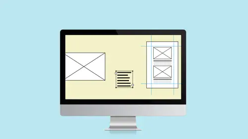
on top of it and that's pretty easy. And I have a logo and this actual...this logo came from somewhere else. This is an imported Illustrator file. So let's figure out how we made each of those. So I'm just gonna go ahead and recreate it down below basically and I'm going to look at the colors that we have. Actually, I'm going to go ahead and let's talk about colors while I'm here with this page. So what I did back on this original page, let's come over here, I had these three color frames and I'm just going to select all of those and copy those. And I'm going to put those right now just off on the pasteboard which is this gray area out here. I'm just going to paste it out here on the master page just so I have those. And basically why I did that is I just created these different colors that I liked and came up with three colors that I like the look of and I thought this is my color palette and I kind of just have it off to the side so I can always work with that. So the first thing I want to do is add some color to the document that's here. So I'm going to go ahead and open the Swatches panel and pull that off. And I also want to open up the Color panel which is not in this typography workspace, so I'm going to go to the Window menu and choose Color and Color. That makes sense, right? The color is the main menu here and everything has to do with colors underneath it including the color panel. And I am going to choose the color mode that I want to work in. When we first set up this newsletter, we said it's going to be going to print. So print assumes that you're using a CMYK workflow. Now I can choose RGB colors if I want to but if it's outside the color gamut of CMYK which is again more restrictive, it's going to give me a big warning. So I'm better off working with CMYK images and then when I do go to Export It to PDF which works with the RGB color space, the PDF for digital consumption is what I mean, then I know that I'm okay with working with CMYK colors because all of those fit into the RGB just fine. It's the other direction. So again, I'm going to choose CMYK. This is where I can mix colors or I can just come along here, along the color ramp. And that's what we're going to do because I don't know what color we want to come up with. I just visually said I want three purples that I like and I actually ended up with a fourth one here. Somehow, I ended up with that dark, dark one. So I actually have more than one that are here. So basically, when we create color, we can just, again, slide along the spectrum at the bottom or fill in the amounts here. But I'm just going to go ahead and zoom along here and say, "Okay, there's a green that I like." And basically, when I'm creating a color, I'm actually going to grab a space or...sorry, a shape like that square. I'm going to actually create a new one using the Rectangle tool. And I want to fill that so I'm going to click on this Fill and then I'm going to choose the color. And the reason I made that square, just so I can look at it and see. I need something big that tells me that's the green I want or that's the whatever color I want. And the stroke, I'm going to click on the little stroke icon that's here and I don't want anything to be there. So I'm going to click on this None, this big square here and say None. Basically, what I wanted was the square to be filled with the color and when I find one that I like, I don't really like that dark green, I'm going to go up to the Color Panel menu and I'm going to choose Add to Swatches. And when I do that, it gets added down here to all the different swatches that we have. All right. So if you notice, I've got some odd ones down here in my swatches. That came in from somewhere else, probably that text that I imported, you know, this is RTF. So it came in from somewhere. Not sure. I told you though that strange things work their way in with Word and other things so who knows where that came from. I can get rid of those at any time. I'm also going to get rid of this green one because I'm also not really using it. I do have these colors here. I've got a medium purple, a dark, and a light one, and also some tints of that same color. And then I've got one called purple bar and we'll look at that in a second as well. But let's get rid of the ones we're not using. So I'm going to come in here and I'm going to select. I can Ctrl...I'm sorry. Cmd or Ctrl, click on each of those. Or if I want it to do the thinking for me, under the color or the swatches panel menu, I can choose Select all Unused. But the problem is there might be a purple one that I'm not using. And also, it didn't select the green one. I want to get rid of the green one as well. So I'm going to select those and just hit the trash can and get rid of those. Now, it says what do I want to replace it with? Well, the green one's being used. I need to replace it with something else. So let's replace it with this dark purple. We'll say OK. So now, that's dark purple. So we can add that to our palette that's over here. Like I said, I started with the one, I don't know where that fourth one came in but now I've got a nice palette of purple to work with. So when I created these frames, I basically just drew out of frame. I made sure it came to the bleed mark that's there because this is going to go to print and this is well and this one is, let's see what color this is here, and it's the dark purple but it's 20%. So what I did was I took a shape and I colored it dark purple and then I came over to the tint and said let's make it...let's make one that's 30%. And when I did that, it changed it but I want to make sure I have 30% of the dark purple always available to me. So right after I do the tint, if I come down and click the new swatch icon, it now creates the dark purple at 30%. So now I have different shading of that dark purple. I'm going to grab that and just drag it up under the dark purple here. So I now have dark purple plus 30%, plus 20%. All right. So that's what I did to create this frame that's here. I created this one that was the dark purple at 20%. This one's at 100%. And now I need to put my logo in there. When I create or when I place something, just do the File menu and choose Place. Again, it doesn't matter if it's a PDF or an image or text. We use the same thing all along and we had to come over here to this newsletter and find where I have it sitting and I have one called BARK Logo White. So I did it once in color. I have it once in purple which I use on the back page. We're going to look at that. But I also have one that's in white. So even if I have my options turned on, I can't necessarily see what it looks like because it's white. So we won't be able to see anything. So I'll just hit OK, and when I place this, obviously if I place it here, you can't see anything because it's in white. But if I were to place it inside a colored frame, it would totally work. So let's actually delete this one that we had. Let's say I brought this in and I want to size it down. Now if I just grab the handle and size it down, I sized the frame. Remember everything lives in a frame. So what I needed to do was size the item along with the frame. So I need to make a different set of key commands with that. So there's a couple of different things that I can do. I can size the frame down and then I can go up under the Object menu and I can tell it to fit that in a special way. So in this case, I can say to "Fill the frame proportionally." So when I do that, it filled it but it also chopped it off at the bottom. So that doesn't always work with the vector images. What I would rather do and I'm undoing, I'm stepping backwards, I want it to just size the frame and the content together. And this is kind of tricky whether you're doing it with photos you're doing it with logos in this case. But you need to hold down the Cmd key on a Mac or the Ctrl key on a PC and I also want to hold the Shift key which keeps everything constrained proportionally. And when I do that, click and hold on that and then drag this item down, it sizes the frame as well as the contents of that frame. And so I'm going to drop that item there and again, I can go back to this View menu and I can choose Preview. And it gets rid of everything that doesn't print and that's a nice way to look at...see how this actually lays out. So for instance, I've got...it doesn't look necessarily centered here because I've got that extra space all set up for the bleed. But when I turn on preview, now it looks pretty well-centered. You might want to shrink this up just a little bit more. I'm holding down again the Cmd key, the Shift key, and mousing it down, sizing it down. And I'm going to turn back on Normal so I, again, can see where everything's laid out because I want to make sure that that logo doesn't go past the margin marks that's there. In fact, I want to make sure that it actually sits up right against it. So I'm going to select it with the Selection tool and I'm going to use the arrow keys and just move them up and down. If one arrow jump is too much, you can hold down the Cmd and Shift keys or Ctrl+Shift on a PC and move it very small amounts. Or if I just hold down the Shift key, it jumps it in larger amounts. So again, we can just dial in exactly where we want it to be. I'm going to zoom back out. I'm doing Cmd/Ctrl+0 to fit the page in the window. So I've got that logo ready to go. Now I've got two options with this. Right now, what I have is I have a text frame sitting on top of a colored image frame or a color shape frame. So I could just leave it at that and do it just like that or I could make this an actual text frame that has color in it. But the reason I'm not doing it in this case is that I have that bleed on the right and the left. So even if I told this to center in the frame, it's going to look off center because my frame actually, in this case, the colored frame bleeds off the end. So things to think about is it makes it easier because you would have one frame to deal with and not two. So when I change the size or whatever, I have to change the colored rectangle and I also need to change the text frame. But it means that my centering won't actually be centered. It will center it on the frame which hangs off the page a little bit to accommodate the bleed. So that's something else to think about. So in this case, I just have a text frame and what I did was I drew that text frame...Let's close up some of these guys over here. So I drew the text frame to fit... Come on. There we go. And I drew that text frame to fit that size to the edge of the page and also, I want this to fit at the top there and the bottom but I've got it centered not only left to right using the paragraph panel. But in the text frame options, so again, remember Ctrl/Cmd+B brings up text frame options. One of the things you have is vertical justification. So I can tell it how it sits in the frame vertically. So by default, everything sits at the top but I want it to be centered so that it's centered completely. It's centered left to right and it's centered top to bottom as well. Let's get this guy out of the way. Get this guy out of the way as well so we have more to work with. So anyway, so I have a colored frame. I have the text frame on top of it. I've got a colored frame over here and I've got the logo sitting on top of that. That is all on this front page master page that's here. So that when I come in here and I start to make text or start to make this page layout, if I select this top, I can't actually grab any of that because that belongs to the master page. The reason that comes in handy is if I were to use this, let's say I wanted this on the back page as well, so I'm actually going to add another page. Let's pretend we're going with five pages now. I'm going to add one more page using the panel menu. I'm going to say Insert Pages, insert 1 after Page 4 and I'm going to tell it, "Use that from page A, master page." So I've got it there as well. Maybe that's what I want the back to look like, same as the front. And I decide, even though I've got these two pages set up, that I want to change the color of that header. I only need to go into the front page master page and change that. Let's make this that medium color. So I'll go ahead with my swatches. I will come in here and we'll just, let's say, make it the medium purple. Nice. And I've got the medium purple, now when I jump back on my pages to the last page or the first page, they've both been updated as well. So that again just drives home the whole why you would want a master page, maybe the front page, not as important. But again, I did it there in case I did decide to use it somewhere else because that's not necessarily just a front page. It could be, again, it could fit well in the back page as well. All right. So that's how I did those two things that are here. Let's talk about some of the things that are on the master pages. So things that appear on all the pages. I've got this bar at the top. And again, I can't select it because it belongs to the master page. I also have this bar at the bottom with the page number, the name of the rescue place, and the actual month that we have set up for this particular document. So let's go to the master page and see how we built those. So again, now on the master page, I can select these items because that's where these items live. And the thing at the top is a gradient bar. So if you notice, it kind of fades from a dark purple to a light purple. So what I did for that is I set up a color that is a gradient swatch. So if I go into the swatches panel, one of the things down at the bottom is this purple bar, and if I double-click on it, I can see that it's actually a gradient swatch and not just a regular color swatch. And it's a linear gradient which means that it happens along a line as opposed to a radial gradient which I could also do which happens from a point and radiates outward. So the linear point, I basically have a three color gradient that I created. So let's show you how I created that. So let's create a new one. I'm going to go up to the panel menu, the swatches panel menu, and choose New Gradient Swatch. And it automatically opens up the last one that we had. So that's automatically there but we can make changes to it. When you first start, yours might look something like this. Let me actually just delete some of this and you'll see this point that's like right in the middle and it's usually black to white is how it starts. So let's create a new linear one and we'll create it with some of the other purples that are here. So basically, all I want to do is double-click on this left, it's called a stop, a color stop. Double-click on that one and choose a color. Let's start with the bright instead. Then I'm going to create another one and actually, I want to bring this down and click and create a third one. So I'm just clicking underneath and it creates new one. So every time I click, it creates a new color stop. If you've got too many of them, drag them off. I'm just clicking and dragging them right back off. And each time, it separates that into 50%, 50%. So I'm going to go ahead and start with white or...sorry, the really light purple. I'm going to go to the medium purple next. And if you don't see your swatches colors, that's because it may have reverted back to one of these other color modes. So choose swatches, that's the medium one, and then we'll make this one the dark. So go swatches and go to the dark purple. So now hopefully, you can see it goes from the light to the medium to the dark and maybe we want it to be more on the lighter side. So I'm going to drag this and when I do that, those center points move with it. I can also say, "Well, actually I want a lot of light." So I can change where that transition happens. So a lot of the light, color a little bit of the medium, and very little of the dark. In fact, I can change it like that. All right. So now we've got ourselves a new purple one. We'll call this "New Purple" and we'll go ahead and click OK. So now we've got that here. So when I select this item or if I were to create this item, I could just create it with the frame, drag it across, and then it automatically fills it with that new purple. We don't want the green stroke that's on there. I'm going to take that off. It was grabbing that from something else. So I created that bar. We just did it with the new one, so let's actually take the old one and we'll select it and delete it. Let's put the new one up in here. We'll put that there. And I've got that bar up there which is actually where I want the text to begin. So I really don't want my bar to be hitting that because that's actually where I decided text can start as high as that guy that's there. I put that guide on the master so it's always there. In fact, I selected this and kind of chopped it into thirds. So I've got a little bit of gap between there and I've got a little bit of gap down here between the line that separates it here and where text can end. And then I separated that into thirds just to kind of give myself an idea when I'm laying out that page where maybe sidebars need to go or just how to separate it into thirds visually. And I think I just eyeballed that. I don't even think I laid that out perfectly but then, I can look at it and go, "Okay, this one needs to go on the bottom, this is two-thirds at the top, this is everything but this fits within that space." And then this one, I just did half and half because it's the back page. I'm not as worried about that. All right. So again, I just threw on those guides because I thought they might be handy to me. So that's how I did that bar at the top and again, because I changed that, it now changed in all these other places because I made a change to the master page and then it rippled down through all those as well. I could have another master page based on this master page that uses a different color bar but everything else is the same. So if I base it on that, then again if I go back and change the bar on this page, any child masters that are underneath there, that are based on that, would also have that change. So again, I'm trying to always bring it back to here's the main one that changes and then it kind of ripples down to everything down below that, all the other masters and all the other document pages as well.
Class Materials
Bonus Materials
Ratings and Reviews
karlafornia
There are a lot of excellent instructors on Creative Live, but I think Erica's teaching style is the best. She is very easy to follow, completely thorough and methodical, and very pleasant to watch and listen to. Everytime I watch one of Erica's classes, I am inspired and feel confident to create something with the program tools she explains so well.
R. Best
Love classes like this. Straight to the meat of the topic so that I can get started on a project right away. Now I feel comfortable enough to tackle a newsletter from scratch! YAY. Erica explains things in an easy to follow style that is perfect for my style of learning. I don't have to weed through minutes of dialogue to get to points that I need to revisit! THANK YOU!
Marsha
Tons of info and she presented it in a manner that without ANY knowledge of InDesign I was able to follow along and felt I could design a newsletter myself! Erica is a fantastic instructor and I will watch any class that she offers! Thanks to CL.
Student Work
Related Classes
Design Projects