Working from a Photograph w/ Live Trace
Lesson 14 from: Design Surface Patterns From ScratchBonnie Christine
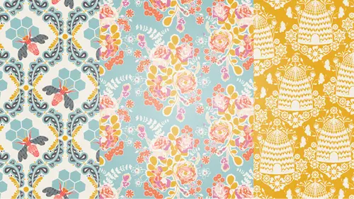
Working from a Photograph w/ Live Trace
Lesson 14 from: Design Surface Patterns From ScratchBonnie Christine
Lessons
Day 1
1The World of Surface Pattern Design
35:40 2Living Your Creative Dream
22:15 3Introduction to Illustrator
27:16 4Basic Tools: Pen, Text, & Blob
22:28 5Color & Function Tools
32:27 6More Tools: Rotate, Duplicate, & Replicate
19:16 7Custom Color Palettes
18:49Essential Tools for Pattern Making
41:59 9Tools for Sketching Inspiration
27:50 10Inspire & Nourish Your Creativity
34:55Day 2
11Creating Objects from Scanned Sketches
17:04 12Tracing & Coloring Sketches
30:46 13Tracing & Coloring with the Pen Tool
37:44 14Working from a Photograph w/ Live Trace
36:24 15Hand Tracing Over Photographs
31:27 16Building Pattern Tiles in Illustrator
21:13 17Adding Textures to Illustrations
28:52 18An Unrefined Look in Illustrator
26:10 19Typography & Students Homework
21:39 20Legality of Design w/ Annie Tunheim
27:33 21Trademark & Licensing w/ Annie Tunheim
27:50Day 3
22How to Design Repeating Patterns
18:52 23Complex Cluster Patterns - Part 1
27:38 24Complex Cluster Patterns - Part 2
28:35 25Getting Noticed: Portfolios & Trade Shows
39:43 26How to Drape on Pattern Mock Ups
19:07 27Fun Stuff: Desktop Backgrounds
19:42 28Fun Stuff: Gift Cards & Tags
29:05 29Fun Stuff: Clip Art & Shipping Labels
28:17 30Spoonflower: Stephen Fraser
29:04 31Uploading Patterns for Web Printing
20:29Lesson Info
Working from a Photograph w/ Live Trace
I'm really excited to talk to you about working from photos and how best to take photos. We're gonna take some photographs to work from today and how to get them into Illustrator, and how to illustrate from them. So in session one we talked a little bit about why it's important to be taking your own photographs. It is so easy to grab a photograph off the internet and start designing from it, or taking a color palette from it, but that you run into some issues from doing that, and I am a huge advocate of creating your own inspiration or sourcing your own inspiration in creating your own images to design from. That way at the end of the day everything that you've created was truly originated from within you and you get to work from things you've created from start to finish. So today I wanna start off by taking some photographs of some flowers that we're gonna be using. There are two ways that I like to work off a photograph in Illustrator. One is to use the Live Trace tool, which works ...
in a particular, works for some things, and doesn't work for other things. So I'm gonna show you kind of best practices for that and how, how best to take a photograph that will give you the best results for Live Trace. And then the other way is to lock them, just like we did our sketches, and trace over them, and you can create some beautiful art work that way too. It's still important how you photograph them, but say like the background on those images are not quite as important because we're not gonna be pulling in a bunch of different colors. We're just gonna be using them as something to trace over. So right now I'm gonna start using my, let me touch on this too, you can use your own camera. You can also use your iPhone, or your smart phone or any kind of a camera that you have. Today I'm just gonna be using my iPhone, I have a 5S. But I am using this to show you that you don't have any, you don't have to have any special equipment. You can use just whatever is available to you. I'm gonna use an app to edit my photos with. If that, if you're beyond that, if you're using your digital camera and you're editing them in Photoshop, by all means, do that. I'm just showing you that you don't have to if you don't have that stuff available to you. So I am going to switch over now and start to use my phone. I have this beautiful vase of flowers, and I am gonna be picking some single stems out of here to photograph and I have just set up a white foam cord board set up over here, so that I have a white background behind whatever it is that I'm photographing. So its important to have it on the bottom and on the back so that if you are photographing from the top you still have a white background, okay? So let's see. I'm gonna come right over here, and start working on my phone. So I'm just gonna go to the regular camera app and I'm just gonna hold this flower, but I want to try to get my hand out of the way as much as possible, so that I can, it doesn't have to be completely hidden now. I'm gonna give this a little crop later, but I don't want it in the way because we're gonna Live Trace this photo, and it's also great to kind of get this flower from a couple of different angles, and that way you can use it in your design work, and it doesn't, it looks so much more natural. Even sometimes I'll get it from the back. Let me do it up here. Just kind of like it's falling over. So I think we're good with that one. And I'm gonna grab one more, a couple of other flowers here to photograph. Okay so I have a little rose here, and I think I'm gonna put it in this vase so that I can kind of get my hand out of the way completely. So you can see the glass but it's gonna be okay for what we're doing. I'm just gonna shoot it from straight down, and then maybe from the side here. Okay and I'm gonna crop my hand out of that one, it's not gonna be a big deal at all. Got a couple of other things here that we can photograph. This little leafy piece is gonna be really pretty. So just play, play with your angles, and have your final pattern collection in mind. So these flowers, I have in mind to put in the vase that we just illustrated in the last segment. So I want them to be drapey. I want them to kind of not be sticking straight up and down but be drapey. You know Bonnie I was going to ask if you had to really think about what kind of flowers you wanted to use for this, but you had your design in mind when choosing these flowers, right? You wanted specific colors, a specific palette? I did and I will kind of go through this a little bit in a second, but when you look for a flower I like to look for something that has a lot of color variation. So this has that deep yellow inside and then it's got like streaks of color on the petals. When I'm shooting this rose, let me bring back, this is a different rose but I think it's beautiful. You can see that it has this really deep, deep inside color to it. So it's gonna Live Trace beautifully. Something like this, that doesn't have a lot of contrast, this white doesn't have a ton of contrast, it has a little bit. But the white petals are just getting lost in the white background, is not gonna Live Trace as well. So you wanna look with something with a lot of dimension, but a simple background. Okay, so I think that I am good on photographs for that, at the moment. And I'm gonna show you how to edit these in my favorite photo editing app, which is Afterlight. So I'm gonna open the Afterlight app and just select New to get to my camera roll. And open exactly what we just took photos of. And I'm gonna grab the first one. And you can scroll through the photos that you just took from this app and I'm gonna select, use this one. And I'm just gonna brighten it up and increase the contrast a little bit. So I'm doing this to brighten up the colors. I'll go to these, the second one over here, and go to the brightness, and just start to increase the brightness here. I'm doing this to brighten up the colors, make them a little more saturated and also, to reduce any background color that came through. This is also a great way to crop your image and I'm gonna just kinda get my hand out of the way there. Okay, so I think that one's good to go. And I think it's gonna do really well when we go into Live Trace. So I'll hit Done and in order to save that image, I hit Camera roll and it has saved. I'll go back to New, go to Camera roll, and just grab a couple of these other ones that I want to work with in Live Trace. I'll use this one. I'll brighten it up some. And so this glass is gonna come through when we Live Trace, but we're just gonna delete it after it gets in and it's not gonna be a problem at all. And increase the saturation just a little bit. And when you come to the crop tool, I'll just crop this down and just get rid of any of that background. So if I had photographed this out in nature, I would have, probably, a plant and a leaf behind it and that's fine for if I was working on tracing this, but it's not going to Live Trace very well. And I can kinda show you that here when we get back into Illustrator, why this is so important to do this. So I'm just going through the same steps on each one of these, I brighten them up, I increase the contrast, I might bump up the saturation just a hair. And then when you come over to the crop tool, you can straighten if you want and then crop it. And so I'm gonna make sure to crop out the line from the seam of those two foam cord boards, just so we don't have anything coming through when we Live Trace. I'll save it to my Camera roll. I think we might do one or two more. We have a question. Okay. Quick question, so little epiphany moment here. If I had four color or multi colored artwork instead of just black and white line drawings, and I took a picture of it, I would do all the same process because it would be a photo? Yes. Is that correct? So if I did a textured background that I wanna use this would be the same process? Yes, you could use it for the same process. You could also place with water color, something like that, but if you have something 3D like you're talking about, not 3D, but if you have something that you've painted or colored, you can also scan that in and go through the same steps that we did previously. Instead of scanning in black and white, you would just scan in color. The thing in Illustrator is that for most, well, I won't say, I won't say for most. You'll be fine if you're in the print industry, you'll most likely be able to use as many colors as you want. So something like watercolor will come through just fine. In the fabric industry you are a little, you have to stick to a certain number of colors that you're using. So say it's 1215, but you don't have hundreds of colors that you can use. So let me be clear on that. You do have hundreds of colors to choose from, but in your final document, you can only have a certain number of colors that go through. So something like a watercolor, when you scan that in and try to Live Trace it, it's gonna have, you can choose how many colors will come through, but to look its best it's gonna have probably hundreds. But you can get it down to six and just play with how it looks. And you can still get kind of a painterly look with it. I'm still fascinated by that white rose yesterday. Yes. Okay I think we are good here. So the next thing I need to do is get these into Illustrate. So to do that I'm gonna use Dropbox. I have the Dropbox app and all I'm gonna do is hit this three dots at the top right hand corner. And select upload. And I'm gonna choose the pictures that I just saved and hit upload and those will be uploading to my desktop in just a moment's notice. I think the three dots is kind of like a universal settings. Like whether it's iPhone or Android, it just, the three dots usually means there's more stuff here, click here and find more stuff. That's right. So I clicked on the more stuff dots. Okay, you can find those in the top right hand corner. Do you do Dropbox for business or just normal Dropbox? I do, we can talk about Dropbox for just a second. I use it for everything. I save all my files in it. I also share folders with clients that I'm working with. So it's a great way to share large files that you don't have to upload, attach to an email. You can save it to Dropbox, share the folder. But most importantly I have all the files with me all the time because they are saved in the cloud, is that, yeah? Can I use that? So they're saved in the cloud and that means like when I came here, I didn't have to worry about a USB port or emailing myself a bunch of stuff. I just sign in to my Dropbox account when I got here and I have absolutely all of my files. So I'm a huge advocate of Dropbox. I use it everyday. Do you use the one that's for business or is the Dropbox for business try to make you pay monthly or? I'm not sure that they have Dropbox for business. I do pay a monthly fee in order to get the larger amount of memory. But to start Dropbox it's free and I you can I think have, I don't know, a certain amount of memory for that, yeah. So I'm gonna go ahead and open up Adobe Illustrator. And create a new document by hitting command N. And I will name this document Working From A Photograph. All of these settings are fine with me. We're gonna do letter size and work in pixels and I'll hit okay. So those images should be uploaded now. They are under my photos, let's see. Yup, there they are. So all I have to do is select these and drag and drop them over into my Illustrator document. Think I want one more there. They're gonna be huge. That's okay, all you have to do is scale them down. So hit S for the scale and you can see it dropped, it's gonna drop the marquee and where to scale it from the center of everything that you have selected. So it's right there right now, so I wanna drag in from a diagonal and hold the shift key to do so in order to keep it proportional. So I am gonna start with the first one that I took which is this guy right here. I think that photographed really nicely. And it has a lot of color variation. So the first thing I'm gonna show you to do is use the Live Trace tool on this. So Live Trace tool is over here on the right. If it's not for you, you can find it under window. And instead of using the black and white logo like we did in the last segment, we're gonna play with our color options here. Three colors is generally not enough. 16 is generally too many so I like to start with the six color. And this I gonna say, this image is pretty big. It's gonna take a while and it's gonna take just a little while to Live Trace this flower. So this is when you wanna be pretty careful about saving your work as you go when you're using Live Trace on bigger images. But the default on this for the six colors, I think is pretty nice. You can see our color options right here. You can go from two to 30 colors. So I probably would not want to go more than eight for this because, and I'll see what eight looks like. Because when you are illustrating the rest of your pattern collection, your gonna have to have, see these six colors are pretty similar to each other, but that does look significantly better, doesn't it? That's really nice. Let me see what, say like four colors would look like. Take it down even further. All those colors are pretty similar to each other, so you're gonna have to build that into your color palette, your final color palette as well. And I'm not sure if I want to have six shades of almost the same pink, but that's just dependent, that's just because of this particular pattern collection I'm designing. If you're doing this for, I'm gonna go back to eight because I think that looked best. If you're doing this for something on paper, use as many colors as you want. Even go up to 20 and it will almost, I'll show you that. Let's just go up to 20 and you'll see that this probably is almost gonna look just like the photograph. And so let's see. See? Isn't that beautiful? And it's no longer a photograph. It is all pixeled. So though that is really pretty and it's gonna be really hard to do this, I can't use 20 colors for what our application is today, so I'm gonna go back to eight, but know that that is available to you. So the reason that I shot of a white foam cord board is because if this was taken in nature with grass and things behind it, all of those background elements are gonna steal the number of colors that you're using. So if I had only gotten, done six colors then you're not gonna have the detail in the flower because the background elements kind of stole all of the glory, okay? Yeah? Would you have to spend time in Photoshop erasing the background? Or you have to spend time in Photoshop erasing and so really if it's available to you, using the foam cord board or some kind of a simplistic background is a huge time saver. So we're done here. I'm gonna hit expand and so that has expanded this illustration. I'm done with image trace for the moment and I'll un-group it. I can delete this background color. I just select it and hit delete. And then this stem, I would like to come in and select the stem and actually it's kind of nice, it put a shadow on it. So I need to open up the color, same color palettes I was using in the last segment. So to do that, I just come to my swatch library. User defined, creative color palette which is what we created yesterday. And I will open up a few of the same that I had opened earlier. So I'm gonna make that green and then maybe this shadow a little lighter. The other thing I could play with doing because I really feel like I need to even reduce the number of colors in here the same, because that's a lot of pink to take up my color palette with. I'm probably gonna try to stick to 12 to 15 colors in the final color pattern collection. I'm gonna come up here to my recolor artwork tool and see if you can just kind of reduce the number of colors in here. So I think these two are really similar and so if I wanna remove one, all I have to do is click on either one of these and drag it to the other. And you can see what that did. Just kind of brought in some right there. And I think that that's fine. Not sure if I'll be able to do it again. I don't wanna lose too much of the detail. But I'm not sure. I think that still is really nice. So I think I'll leave it that way and that's gotten me down to two pinks. I believe I could make these greens the same. I don't know about that. Let's see if I do that. So I've reduced even yet another color and then I think I need both of these oranges in order to keep some dimension right there in the center. So I'm gonna keep both of those the same and select okay. So if I were to open up recolor artwork tool again, you'll see now I only have two pinks and those two yellows so I'm down to, what is that? Six instead of eight and I feel better about having that many colors in my color palette. You could also at this point play with changing these colors. Let me scroll this over a little bit and reopen that. So I have my color palette over here and it's not gonna probably instantly look good because the way a flower works is that all of the hues are staggered so when you run through these, you'll have to find something that, that kind of caters to it just right. But event that is kind of pretty, don't you think? And that's kind of pretty. I think I have quite a few oranges in here. So if I were to drag and drop these to sort of match at least the value of what I had up here then I may be able to replicate the look with a different color palette. Got green. And I think I need like something dark right there. So that is one way to then match whatever you have Live Traced in to an existing color palette that you have. So we'll be working with all these to get them cohesive. The next thing that I am noticing though is that because I reduced the colors, you can see that this and this is the same color. But they are separate objects now so can kind of see this seam. Can you kind of see the seam that's interweaving right there? Not a huge deal, but it would make your document kind of smoother and your print smoother if that was just one solid object now that I'm happy that they're the same color. So in order to do that, I'm gonna zoom out, you can grab one color and I used the select same feature again, select same, fill color. That's gonna select everything in this document that's that fuchsia pink. And with my pathfinder tool, I can hit unite which unites all of those together. I'm gonna do the same thing for the pink because I reduced the number of colors for that one as well. Select, same, fill color. And unite those and that just gives me a much nicer, I think everything else is good. That gives me a much nicer illustration to work with and recolor. Okay so I'm gonna group this and we're gonna come back to it but I'm gonna do a couple of other over here. I think this rose is probably gonna Live Trace to be really beautiful. So I'll come to the Live Trace panel. I'll start with six colors. I'll hit okay, I know it might take just a minute. And see what it has for us. So just like I did last time, sometimes you can take the color up to eight, say, to give you some more dimension. But then after you've done Live Trace, then you can reduce the colors again. But it's been colored differently because it had more detail in it at one point. So you can always play with increasing the number of colors that you have here and then know that you can reduce them using the recolor artwork tool in just a few minutes. This one is gonna be really pretty because it has that dark hue right in the middle of it and then the petals on the outside are significantly lighter so I think it's gonna give us some really nice dimension. Yeah I think that has colored really nicely and I think I like it just the same way that it is with the six colors. So I am happy with that. I'm gonna hit expand. And I'll un-group this and delete the background. Now there are a couple of things that we could do to maybe just clean this up a little bit. I don't think we need this guy, delete him. And maybe this over here, we don't need, we don't need this stuff right there just because it's kind of distracting. I'm not exactly sure why, I guess it was the shadowing on this, it wanted to add a couple of colors to the leaves, but I would rather them all be just a solid color. So I'm gonna grab this and the end and all of this. Not that. And change it to, I'll just change it to green. And I grabbed something in here, let's see. Let's do that way. Now before I de-select all that, since it's so many different bits, but they're all green and I'm happy with that, I'm gonna unite them using the pathfinder tool. So not it's just one color. And I can still come in and get rid of some of this pink. Just to clean it up a little bit. And this, this pink kind of got brought around here, I think I just wanna use the eraser tool to take that away. It's just an outline that looks okay right now, but when we get in to recoloring this it could be distracting. This we don't need so I'm gonna delete that. And I'll just rotate this so we are like looking at it. So if I want this to match this illustration, I can create a color palette from this one and then try to recolor this one to match. All I have to do is select this illustration, come over here and create a new color group. Hit okay and then I have all the colors that are in that illustration right here in my swatches panel. So I can grab this rose and using the recolor artwork tool, try to replicate the color story in it this way. And it's not always the easiest thing to do. I think maybe it would help if I reduced the colors in this a little bit too. I wonder if you can do that and it's just going to make it a little simpler. And this came through as white for some reason so I'm just gonna delete that. So let's see if we can get it. I think one thing we need in this color palette that we're missing is a nice neutral. So I'm gonna delete that white and bring down a neutral beige. You can just drag and drop your colors around and then also maybe a light pink. And see if I can get this to sort of match now. Though we only have four colors in that illustration and I think it has a lot of depth which is really nice. So I'm just kind of copying the hue. I know that this was our darkest color so I'm gonna bring the darkest pink over. This one is almost the same color and then the green. I think this is a little too light, so maybe I'll play with this orange. Or this pink. And I think that, I think I like it with this white better. I'll hit okay. And sometimes it's hard to see this petal right here, but if we have this on a background then it's gonna look really nice, okay? So Live Trace, I'm just gonna move this guy over here and see if there's anything else we wanna do one more time with Live Trace. How about we do this leaf figure just because it's different from what we've been working on. So I'll open up Live Trace and start with six colors. Live Trace can be a little finicky as what you're learning. So it's not gonna definitely give you the look that you're wanting, so it is a lot of trial and error. So take lots of pictures and just start playing with it and see if you like where it's going and if you don't you can always change direction. Yeah? There a simple white tool in there, does that work somewhere in this process? Yes. I'll show you that next. Okay. Yeah, thank you so much. Let me see what eight colors looks like, just because I don't think we need all of those colors in the leaves, but I could also reduce those using the Live Trace. Okay, I think that's good. I will collapse that, hit expand, un-group it, and then delete my background. And that just came through really nicely. The shadowing on the leaves is nice, but I don't think we need quite that much so let's see if I can see all these greens. I think maybe we need like maybe two greens. So I'll, let's see, maybe those two. And I think that's fine. The two dimension and that's gonna reduce my color palette significantly which is gonna be nice. See about that. And I don't really know where the yellow's coming from. I don't see yellow anywhere in that. The center of the flowers? No, I don't see it. I don't see it so I'm just gonna get rid of it so that we have even less colors. So now when I reopen the recolor artwork tool, you'll see we're down to four colors. And I think that's great. We can play a little bit with this. And because I have two colors, I think we need, we need to bring over one of the other colors. But we can make the color, the flowers pink just like our other illustration. And go from there. So I'm not really sure why this is pink down here so I'm just gonna delete these. This should be negative space. So I'll come in and delete those. Okay so that is a starting point for using Live Trace on our images. And I'm gonna show you how to simplify. So when you use the Live Trace, you can see that this just has tons of anchor points. We're gonna find out for sure in a minute, but I bet it's well over a thousand. We don't necessarily need that many to get the same affect and when you're using a big document in Illustrator, having lots and lots of anchor points is just not really necessary and it will, usually it's not necessary and it will slow your document down. So in order to remedy that, I'm just gonna hide my edges because you can't even see your illustration for all that. And use the simplify tool. So that is under object, path, simplify. That will bring up the simplify dialogue box. And if you hit preview, it's gonna show you how many we started with. So 7,611 points is what we started with. And this clearly looks terrible, but it's only at 50% of a curve precision. So when we start playing with this curve precision even if we get up to 90, even 95%, we've almost cut our anchor points in half. Maybe 98% and maybe I would like to get down to so 96%. So I think 97% gives me, I'm totally happy with that and it's cut anchor points by a little over 2,000. So any little bit helps. Any little bit helps. Okay. So the other thing I can do is un-group these and I will do the same thing I did last time. I wanna group or use the pathfinder to unite all of the same colors. So I will select the same color green. Fill color. And one thing I have to be careful about is that I don't have this green over here because I don't wanna unite this green with these greens. Just in this one document. So I'll hit unite under the pathfinder and that has also by nature simplified my document. It'll have reduced the number of anchor points as well. I'm gonna do the same thing with this dark green. Select, same, fill color and unite those. So I feel pretty good about what we have so far. I'll group that and move it over here. We have a little bit right there that I'll delete. And next I want to go into, do we have any questions about using Live Trace on photographs? No we don't have any Live Trace questions, and we have some other questions that are coming up. More general questions about the projects that people are working on. We have a lot of people in the chatroom who work primarily in watercolors. They're talking about bringing that into this world. Would now be a good time to get into that or we can hold off too. Yeah now's a good time to get into that. So a lot of water color artists work in Photoshop because you can really see the painterly strokes in Photoshop. By nature, we can't, we just can't work in that way especially for the fabric industry. Maybe for print industry you could. So you can absolutely use the same process for your watercolors. Just scan them in. Scan is always gonna give you a better final piece than a picture will. So scan your watercolor images in and use the Live Trace tool. I wish I had some watercolor with me. You guys don't have any watercolor, do you? Yeah. Use the Live Trace tool and play with the colors. If you're doing print and it doesn't matter how many colors you have, bump it up to and see what it's gonna look like. It might look really accurate to your original watercolor painting and then it's all vectorized and you can play with it. And if you need more like six colors, it's not going to, you do. Okay, we'll talk. (student mumbling) It's beautiful. Okay, we'll talk. Six colors is not going to be that beautiful watercolor with all the dimension, but it is still gonna be painterly. So I have done a couple of prints with this kind of painterly, even with three colors. And the three colors are really similar, but they're different enough to give some dimension. So you can absolutely work in watercolor. Illustrator Live Trace tool will be your friend to do that.
Class Materials
bonus material with purchase
Ratings and Reviews
Emily Leggett
I am so glad I took the time to sit through all 3 days of this course. I have been to hour long classes that I can't wait to get out of and this one I sat in for 3 days and I am wishing it wasn't over. I take a lot of continuing education classes and am always trying to learn new things and I have to say this is by far the absolute most informative, educational, inspiring, and motivating classes I have ever taken. Bonnie Christine was an amazing teacher. She took the time to take us through all aspects of the process and even beyond showing us so many things that can be done with everything she taught us in this class. I think she did a great job with the class, was easy to follow and is someone I would love to learn from again. Great job on everything. I would recommend this class to anyone who wants to learn about surface pattern design and Illustrator. Great job to everyone involved in putting this course together!
a Creativelive Student
Awesome awesome awesome course! Thank you Bonnie! Thank you Creative Live! I have learned so much... so much great information packed together in one class. I am so glad I bought the course so I can rewatch it any time I need to.
a Creativelive Student
I'm about halfway through my first viewing of the course and I have to say, its been electrifying! There is so much quality information here, its an excellent starting point, and I do think I can start working towards a career in design now. It also makes me want to find more information and courses in the art and design area. Bonnie is such a joyful, honest and enthusiastic instructor and really, it feels like she';s hosting an amazing party for her friends. Thank you Bonnie for doing this course and thank you CreativeLive for pricing it so affordably