How to Stand Out from the Crowd
Lesson 3 from: Design, Print, and Build Your PortfolioBonnie Christine
How to Stand Out from the Crowd
Lesson 3 from: Design, Print, and Build Your PortfolioBonnie Christine
Lessons
Part 1
1The Importance of Having a Portfolio
09:03 2What to Include & Why
09:27 3How to Stand Out from the Crowd
10:59 4Having an Online Following Behind You
06:25 5How to Show Your Work & to Whom
15:47 6Gathering Inspiration
08:33 7How to Set Up Your Artboard
05:38How to Build Your Intro Page
09:12 9Build Your Table of Contents Page
10:05 10Creating Your Online Presence Page
11:12 11How to Design Process Page & Collections
21:01 12Build a Sample & Examples Page
07:12 13Create a Contact Page
17:30 14Printing Options & Digital Publishing
13:29 15Ready Your Supplies
05:09 16Going Over the Process
03:48 17Prepping Your Pages
09:09 18How to Build a Portfolio Cover with Fabric
42:13 19Add Final Touches on the Cover
07:19 20How to Stack & Bind Your Portfolio
08:41Part 2
Part 3
Lesson Info
How to Stand Out from the Crowd
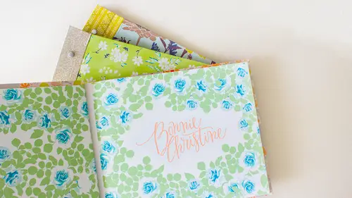
The next thing I want to discuss is how to start standing out from the crowd uh art directors our publishers depending on who it is that you're interested in working with will sometimes see hundreds of portfolios a week and maybe even more digital versions they make get even more e mails and that a week so it is important to, uh, stand out from the crowd and very your brand it's important to know what makes you different from your competitors, so I think having both the digital and hard copy version is a good starting point for being standing out from the crown. So your portfolio specifically your hard copy I want you to start thinking about how you can make it special it should feel special toe hold I like to say it should be you in a book it should be a direct reflection of your body of work, your style, your brand and where you want it to go. It might read like a story I've chosen to do that with mine, so I have a table of contents and chapters that's definitely not required, but I ...
like to sort of make it read like a book or a story like I said, we're going to talk about this more, but it should be a reflection of your brand and where you want your body of work to take you in the future and then another thing we're going to touch on is how having an online following behind you can really help you succeed in this. So the point is that if your work is not presented well, no matter how beautiful it is it's not going to take you as far as it could if it was presented well, so presentation is everything. Market options are boring and dull and usually black and you not that blacks bad, but you just kind of want to get away from the standard and start envisioning something and bring it to life. Do you know what I mean? When I say it should be hand made in that home made do you know the difference if you wanted to look handmade, but but maybe not homemade homemade is like macaroni necklaces, you know, and handmade is a little more hittable but not edible. Okay, so I want you to really think beyond plastic binders and plastic inserts its protector sheets start thinking beyond this because I promise everyone has seen more than these than they want to see. So my next question is what makes you and your brand different and how will that show through your portfolio? This is a great this is this is a hard question to answer what makes you different even had think about it a little bit because it's you have to wrap your brain around around really what makes you different and why would you be appealing somebody? But this is the next question that I want to ask and so two if you're at home if you want to think about this and in your answers in the chat room and then if you guys no what makes you different and how you can show that to your portfolio if you have any ideas you want to toss out yeah if I was saved my eyes different I like little simple cartoonish like artwork hannity's bold colors and I think if I had to say something different about mayes that's what I was like yeah that's great definitely different because my style would be kind of like an abstract botanical there's a little line joints like backgrounds architectures I bring a lot of structural design to it and the colors are mostly organic, although that could be kind of vibrant beauty of my thing ticket I'm striving to lead definitely dye my hair orange or something and because that's like nothing now is that if you've got a bright color in here, you get more you noticed more saying, telling your face, I don't know I'm still working towards that something different privacy me around have tits like this so people will notice that I think I think so um I think because of architecture and interior design is moved so so much into the computer generation I'm trying to hold on to the tanned rendering and that sort of fan so okay great media you have anything? I am so sorry I missed the question I was writing down the markets I wanted to approach that okay that's good we're discussing what makes you and your brand different and how you khun show that in your portfolio. So for me I I think that one thing that's uh helps me stand apart is that I like to attach a story teo I like to tell a story through my pages so I attached stories to my collections and I try to take that through the color story and the names of each pattern in that kind of thing. So I hope that it gives a real personal glance into what I'm doing as an artist but we have some examples coming in now. Kathy holdings in the chat room when she says what makes me different is my aesthetic which is heavy in vintage style typography it's a little bit more masculine and delicate but it helps me stand out and read scorpio says that right now my portfolio is just a photo album and I really wanna have something that's more artistic to show to retailers to really showcase my my brand and so you know, I think people right now are jumping in there sharing all they're different they come from all different backgrounds everybody's at a different stage I think in their portfolio but it's good to have these goals now especially is that we're at the beginning of this class people can really work on this throughout our session definitely great answers from everybody, so your book should be your brand we've been saying this word a lot on dh a lot of people have different ideas about what brand means it's um and how to build your own brand so I'm going to be showing you my portfolio today on dh you're going to be getting a really good a glimpse at what my work looks like, but I think that my book communicates my brand so your book should look completely different. It should look like your brand. So does anybody want to throw out a definition of what you think brand is? Yeah, it's, basically your commercial identity that's great that's probably the easiest way to say it. I have a couple of definitions here one is from entrepreneur new entrepreneur dot com your brand is your promise to your customer it tells them that what they can expect from you your products and services and it differentiates you from offering you're offering from that of your competitors your brand is derived from who you are who you want to be and who people perceive you to be I thought that was a great definition, and then the other one says branding is the art of aligning what you want people to think about your company with what people actually think about it, and vice versa. So from a very simplistic point of view, brand is also the look of your stuff. So ideally, your website, your social media outlets and your portfolio should all have a similar look and feel to it, and basically they should all makes sense if somebody were to look at all of them, they would say, yeah, that's totally yours or hers or whatever, so consistency is key consistency and how you design your more materials and all the way down to him colors and things like that. So you want to keep a cohesive look throughout your book, your portfolio, whether it be a digital or hard copy, and you also want to keep that police have look through your other, your website and social media al it's. So I suggest when you make your portfolio to use your brand colors and this should probably be between, like, three and five. Um, of course, this doesn't apply if you're doing a lot of illustrations, or I don't mean your your actual artwork has to be down to three or five colors, but the u s get well, get into this in the second segment, but the colors that you used to do, things like your contact paid and things like that you should narrow it down, and then you should also make consistent thought choices. I think we, myself included, can get carried away with fonts sometimes because there's so many and they're so fun. But I suggest picking a sarah if a sand saref and then maybe one display font and sticking with those three as you go through a portfolio so it gives it a little bit variants, but not too much to where it's all over the board. Ok, the next question I want to ask is, if you can think of five words that describe your brand, I want you to write these down and maybe keep them with you as you build your portfolio for me, I this was another question. I tried the answer and the's air hard questions. I had to ask myself, too, but I hope that my brand it reads artistic helpful, honest, feminine and sweet on dh that's, where I try to go with my blogged, my social media sites and my portfolio tomb so we would love to hear from you at home what you think five words are that describe your brand and if any of you here in the audience already have five off the top your head. We'd love to hear those two there's, they're scrambling right thing, their office up your head, you're writing them. Anybody want to share? I have three, okay, we'll start with three simplicity bold and fun. That's. Great, I can already envision. Your portfolio is helping to sort of get on idea of what your you want usto I'm scattered with so that the different images are we all creatives, air, scattered, that's, the glory we got. A couple came in here, here's one from a viewer in the chat who says fresh, clean, classic, artistic and sweet and then karen m says fun, playful, pretty light artistic on imaginary, says fresh, honest, modern, feminine, bright can't you already see? I can see three totally different looks just by those five words. So I think this is a key part of envisioning what where you're going to go with this?
Class Materials
Bonus Materials
Bonus Materials
Ratings and Reviews
user-d55306
Bonnie, I want to give a super big Thank You! You have helped change my life. I was recently laid off from my full time job. Due to your courses, I have dedicated my time to continue designing. You have helped my heart come out on the pages. Thank you sooooo much! :) thankful & very happy, Dawn Stratchko https://www.behance.net/dawnstrat5b137
KarenEm
I thought this class was engaging and informative. Bonnie Christine has such a natural way of presenting the information and never seems to lose her concentration. I really wanted to learn more about how to put together a professional but handmade portfolio and that is what you get. Thanks for the great class!
a Creativelive Student
Absolutely loved this course! I learned so much and feel confident now on how to present my company in a consistent and professional way.