How To Create A Duotone Effect In Photoshop
Lesson 6 from: Creating Impressive Effects with PhotoshopJesús Ramirez
How To Create A Duotone Effect In Photoshop
Lesson 6 from: Creating Impressive Effects with PhotoshopJesús Ramirez
Lesson Info
6. How To Create A Duotone Effect In Photoshop
Lessons
Lesson Info
How To Create A Duotone Effect In Photoshop
this effect is gonna show us how to create a dual tone effect. And there's there's a lot of definitions so that war do atones. I'm just gonna go through several examples of what that is and how you can use that. One of them is gonna be more of a graphic design style, so I'll start with that one. So we have this layer here of this woman, and we just want this image to be two colors, I think went to Grady it map. And we've sort of this because this already where we have a Grady INT that maps onto the image based on the luminous values, the colors here on the left attached the darkest tones of the image. The color that we choose on the right here attach is to the brightest tones of the image. In this case, we have black and White does is pretty in a black and white image. I'm gonna click on this year. I come here to bring out bring out this drop down menu and select reset greedy INTs, and I'm gonna press. Okay, these are my default radiance. So now I'm gonna change the color to this one h...
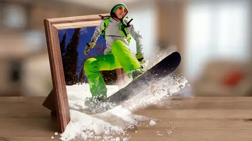
ere you can see another example that so now we have this purple color in the dark tones, this orange color in the bright tones. And I mean, in reality, this is already are dual tone effect. But we want to take it a step further. We want to make it more of a graphic design effect. So what I'll do in this example is I'm just going to click on the quick selection tool, click and drag, and I'm actually gonna be on the woman later to make sure I'm selecting from her. I know I have sample all layers selected, but I think it's a good habit of always having the layer you're targeting selected as opposed to just relying on the sample all layers. This simply means that no matter what layer you click on, you're gonna sample with directly below that. A lot of times that could be good. A lot of temps it's not so good. So, um, clicking the woman later there, click and drag make a selection around her, and just to make things ah, easier to see. I want to stay with ingredient map. I'm gonna hold option. That's all time the PC and click and drag outside other selection there. And what I'm gonna do is I'm just gonna go into the select and mask workspaces to refine the selection a little bit better. So I'm gonna click on the selected mask or space without actually creating a layer mask. So click on that and us what the mask would look like. And I can check Smart Radius just to try to create a better selection. I can use the edge detection tool and paint on the edge here, see if I can get those strands of hair. If I don't get him, that's okay. It's not a big deal is sort of what we were discussing earlier with the question here. Hair is very similar colors to the wood behind her, so it's really hard to get those details. So you have to make a decision. Spend the time asking that out or this regarding it. In this case, I'm shooting disregarding, but you know, that's a decision that you'll have to make. And it may make a difference in your imagery. May not. So, um, for now, this mask seems to be good enough, so I'm gonna press okay. And what I'm gonna do is I'm just gonna delete this layer mask, and I'm gonna create a new one by clicking and later my sky con. With that selection active there it is. Then I can create a ah, hold the option key, click and drag and apply that same selection to that girl layer. And then I can go into the solid color adjustment layer and place that seller color directly into the background, and I can decide what color is gonna be. I can make it that orange, or I can make it that purple. So this is more of that in them. As you can see, the mask is not very good. So you would definitely need to go in there and make adjustments to the mass that you don't get, um, that noise around. But you can sort of see the effect there. So we have this duo tone effect. This graphic design style effect and what I can do now is make a duplicate or the girl layer here, the woman layer and click and drag it. Um, actually, I will just work on the bottom one. So but the bottom one selected I can invert the mass command I control I on the pc to invert the mask. And, um, I can change the blend mode to luminosity and just bring the opacity way, way down. So just to barely have a hint of that background, So yes. So this is that, um ah, dual tone effect that it's more of a CIMA graphic design effect. Of course, of your, uh, this is not a graphic design class, but at this point, you could come in here And what? The type tool. You know, just type whatever you like with maybe white text. Then you know you're creating your nice graphic design banner. Um, I'm gonna hold function in F 12 function because I'm on a Mac book pearls when he told the function key and then hit the F 12 key to revert the image. So file revert here just brings back the image to the last save point, or when it was first open. If you haven't saved that since you opened it, and we can actually that same great map and apply a dual tone effect similar similar to what we just did by selecting the greater map and just going into color and just bringing down the opacity. And so it's this is more of a photographic duel to, in effect, than a graphic, the scientific. But as you can see, you can take advantage of the, um, Grady ins that photo shop provides for you. So there here's one. Here's another. And you can just go through the list and see which ones look good for the effect that you're trying to create. And also try the different greetings that Photoshopped has already mentioned. A photographic toning was I personally like a lot. So, um, you can just come in there and start experimenting with the different ones. And this is one that I like using a lot of the, um, blue yellow effect for And this was going back to our snowboarder? Yes. Would you ever add a shadow? And the answer is so the question is definitely you want to add as many elements as you can to make it realistic. And, um, yeah, you know, without going through the whole process, I'm really not gonna be able to, but it's what you would you would you would generally push maybe a light shadow down but yeah, And if the student was in a class earlier, what I would do is probably used the exposure adjustment layer and bring the exposure down, then inverted command I and then with the breast. Or just paint with white on the layer mask to, you know, create the shadow that the snowboarders creating.
Class Materials
Bonus Materials
Bonus Materials with Purchase
Ratings and Reviews
JIll C.
Creating Impressive Effect With Photoshop is another action-packed class filled with really useful information. It includes how to do fun (or even useful) face swaps, How to create shallow DOF in images even if you didn't use the right lens and f-stop combo, how to create the golden sun flare effect, how to do a double exposure effect, how to create a duotone/graphic effect, and others. There is so much info packed into this short course that you will need to play it over and over to absorb all of the keyboard shortcuts and layer techniques, but there is surely something for everyone in this course.
Phreakgirl Photography
Whew! I watched it live and he goes so fast I couldn't even write down simple steps to refer back to later. SO MUCH great information packed into this course, but I'll have to buy it and use Pause and Rewind a LOT!
user-1c544c
Great class & instructor. As soon as I was done with the class, I wanted to try what I learned on my photos.