Setting Up Your Photo: The Basic Rules
Lesson 5 from: Craft Photography FundamentalsCandice Stringham
Setting Up Your Photo: The Basic Rules
Lesson 5 from: Craft Photography FundamentalsCandice Stringham
Lesson Info
5. Setting Up Your Photo: The Basic Rules
Lessons
Session 1
1Introduction to Craft Photography Fundamentals
04:59 2What Your Visuals Say About Your Brand
04:56 3How to Become a Photographic Author
10:44 4How to Use Natural Light for Your Product Photography
10:00 5Setting Up Your Photo: The Basic Rules
09:07 6Becoming the Viewer to Take Better Photos
10:30 7Shooting 3 Setups: Creating the Backstory with Images
34:32Shooting from Top Down with an iPhone
19:49 9Shooting Paper Products with an iPhone
10:54 10Shooting Jewelry with an iPhone
19:01 11Editing on your iPhone
15:28 12Finding Your Brand's Aesthetic
18:39 13Find Your Product and Customer Target: Exercises
11:12 14Figuring Out Your Audience
08:46 15Interview with Gilit Cooper of The Bannerie
08:45 16Branding Beyond Instagram
19:47 17Looking for Natural Light in Your Home
19:36 18Building a Styling Prop Collection
08:22 19Creative Backdrops
13:52 20The Essential Product Photography Props
11:18 21DSLR Basics
02:39 22Understanding Shutter Priority And When To Use It
26:29 23Understanding Aperture Priority And When to Use It
37:16 24The Basics of White Balance
12:52 25Photographing Jewelry
37:27 26Setting Up a Bedroom Set and Photographing Pillows
19:59 27Photographing Greeting Cards
06:53 28Shooting Products on a White Background
17:24 29Top Down Photography on a White Background
13:06 30Shooting Products on a Black Background
07:23 31Shooting Reflective Items
12:20 32Shooting with Backlight
04:01 33Top Down Photography: Shine & Reflection
24:50 34Basic Editing in Lightroom
31:37 35Batch Editing in Lightroom
06:00 36Editing Jewelry in Lightroom
10:01 37Editing White on White in Lightroom
06:54 38Editing Shine and Reflection in Lightroom
17:03Session 2
Lesson Info
Setting Up Your Photo: The Basic Rules
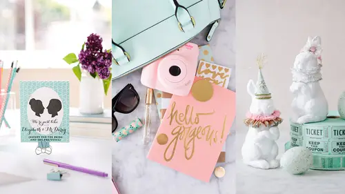
So we're gonna do a little image exercise. Everyone, just in your mind, think about how many images you saw yesterday and then count it out and tell me the number. They're laughing, you can't see them but they are laughing, because that is impossible today. That is impossible. You probably saw thousands of images yesterday, just scrolling through your own Instagram feed. Let alone if you took the subway or you're driving down the road and you see the billboards, or you're looking at your TV and you see images flashing, or a magazine, I mean we are overwhelmed by imagery today. And it kills me a little bit in my heart, it says, the Louvre found that people looked at the Mona Lisa an average of 15 seconds, which makes you wonder how long they spent on the other 35,000 works in the collection. So someone flew to Paris to see the Mona Lisa. They stood in line for three hours to see the Mona Lisa, and they stood in front of the Mona Lisa for 15 seconds? And they were like, I'm good. I total...
ly see what he meant when he painted that painting. I know why she's smiling. Right? Hey, that could be overwhelming as a creator. To think, someone's looking at the Mona Lisa for 15 seconds? Like how am I gonna get someone to look at my photo for more than 15 seconds? The average attentions span in 2005 is 8.5 seconds. That is the average attention span looking at an image. And honestly, I would say it's even less than that, because think about how you look at Instagram. Do you look at each and every image for 8.5 seconds? I don't. I love you mom, but if I don't like your picture I'm gonna scroll through it, and she's watching this so she's probably, really hurt her feelings, I love you. But that's the problem that we have to overcome as a creator, and again, it can become really overwhelming, but when we use these elements and we start to create a brand identity, then people will only have to look at our images for a few seconds to know its ours and to know what it's about, and we have to build that up through imagery. So it comes with a lot of work and a lot of thought into what we're presenting to the world, but it's possible, it is possible. Okay, we have 8.5 seconds or less to tell people our story, how are we gonna do that? All of these elements that we've led up to, plus composition. So composition can strengthen or weaken a story and above all it should lead the viewers to your main subject, to your main character. It has to, if you only have 8.5 seconds, everything in your image should be pointing to whatever that main character is. Rule of thirds, we all know that, I didn't draw the lines up for you, hopefully everyone knows the rule of thirds, but basically we draw our lines and on the intersecting points we place our subject. That one's pretty adorable. Centered. Centering things, people always say don't do it, lies. If you put something in the middle I know exactly what you want me to look at, right? Can it be boring? Yes. But can it be interesting, and powerful, and unique? Yes. So there's definitely a time or a place to use a centered subject. Balance, and we can use symmetrical balance or asymmetrical balance, like we have here. Same apple week, just carrying it through. So you can see it has that same look as the girl holding the dish. Height, placing your subject at different heights adds interest to the eye, and what that does is carry the eye through the image. When you get direct horizontal or vertical lines, your eye's not gonna travel it's gonna stop. And we want the eye to move through the image quickly. So we wanna add different heights and different levels of interest to do that. Contrast, in tone or in color. So here I'm photographing a black and white card and we're adding color to the background because it makes it stand out. Repetition of shape, pattern, or color. As human beings we really like organization. So creating a pattern or a repetition is gonna draw us in into an image. You might think your teenager likes chaos, but I promise you everyone likes a little bit of organization in their imagery. Use of color, and this is another great tip for if you just don't even know where to start, pick a color palette, what colors do you love? And just start creating images with that color palette. And if you consistently do that, people are going to start connecting that color palette to you, and then anytime they see something in their Instagram feed or in their Facebook that is that color palette, they're gonna guess it's you. Because you have given them those visual cues, this is who I am, these are my colors, and they will start to connect with that. Again, we wanna avoid creating harsh lines. So there's two major things wrong with this image. The first is it's crooked. Ugh, it looks like that stool is gonna slide right out of the room, right? Make sure that anytime you have horizontal lines in your image, that they are straight. Otherwise it's gonna be super distracting. And then the other one is, I'm selling this blanket here, the print is exactly above it, they're almost the same size in scale, and because they are directly above each other it creates this line through the image and it's a stop line. So I can straighten it out and I just move the print slightly over so it's offset, and now it feels much more comfortable and I know what my main subject is. Simple, easy, changes in things. Odds. So this is another easy place to start if you're feeling overwhelmed. It's just easier to create a composition with an odd number of items than it is with an even number. I don't know why, but it's a thing. So start out with three, or five, or one, instead of two or four. It's just gonna be harder to create a nice balanced composition. And then I want you to look at this image. Blueberry Pies, this image has been picked up everywhere. Who knew that jars of blueberry pies were so popular? Now do you see the similarities? It's the same composition, almost. I've placed all three of these circles in almost the exact same place, and that was not on purpose. We all, and hopefully as you did this exercise, that we're gonna talk about in a minute, have a connection to specific weights or areas in an image where we like things to be placed. And we may not even realize it, but we do. And so clearly I do. Yes? This is great about composition, and if you guys have any composition questions, feel free to grab the mic. One that I was wondering about was in one of those images you showed there was something on the wall that had the text. If you're going to add text later, which I know you're gonna show us, are you thinking about that in your composition? As to leaving open space for text? And how does that impact the composition? Definitely. So I always have the end in mind. Where it's going, is it going on Instagram? Is it going on Facebook? Is it going on my website? Is it a header? Because you wanna know, is this a vertical image? Is this a square or is this like a cropped banner for the top of my website? And as well, am I adding text to it? So is this like an ad and we're gonna have like, go to this website, or look at these pretty things? Whatever I wanna write on it, I do always have that in mind, and I create and we will show a couple different compositions where we've left space in the center specifically to add text. So yes, I do, keep that in mind.
Class Materials
Bonus Materials with Purchase
Ratings and Reviews
a Creativelive Student
This class taught by Candice was amazing. She teaches in such a step-by-step, easy to understand pace. She shares so much of her own tips and tricks she uses to create beautiful images without spending a fortune or having all kinds of expensive equipment. Having the DSLR lessons included was really great for anyone who wants to do more than the camera phones are capable of. Learning the basics of how to use a DSLR is confusing for most people, but Candice broke it down in the simplest way possible. Social media is all about imagery, so if you want to put out the most beautiful eye-catching photos, then you want to learn how to use more than the camera phone. I don't have a business where I need to take photos of things I sell and I still enjoyed her class so much. As a photographer, I am going to use her ideas and insight when I photograph things for fun. There is so much to gain from this class. I would highly recommend taking her class. She is a wealth of great ideas and information and has that friendly personality of someone you'd want to sit and have coffee with.
yomichaela
A wonderful class to get you going with craft/product photography. Candice provides (and shows) fantastic examples and it's really fun to watch her work through a shoot, moving items, etc. to create the final image. She also covers some basic photography tips which is very helpful. Great class! I definitely recommend to others!
Melinda Malamoco
I loved this class! Candice is so personable, clear and relatable. I would want to hang out with her and be creative! I have been taking pictures for YEARS, and for my Etsy store for over two years, and I still learned a lot in her class. The lessons are set up in a way that you can follow, take what you want and don't worry about what you don't need. I will say that I got a TON of ideas for how to better display my brand, what my personal style is and how to be consistent with it. I so recommend this class for anyone who has small business or just wants to be able to take better pictures of their products. Okay, off to build a prop kit!