Project 2: Start With a Focal Point
Lesson 15 from: Compositing for Digital ScrapbookersTiffany Tillman-Emanuel
Project 2: Start With a Focal Point
Lesson 15 from: Compositing for Digital ScrapbookersTiffany Tillman-Emanuel
Lesson Info
15. Project 2: Start With a Focal Point
Lessons
Class Introduction
17:03 2Conceptualize & Narrow Down a Theme
11:21 3Build Your Compositing Studio
05:24 4What is Blending?
09:38 5Most Common Blend Modes & Groups
08:07 6Self Blend a Photo Two Ways
12:31 7Drop & Go Blending
07:39 8Blend Two Photos Together
21:36Project 1: Introduction
05:49 10Project 1: Build Background & Focal Point
31:45 11Project 1: Create Grounding
13:57 12Project 1: Add Personalization & Lighting Effects
28:58 13Project 1: Fine Tune & Finalize
10:57 14Project 2: Deconstruct Layer-by-Layer
04:41 15Project 2: Start With a Focal Point
18:13 16Project 2: Add Background & Build a Scene
09:25 17Project 2: Create Grounding
04:07 18Project 2: Add Lighting Effects
14:15 19Project 2: Add Personalization
11:56 20Project 2: Fine Tune & Finalize
18:39Lesson Info
Project 2: Start With a Focal Point
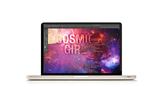
So you're going to need three hero worthy photos and when I say hero worthy, they don't have to look like my son's photos, okay? What I mean is if you have a particular subject who has a close-up of them, that would be one photo. So I do use one close-up photo and particularly one action photo. One full-body photo of somebody moving or doing something. Again, that's going to help your composite. If you have at least just one more photo, that's just three photos that you need to find for this particular piece and it can be anything. We're going to just play around with blending on that photo and make it stand out so you don't really have to dig too deep, hopefully, for three photos. Now, let's get started. All right, so first things first, we're going to create a new layer in Photoshop. We do know how to do that. Excuse me, a new workspace in Photoshop. Go to file and new and same as before, 12 inches by 12 inch for the width and height, resolution of 300 pixels per inch, color mode is ...
RGB, and with a background contents of white and click okay. Next step, we're going to add and extract our focal photo. Now, the reason why I'm starting with this step rather than my background is because typically I will start with my focal photo. Sometimes that means putting a moon into the background and I have to blend it. Other times it's not about blending, it's about getting the photo in the right place and then deciding where to go. As we had talked about and I think Jin you had asked me this question about process like yesterday, right? Well, process doesn't always mean that you start with one thing and not another. You can start anywhere you want. It just depends on your kind of workflow. So sometimes I will start with my background because it's going to be very important. Sometimes I will start with the person's focal photo or the moon focal photo or whatever because that's going to be the most important. Typically if I need to build a substrate layer and build a lot of layers then I'm going to start with the layers, the substrate. So as you can tell, pretty much whatever needs to be first is going to be first and everything after that is butter. Okay. (laughs) So first things first we're going to open up the photo. Now, my photo is the one I'm going to be using. I do suggest that you grab a photo that has a nice little close-up that you can use and let's see, I'm going to use this one. And I think it's, I think it's the same, it doesn't really matter but I'm going to use this one and is? Yep, that's kind of a dark photo and again, there's a shadow kind of casted over his face but that's okay, we can fix that. Now if you have Lightroom available to you, you can go into Lightroom or Camera Raw and increase the exposure, you could do all of that. There's no problem with any of that, however, you work in your workflow. I'm going to work from this one so that I can show you how to use adjustment layers to brighten it up where you want it to. Okay? So we're going to open our photo and the way that we do it, so I'm going to use a quick selection and I'm comfortable with the quick selection for this particular photo because there's some contrast between him and the background. Okay, I believe the quick selection is gonna to be able to say okay, this is where he is and this is where he's not. I don't think I have to guess too hard for it. So we're going to click on the quick selection tool for this photo and I'm going to come in and get a little bit closer to them and increase my brush and again, kind of like I was talking about in the previous lesson is that I'm going slow. I'm not clicking. I'm letting it reconfigure every time I move and wherever I see that it has not grabbed, I'm going to go grab it. Okay, now you see right there now I'm going to stop because it grabbed that extra part of the green. I don't want to go working up here so much because I need to go fix this part first. So I'm going to reduce the size of my brush. Anytime you're working with a brush bigger than the area, if you go to try and do that it's going to start messing up. You want to limit your keystrokes for your extractions as much as possible when you're working with the quick selection tool. The more you click, the more opportunities you will give the selection to mess itself up. Reduce the brush when you're extracting this manner. Reduce the brush smaller than the size that you need to extract. That's a big deal because if not, it's always going to select a larger sample size. I'm going to hold down the alt key and click and try and give it a chance as I come closer to figure things out. It wants to figure things out. It's happy (laughs) doing its job saying okay, well what do you want and what do you not? What are you trying to do a little miss Tiffany? So it doesn't mind going slow and if I go slow with it, will give it a chance to do the job that I need it to do. So there we go, it's kind of close. It's not perfect but I will tell you, compositing is one of the most forgiving extraction techniques that you can do. Especially with the trick I'm going to talk about with picking a background paper and colors and stuff like that. How you can kind of kind of mess around with it. We'll talk about it in a second but it does not have to be perfect by any means but I promise you, it can be if you take your time. I'm going to take my time to really kind of get closer to those edges. Now, if the edges were blue, let's just say that I wanted to extract his face or his clothes and costume against a blue background. I wouldn't do it with the quick selection tool, I would have to do it with something a little bit more precise. Maybe like the pen tool because that's going to be a lot harder. So I'm a scrapbooker, I want it to be quick. I wouldn't probably choose a photo like that or if I did, I wouldn't choose the quick selection tool. I would either do the pen tool for a better precise extraction or I would blend the edges away. But I don't want, I mean you could use like alpha channels and stuff like that. Channels specifically. I'm not going to do that. That takes a lot of time to do those kinds of selections and I know for my professional friends out there, you live by that and I do too when I'm working for something that's really important but for this kind of page, I want to impress my son. He does not care. (laughs) So it's okay and when I'm 99 years old looking back on this layout, I am not going to worry about... Oh, my extraction technique was pitiful! I'm not going to worry about it at all, I promise you that. I'm going to go, did really happen? That's what I'm probably going to say. So that extraction looks clean. Again, I've zoomed in to 100, almost 200 percent to turn around and look at it and after this point, it's pretty much the same process. Right click. Go to your fine edge panel. Once refined edge came out, it changed the game and I do believe with the new changes they've made to Photoshop Creative Cloud, they got even better and bigger extraction tools. So you know, we've got some good stuff. I like to again, to view it on white. It's not going to be perfect. I'm not looking for it to be perfect but I at least need it to be smooth. So I'm going to increase my smooth slider and you can see just how good my edges start to look as soon as I just increase the smooth. I've got a little bit of ear stuff going over here so I'm going to fix that and I can add some contrast if I want it to be a little bit strong and I might for my focal photo to not be so fuzzy on the edges and then I can click okay. Now, I'm going to go ahead and just contract by one pixel. It's a fairly large pixel. If it was a smaller pixel, I probably wouldn't contract it but for this purpose, I am going to do that. So I'm going to go to select, modify, and contract, and bring it in just by one little small pixel. Just so I make sure I get rid of all of that outline because this is a big contraction of a big kind of photo that we're working with. Okay? So we're still on page 21. We are on number 3 letter D. So we're going to right-click within the selection and select layer via copy and now we have our extracted piece and if I go in there and if I remember correctly, I think I had some ghost pixels but if you open up your layer styles and go to stroke and go on inside or I go center but outside and switch it to red or some kind of red, it will show you if you have pixels like that. Okay, like that right there hanging from the ear and notice that, that's a problem. So I'm going to go to my eraser tool and just very ever-so-slightly just kind of get rid of all those extra pixels that were right there. If I added a shadow you would see that show up. Everything else looks pretty doggone good for a really quick selection and you can increase your stroke and look around to see if you've missed anything and as long as you see a clean look like that, you're good to go. So you can toggle off your stroke. That's an optional thing, you don't have to do it. So now on letter E, you can use the move tool to bring your new photo into your layout, if it's not already in there. So I'm just going to slide it in there and there's my photo and it looks a little small so I'm going to increase it. I don't mind because if you guys had saw, I said that if you want to, if you have a photo or if you bring in something that's kind of this big, you can increase it to this size, the full size. If you have a photo that looks kind of almost like a 4x6 and you increase it maybe that much. Maybe by 50%, it's okay on your layout. It's not going to be a humongous big deal if you do with that. I would not increase this to the entire, the full frame, it's going to look pretty bad and if you happen to look at my print, if you guys were here in the studio audience, you cannot see, there's a little bit of noise in his face but you cannot see a lot of that pixelation. It's smooth and clear and his face looks good. So you can enlarge your photos, that's one of the biggest questions I get is can I enlarge this photo? Should I only enlarge it by 25%? I'm like no you can do a little bit more than that. Especially if you're shooting with a DSLR of course. It's okay to do that. Now, if it's a web-based photo, you know, you took it into Facebook and then you try and increase it, no, don't do that, that's never going to work. Anytime you start working with 72 pixels of photos, you're not going to be okay with that. But most cameras nowadays, if you're shooting straight out the hip, it's going to be alright and I mean straight out of the camera, it's going to be okay. Before you post it online. All right, so we have our focal photo in there. I'm going to throw away the effects that I had. I'm just going to click and drag it to the trash can because it's not necessary anymore. All right we're going to use, let's see, so we start with E, use the move tool to position your subject on the right-hand side of your layout which I have done. I've increased this size. Click on the add layers mask icon and quickly change your foreground color to black. So here's what we're going to do. 99% of the time you have photos that look like this, right? (laughs) Somebody's cut off on the shoulder, the legs cut off, and you want to use this in a project. What are we going to do? It's an easy fix. So here's what I suggest doing. When you have a cut-off and you don't want it to be as prominent, first you're going to kind of mask it out and second, you're going to put something over it. Easiest way to fix it. Don't try and build an arm or leg or something, to clone. I've seen that and it's just like huh? You know, you get that dog-eared look like... What's that boss? Don't do that. So click on the add layers mask and it's dark, we're going to fix it but let's do this first. Click on the add layers mask and select the brush tool and because we're working with a white mask, our foreground color is going to be black and with a soft round brush. And I think yeah the size is a little bit okay. I'm going to reduce it down and we're just going to kind of, oh that's too small. Make it a little bit bigger and kind of just say hey, you don't need that arm. No big deal, didn't have arm. You know, it's okay. You can come back in and do the opposite but you need to get rid of that strong edge. Do not have strong edges on these kinds of layouts. Don't do that, like ever. Just don't ever have a strong edge in life when it comes to this kind of compositing. You won't find them, we blend those. We fake them, we hide them some way but you don't want to ever have strong edges because if there's one thing that's going to take away from a composited piece, it's the fact that you have a hard-line edge on something that's supposed to blend in with everything else. That's the point of exterior blending, to concentrate on those hard edges and get them to do something. Whether we blend them, whether wemake them seamless, whether we composite them into new backgrounds, that is the entire point is to make things gel. So there we go. Okay, are there any questions before I move on to making this photo a little bit brighter and better. Any questions? Anything online? Awesome, okay let's move on. So we are on page 21, step 4. Create contrast within your photo and also lighten it up. Now, you may need or to do this, you may not need to do this. This is what I do if I'm given the photo like this which is typical of some of our photos. We're amateur photographers. It might be a little dark and it might need some contrast. This one needs both. So here's what I will do. I'm going to jump the background layer. I'm not going to do a dummy layer. I'm going to jump the background so I don't mind my file size getting big, I don't mind so duplicate your photo, command J or control J. So now I have two photos and I want to keep the mask. If I got rid of the mask, you keep the mask because if you get rid of the mask then that photo no longer has that mask anymore. So every time you jump the background layer, keep the mask. If it's a dummy layer, you don't need to do it but jumping the background, you need to keep the mask. Create a clipping mask from the second duplicate to the first one and then we're going to change this duplicates to, let me see what how I did this in my, yeah I do end up doing it. So change this one to the overlay. Now, you guys what this overlay do? Darkens, contrast, Contrast! All right, good. It makes contrast. It darkened here because it's already dark, that's cool. We're going to reduce the fill, just so it's not too dark but I at least I have contrast. I'm gonna to name this layer contrast to keep track of everything. Then I'm going to duplicate this photo again and I'm going to clip it. I'm working a little bit faster because I feel like we know what we're doing so we can work faster. Which mode do I use to lighten it? Screen, very good. So there's my screen mode. Now, it's a fill at 19 percent but look what happens when I increase it up. There, boom, bingo. Oh finally, I got some screen contrast, that's all I needed. Now, if I want that contrast to show up below it, I have to reduce the fill just a little bit so you can see it. Now, the contrast isn't very high but when you start adding your background and other effects, you need the photo to pop a little bit. Soon as you start adding effects, that's probably the biggest thing with photos that I see on a composited layout. There's no added effects to jump the background or dummy layer to make it look like it's blending very well with the background. Backgrounds are very bright. They have lots of color and stuff so when you add a photo that does not pop, it just doesn't feel right. Something feels flat. So I add both a contrast and a screen layer and I clip it and I play around with my fills depending on the photo to add brightness and lightness which you could do with an adjustment layer and add contrast which you can do with the levels layer. Or if you're using Photoshop you can use a curves layer. That's another way to easily add contrast as well. Okay, so I will play with my screen fill and my overlay to get the right prescription, the right recipe for a photo. There's no perfect values, it just always depends on whatever your photos are but every single time I do a composite, I will do these two layers. I would jump the background layer so that I can make sure that I have enough light and enough contrast. And as you can see my file size has gone up tremendously. Was at 20 megs when I started. I added another 20 meg photo and added another 20 meg photo. So if you do not want to do it that way, do not worry about it. Also if you want, you know, if you change them around, the direction you will get different results. So just be mindful of that as you work. All right so that was on page 22. All right, let's see, that's letter D. Use the layer's layer mask to conceal brightness to specific parts of the photo. So I'm going to put my screen back on top and talk about that for a second here. Now, when I toggle this screen layer off, you see his photo and it looks very dark. I toggle it back on and it looks better but let's say for example, you look at this and you go, his face looks cool, his clothes don't need to be that dark or need to be that bright, maybe I want that to be dark in his face. Well, you can conceal just that part. You can come back in with your brush tool and then you can use, what am I painting on? Yeah, okay good. I'm on my layers mask and you can come back here and darken the contrast that or this the darkness that I had on his clothes. So you can interior, this is interior blending. You can come back and kind of play around with that if you need to, if you find that you need to. At this particular point I will not say for sure this is where my fill opacitys for either layer is going to end up because I haven't added anything else. When I start to add stuff in then I can go okay, I need to revisit this and fix this. All right and finally the last step on that part is optionally, you can use adjustment layers or dummy layers like levels and curves to create even stronger contrast if necessary and brightness too as well. Any questions with that? That was pretty simple I think as far as a focal photo. Any questions online? Very good.
Class Materials
Bonus Materials with Purchase
Ratings and Reviews
Phyllis
I was in Tiffany's Mixed Media class and was also lucky enough to be in this class. Tiffany is an AWESOME instructor and well organized. Her Mixed Media class was a great building block for this class. The class is well worth the money--well organized workbook and other great bonuses. If you want to take your scrapbooking to the next artistic level, I highly recommend Tiffany's two classes at CreativeLivel.
a Creativelive Student
Great course with easy to understand ways of blending more than one photo together for a great composite layout. Excellent materials and workbooks.. Thanks Tiffany for a wonderful class! - Christa (cfile)
E.L. Bl/Du
I think Tiffany is good at explaining it so those who arent pro photgraphers can start at the basics to learn photoshop. I really liked watching this even tho my vision is in another direction, I like how she explains how to get there in photoshop. She makes it not so scary to jump in. She is clever mom too, every parent wants their own kids to be a star and she surely did that. What a neat thing to "scrapbook" the photos. I liked learning adjustment layers, would like more in curves too. But great place to start out in ps. I recommend if your lost in PS.