Blend Two Photos Together
Lesson 8 from: Compositing for Digital ScrapbookersTiffany Tillman-Emanuel
Blend Two Photos Together
Lesson 8 from: Compositing for Digital ScrapbookersTiffany Tillman-Emanuel
Lessons
Class Introduction
17:03 2Conceptualize & Narrow Down a Theme
11:21 3Build Your Compositing Studio
05:24 4What is Blending?
09:38 5Most Common Blend Modes & Groups
08:07 6Self Blend a Photo Two Ways
12:31 7Drop & Go Blending
07:39 8Blend Two Photos Together
21:36Project 1: Introduction
05:49 10Project 1: Build Background & Focal Point
31:45 11Project 1: Create Grounding
13:57 12Project 1: Add Personalization & Lighting Effects
28:58 13Project 1: Fine Tune & Finalize
10:57 14Project 2: Deconstruct Layer-by-Layer
04:41 15Project 2: Start With a Focal Point
18:13 16Project 2: Add Background & Build a Scene
09:25 17Project 2: Create Grounding
04:07 18Project 2: Add Lighting Effects
14:15 19Project 2: Add Personalization
11:56 20Project 2: Fine Tune & Finalize
18:39Lesson Info
Blend Two Photos Together
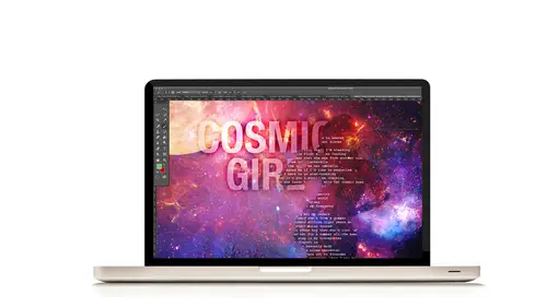
Let's take a look at one more exercise that is going to take a little longer for us to go through, and this one is going to be about blending two different backgrounds together, using a gradient. So, to do that, and if you're following along, we're still on page 12, right at Number 1: Practicing Blending Two Backgrounds. I love blending backgrounds, just to kind of set this up here. Every time I get a pattern paper, or an abstract paper, I look at it and go, what can I do with it? How much trouble can I really get into with these papers. The example I'm going to share with you guys, I like to call it Heaven and Hell. I'm really going to take a light, beautiful photo, or background, and contrast it with a dark, and create like a hell scene, and a heaven scene. It's not gonna be that bad, but I tend to think of it, that I want to create light, I want to create darkness. Now, having a fine arts background, I am always looking for light in my layouts, and if I can create highlights and sha...
dows, that's great, but if I can create background where you have some part that's asymmetrically balanced with light, I'm gonna do that. It's not something that I'm gonna point out, but I find ways to try and activate that on my own layouts. So, this is a really cool way to do that with background papers that I think you guys will like. So, we're going to create a new layout in Photoshop. Go to New, File>New. Same size, 12 inch by 12 inch, a resolution of 300, color mode of RGB, but this time we're gonna want our contents to be white. I don't think that matter's coming up, but I think just go with white right now, and then click OK. Next, you guys who are working at home, you're gonna want to grab two of the outer space background papers of your choice. I'm gonna grab specific papers because I know what I'm looking for. Navigate to your outer space papers, and the papers I'm going to use is Number 1, which is right there, and then I'm going to grab another one which is going to be Number 2. Let me make sure before I start, there's seven, there's six, there's five, there's four, there's three. So, it's going to be Number 2. Now, for you guys who are following along at home, If you decide that you want to use two different papers, you're gonna get two different results. You're not going to get what I get, but you're more than welcome to practice with whatever papers you want. So, we have our outer space. We're gonna use the Move tool, which is step 2, letter B, and then we're gonna drag it in, and we're gonna drag both papers in. So click and drag, and hold down the Shift keys so that it lands exactly where you want it to, right nice and centered. Go get outer space, Number 2, click, drag and hold, and drop it in using the Shift key. Now we have two layers in our Layers panel, the one that looks like a blob, and the second one, these are all pictures of the universe, by the way, I don't always know their technical terms, so don't hit me up for being scientific right now. We're just learning Photoshop. I have my top-most paper which is going to be my hell paper. And then I have the bottom one, which is going to be my heaven paper. So toggle off the visibility of the top layer in the Layers panel. Step 3, let's create a gradient. Gradients are by far one of the easiest tools to use for blending. If you're not using gradients, you're doing yourself a great disservice when it comes to blending, because they are just wonderful for making things so easy. I love to blend photos together using gradients all the time but I think for background papers, they work really well too. So, we're going to target the bottom layer of paper in our Layers panel. That's going to be this paper. So, we're going to create a gradient in between these two papers. This is paper 2, and this is paper 1. We're going to create a gradient in between that. We're going to target the bottom paper of the Layers panel, then we're going to change our foreground color picker to white. Right now it's probably black. You can do shortcut keys if it's not-- if it's any color, no matter what it is, use shortcut keys D to get yourself black. I'm already on black, so it doesn't matter. Then you can use shortcut keys X to jump to white. I'm going to be doing that quite often, D and X, D and X. They're just in your workbook to help you figure that out. Then, click on the Create New Fill or Adjustment Layer icon. Looks like a little eclipse, and from there, we're going to select Gradient. So, click on the Create New Fill or Adjustment Layer icon and select Gradient, and kind of like what we saw yesterday with the gradient map, you're going to have a beautiful gradient show up. It's not clipped to anything yet. We haven't clipped it, but that's where it is. We've got our gradient, and now we need to work with this gradient, in this panel, to change it a little bit to work with our papers. So, we're going to click on the Gradient Editor bar. It doesn't say that, but this is the editor bar where you can actually change the preset for your gradient. Click on that, and then from this dialogue, you're gonna choose Color to Transparent Gradient. Whatever your foreground color is, which doesn't matter what it is, actually, you're going to choose the color, foreground to Transparent-- Oh, no the color to Transparent. Yeah, foreground to Transparent, color to Transparent, it's all good as long as one edge over here has color, and the other one you see all of those, that grayscale checkered map, so you know that there's no color for over here. And once you see that, you can click, OK. Now we can have some fun with this gradient. We need to change the angle to decide where the gradient is going to be seen, and where it's not going to be seen. Whatever's on the transparent top is what you're gonna see. Whatever's on the bottom is what's gonna be kind of hidden. You want to change your angle to negative 120, if you're following along with me, which means the gradient is going to be in the top, right-hand corner, which means we're seeing the bottom, left-hand side. The other thing is you can also pull a gradient so you have more gradient. You can also pull a gradient on a surface so you have less gradient. You can edit this however you want. Now, I've kind of messed up my setting here, but it's okay, I'm not really worried about it. The other thing is, is you can use Style, Angle, Scale. We're gonna take our scale and move it down to 50 percent. So, I really have a strong gradient on the top, and I can see a lot of the paper in the background, underneath it. And then click, OK. So now we have this beautiful gradient, but that's not the effect we're looking to create. We want to create a heaven and hell effect, not a awe inspiring effect, which it looks like right now. We need to change our gradient blend, and blend things into it. Let's toggle back on the visibility of the top layer of our paper. Toggle that back on, so we see our blob piece. Then we're going to create a clipping mask. Now, I did show clipping mask yesterday, but just in case you might not have remembered how to do it, clipping mask, you're going to go to Layer>Create Clipping Mask. That's the simple way to do it, and there's our effect. You can also use shortcut keys, and depending on which version of Photoshop or Photoshop Elements you are using, it can change. You can go to Layer>Create Clipping Mask, and right to the right, it will tell you what your shortcut keys are, and if you're like me, I like to use the Alt or Options modes, so hold down your Alt or Option key, hover in between the two layers, and then click, and that also is going to create a clipping mask as well. Now we have a little bit of our effect, where it's really dark on the top, right-hand side, it goes down into our little Nebula, I believe, and then in the bottom, creates that blend with our papers. So, that's an exterior blend where we take in two things, and match them up together, like that. Any questions so far? It's a pretty simple way to blend something, right? And you can do this with papers, you can do this with photos. We're not done. We're going to edit it a little bit more, and we're gonna have some fun with this, but that's the beginning part of how we make it work. Next, we're gonna edit this gradient blend to give it a little bit stronger look. So, let's target the gradient mask layer, the gradients layer, and then the gradients layer mask. Now, here's the thing that I wanna say with this. Go overboard when you're developing with your blends. Don't just stop when you blend something together. Do something more. Like I said, push it to the extreme, and then maybe dial back. This is art after all, so it doesn't have to be a set of steps where you're going, OK, one step, two step, three step. No, no, no. This is something where you can go, how can I make this stronger? How can I really develop this into something bigger, and make it very artistic. We're all artists after all, so push it to the next level, and that's what we're going to be doing right now. We kind created a darker effect, but I want to go even extreme. So when you want to work with a blended object, when you've added some self blends, often times when you need to change the blend mode, or you need to work with it, you're gonna start with your base layer, the part that has other things clipped to it in the stack. This is our base layer. Our gradient is our base layer now. We're going to target the gradients layer mask, and you can tell-- Let me bring my Layers panel out a little bit. I'm gonna increase my size, but bring my layers down, so you can see the actual mass. You can have your layer targeted, and you'll have a box, a bounding box surrounding the actual adjustment thumb nail. You can also target your mask. So, that's very important that you see a white or blue box surrounding the actual mask. That lets you know that you're gonna be working with your mask, rather than your actual gradient. Next, let's select the brush till we can do that easy, using shortcut key B, and we're gonna use a soft, round brush, and I'm gonna increase the size to really, really big, because I want to get rid of that Nebula, that's right in the middle there. We're gonna conceal that. You can conceal portions of it randomly. The main thing that you need to have, if white is your color for your layers mask, you need black to be your opposite color in the foreground layer. So, we're gonna select X, and that's gonna switch my color picker to X, or to black, excuse me, and then I can conceal portions of my gradient. So you can see, and I just want to show you the difference, when I had that gradient up there, you saw that with it on, it's kind of making some of the papers less contrasted. Going back in and fixing that helps a lot. When you notice that there are parts of your blend that are so over-developed and so strong, go back and fix that. It will make a world of difference. I'm gonna switch back to X, and kind of go backwards to get that strong effect, and play with my brushes to kind of bring it back. I can also kind of randomly pick out spots where I want to hide and whatnot. You don't have to do it because we're working with a gradient, but that's the general look that we want to create, and I really don't want any of the Nebula to show. I want it to just kind of look strong and black on that side. Again, this is all just plain at this point. Right click the Gradients Layer Mask, and disable the layer mask. There we go. So that's-- You can turn off your layers mask by doing that, so you can enable the layers mask, and then disable it if you'd like, so you can see the differences. Now we're going to create a heaven and hell effect. I'm going to disable my layers mask, and then we're gonna create the heaven and hell effect. First, we're on page 13, Number 6, and this is letter A. Target the gradient layer in the Layers panel, then select the Move tool in the Tools panel, that's gonna be shortcut key B. The Move tool also looks like this in our Tools panel if you're new to digital scrapbooking. Then, what we're going to do is use a shortcut key to see which one of our gradients, excuse me, our blend modes, is gonna make this self-blend really cool. Or not, excuse me, a self-blend, but this interior blend. We wanna create stronger effect. Now, we do not blend the top of our stack, our clipped piece. Remember I was saying you blend your base. That's a big mistake that I see a lot of digital scrapbookers make, is that when they wanna blend, they blend the clipped layers. Don't blend the clip layers. Don't blend anything in the stack. You can if you're creating certain effects, but you really wanna blend your base. We're gonna use shortcut key Shift+ and Shift- to figure out which blend mode is gonna do it. I wrote down which blend mode it's gonna be, but just so we can see it live. Use shortcut key Shift+. So, Shift+, this is Dissolve, and it looks cool. This is Darken. This is multiply, creates a really dark effect. This is color burn. That's the one we're gonna use. That creates your hell effect. You guys see that? Let's keep going. This is Linear Burn, makes it darker. Those were our darken modes. This is Lighten. It's gonna make everything all ethereally and really cool and pretty. Linear Dodge, add lighter color. Then we get into our contrast mode. Contrast modes are gonna make some parts darker, some parts lighter, so you're gonna see significant effects with that. Now, Vivid Light. Why does it look kind of like our Color Burn? Look to your chart. It's going to tell you. Linear Light, Pin Light, Hard Mix. That's that Andy Warhol that I was talking about, that if you reduce the fill, you get some really cool effects. Now, if you're working in Photoshop, Elements again, you do not have fill opacity, with blend modes, use your fill opacity to reduce it. I believe, if I remember, it was just as simple as doing shortcut key Shift 9 or 8 or 7, to get to 90, 80, 70, that kind of thing. So, if you're using Photoshop Elements, use Shift 9 to get to 90, Shift to get to a fill opacity of 80 percent, because you do not have it in Photoshop Elements. Still using our blend modes here, Shift+ to continue. This is difference. This is our cancellation modes and our inversion divide. And this is hue. Hue is going to play around with color. Saturation's gonna work with grays, and taking the color out of something. Saturation or un-saturated. Color's gonna work with color, and then Luminosity's gonna work with your darkness and brightness, opposite of color. The one we want to use is Color Burn. Looks good? I think so. You can note the result that Color Burn does. If it's too strong for you, then you can reduce the fill opacity, and get a better look. You can also change the blend mode of the gradient to Vivid Light, and the note result. And I did kind of point that out, that here is the Vivid Light, and the reason it looks like Color Burn, and the opposite of Color Dodge, is because Color Burn and Color Dodge pretty much equal Vivid Light. That's why that works. If you know their relationships to them, then you can say, OK, well I like how dark it gets with Color Burn, but I don't like how there's no light. So, OK, we can try Color Dodge. Oh, well that's too much light. So, then Color Dodge, Color Burn, add them together, you're gonna get Vivid Light. If you have a compositing idea you that you wanna use some bokeh to it, then definitely do that. Lens Flair is a good way to start that out. If you have photos that already have Lens Flair or Bokeh added to it, then you could kind of composite that into a project that you already have. I've seen a lot of people do that. You can create the effect, actually, if you have the Ellipse tool. You can create circles. You can use a gauzing and blur effect, and then create a bunch of circles that have that bokeh effect when you reduce the opacity, so it's a really easy way to do that. I think in the digital scrapbooking world, we call those glows. Great. And then, in the context of what we've been working on today, do you always use your brushes at 100 percent, or do you often use a lesser amount of opacity? That's a very good question, I'm so glad. Who asked that question? This is C-File. One of our students. Hi Christine. (instructors laugh) So, Christine's out in Virginia Beach. She's in my area, so that's awesome. Hey, girl. No and yes. Honestly, when you use your brushes at a reduced opacity, and what she's talking about is if you go over here into the context instead of Menu and you use opacity, you can use flow, when you do that you want to be careful because you're kind of building in a little bit more gray tones. You will find that the more you reduce your opacity and you're not working with pure tones, then sometimes that will look good, and sometimes it won't, so it really just depends. For my examples, I won't be doing that, but there's sometimes when you run into it, and you'll go, you know what, I look like I'm introducing gray, so then you have to counteract that and bring back more contrast and brightness to it. Or, you can use a levels layer and play with your mid-tone grays. So, I will say yes, you can, but sometimes you find that if you start to see that you're blending things, and they start to look gray, it's probably because opacity here has been reduced, and it's not blending very well. It doesn't see pure tones anymore. What I might do instead, Christine, is work with painting modes and blend the layers together on the same layer. I'm gonna get into that for an example, but it's a great question. And because I know you are an intermediate to advanced level scrapbooker, you probably already know what I'm talking about. I know her, that's pretty cool. Any more questions? Fantastic. Ladies in the audience, any additional questions? It's a bit strange to me that we are blending using the background, not because I think it's wrong or anything, just because like, intuitively, I would think that you blend whatever is on top. Why is that? Is there any other intuition behind that? Well, I want to make sure I understand your question. When you're saying that we're blending the background rather than the layer on top... So, we're applying all the blending effects and modes in layer 1 and layer 2. Okay, so we're not applying anything to our first layer, which is our background paper. We're applying them to this layer rather than this one? Is that what you're talking about? Mm-hmm. Let me show you why. So, for example, if you apply-- let's go back to the Color Burn, which is the one we kind of intend, and then I'm gonna reduce the fill opacity down to 60 percent, which is what I would prefer to use this layout. If I was gonna use this as a background layout or beginning of a compositing piece, and I wanted it to be heaven and hell, I certainly want more heaven than I want hell but really what I want, is I want this bottom part to show more of that ethereal look, and then you have a little small spot of darkness. I'm sure with fine arts, how many times have you seen some of those beautiful paintings, where they had those little parts of darkness, but it's surrounding all of these beautiful, lighter parts. They create that juxtaposition or that contrast. So that's cool, but here's the thing. If you don't blend the base, and you blend the paper instead, what happens is this. We're gonna turn this back to normal, bring our fill opacity up, go back to our paper, and then do the Color Burn. That's what happens. Nothing happens. You have to blend the base and here's why. This paper is blending into the gradient. The gradient is blending into the paper underneath it. So if you blend this paper into the gradient, well the paper's just white, I mean, the gradient's just white. There's nothing there. It's just white. So, if you blend, you blend the base. If you then-- let's say for example, we go back to this gradient layer, and you blend with a Color Burn, so now we're blending the paper, but it's really the gradient that we're blending. Now let's say we do a color burn, we reduce the fill down to 60 percent, which is where our initial example was. Let's say we want to jump the background layer, create a dummy layer, we want to self-blend to make more contrast. Let's say if wanted to make work arduous on this, you could duplicate the layer, clip it to the stack. This is now the layer that you would blend. So let's say we wanted to make this paper lighter, now we would add a screen. We can add more and more stacks. Your stacks can get as large as you want them to, but whenever you want to blend something to something underneath, always start with the base layer. Let's say, for example, you wanted to add a gradient but you didn't want to create any type of blend, then that's what it would look like. Always blend the base. I hope that makes sense.
Class Materials
Bonus Materials with Purchase
Ratings and Reviews
Phyllis
I was in Tiffany's Mixed Media class and was also lucky enough to be in this class. Tiffany is an AWESOME instructor and well organized. Her Mixed Media class was a great building block for this class. The class is well worth the money--well organized workbook and other great bonuses. If you want to take your scrapbooking to the next artistic level, I highly recommend Tiffany's two classes at CreativeLivel.
a Creativelive Student
Great course with easy to understand ways of blending more than one photo together for a great composite layout. Excellent materials and workbooks.. Thanks Tiffany for a wonderful class! - Christa (cfile)
E.L. Bl/Du
I think Tiffany is good at explaining it so those who arent pro photgraphers can start at the basics to learn photoshop. I really liked watching this even tho my vision is in another direction, I like how she explains how to get there in photoshop. She makes it not so scary to jump in. She is clever mom too, every parent wants their own kids to be a star and she surely did that. What a neat thing to "scrapbook" the photos. I liked learning adjustment layers, would like more in curves too. But great place to start out in ps. I recommend if your lost in PS.