Lessons
Class Introduction
01:56 2Understanding the Basics of Color
04:10 3Color Contrast and Hierarchy
15:18 4Saturation or Vibrancy of Color
09:27 5Ground or Surface Color
07:32 6What is Color Harmony?
11:00 7Color Palette
11:11 8Set-up Chalk & Charcoal Demo
03:40Demo: Sketch Simple Still Life
05:48 10Demo: Establish Value Structure
09:06 11Demo: Find Temperature Balance
09:47 12Demo: Shadow & Highlight Placement
17:10 13Demo: Establish Dimensional Form of Object
04:49 14Set-up Watercolor Demo
11:50 15Demo: Establish Color Ground
05:26 16Demo: Establish Colors for Object
05:30 17Demo: Sketch Object onto Watercolor
03:20 18Demo: Color Subtraction & Value Range
04:42 19Demo: Color Blocking for Composition
04:25 20Demo: Establish the Shadow Tone
05:11 21Demo: Utilization of Opaque Color
11:51 22Desaturate Image in a Picture
05:37Lesson Info
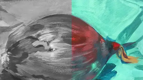
Demo: Establish the Shadow Tone
The next thing I'm gonna do is I'm gonna establish my pepper color. And once again, I'm just gonna coat this whole thing with this red. It's not opaque, it's transparent. You can see the green through this red. I'm laying it down in pretty broad strokes, I'm trying to follow the form. I'm using a little more water than I used with the textural velvet. I'll go right over that. I can always pull that light out again. I can add a lot of water to it to make the color move a little more fluidly, and that will make a smoother mark. But it'll also make a slightly darker mark, so I would probably have to lay this red over this pepper a couple of times to get the darker value of that shadow. But I just wanna get these down here so we can then see something with opacity and vibrancy. Okay. And the background, once again, I might tweak it a little bit, I'll leave it warm, I think, to relate to this, but I don't want it to compete too much with the pepper. So I'll keep an eye on that. Okay. And th...
is is called speed painting. I'm painting really fast. (gasps) But that's okay. I think sometimes there's also a tendency, so I'm gonna make longer strokes, longer smooth strokes, make sure this is not getting too much of a textural shape for the pepper. Sometimes this is like when my students do this in class, they have an assignment where they have to do an in-class model, and they're working on a lime green ground, this exact color, and they freak out at the color, they're like, "It's so vibrant! "It's scary! "Why are you making us work this way?", and then when the colors start to react after they've done the neutral, you know, the first sort of layer of color, they start to understand why it's really critically important to work with a vibrant undertone to really understand something about a color. So this is, again, this is the shadow of this red pepper, this is not the vibrant lit part or any of the upper areas, this is probably mostly kind of the underside, what I'm seeing the underside of the pepper, would be closer to this neutral color. And you can see, once again, red and green, neutralized. Okay? Now I'm leaving that little green nub 'cause it's just the right color. It's perfect. Okay now. I'm gonna add a little more red, in the shadow area here, just to make sure it's dark enough and dense enough, and I could do it again once it dries. Okay. Now, I'll wait 'til it dries and I'll scrub out the highlights again, I'll find them again. So the last thing I'm gonna do, I'm gonna use a really big brush to give this information back there, and what I think I'll do, I'm gonna make that brown, I know there's a fair amount of yellow in it, and there's also a little bit of the cad red, not too much though, we don't want to fight with that pepper, we want some of that green to come through, so I'm just gonna lay down this kind of orangy tone. Keep it thin, keep it transparent, keep it related to what I'm seeing but also, for the picture itself, I want there to bear a relationship between all the other colors, so I'm keeping this, there's absolutely no opacity, it's super light, super thin, it is not competing saturation-wise with the pepper. Even though the pepper's really neutral, it's still more saturated than this color in the background. This color in the background's fairly neutral. Okay, so let me get this done quickly. A little more red. But you can see, we've gotten a ton of color out of very few colors, and that's, I really want people to see that, like look at all the color that I have found with basically a yellow, two reds, and a blue. And that's, I think, kind of exciting when that happens. Let's get this down. And you can see too, the size of my brush really has a relationship to how much landscape, how much coverage I need to make. Now, what I would do if we had, you know, if I was sitting in my studio, I'd probably wet this whole area with just water, and then I would hit the color in it, 'cause the water would help move it around. You get a little more streak when you haven't wet the paper first. Even if there's color on there, you can still wet it, it doesn't matter. It shouldn't move unless you have a very heavy touch and you're ruttening the color right off the surface. That should only happen when you're trying to scrub it. Okay, so here is my background. Now, this piece right now looks super neutral. It's related. It's harmonizing. Things relate to each other, but there's a neutrality factor, because we haven't put any of the opaque color that's gonna pop right off the surface.
Class Materials
Bonus Materials with Purchase
Ratings and Reviews
Anna Kotzè
I really liked the informal demonstrations and I also liked the way she set out her pallet with warm and cold colors. This was not only an informative class but inspiring. The casual and relaxed working style, encourage playfulness. Thank you for an awesome class.
Laura
I’ve had foundations in many of the color instruction that was presented here so the information was a very good revisit. I also think it was explained better in this presentation than in the other training I’ve had. I enjoyed listening to the lecture, thankfully they weren’t drawn out until you want to stop listening. The demonstration was best after we moved off the charcoal drawing (although that was interesting to watch) because using the paints really brought home to me the application some of the lessons learned. I wish that part would have been more robust so that all of the elements in the lecture could have been directly called out in the demonstration. The instructor was most effective when not trying to multitask too much. Overall, I recommend this course.
Eve
Excellent instruction! Most helpful to me in terms of establishing the focal point of an image through use of value, color harmony. Also helpful to understand transparency and opacity and how that relates to highlights and shadows. MJ is fun and likable.
Student Work
Related Classes
Illustration