Illusion of Transparency
Lesson 9 from: Color for Designers: Exploration, Theory, & ApplicationRichard Mehl
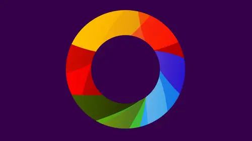
Illusion of Transparency
Lesson 9 from: Color for Designers: Exploration, Theory, & ApplicationRichard Mehl
Lesson Info
9. Illusion of Transparency
Lessons
Day 1
1Why Study Color?
20:52 2Natural Awareness of Color & Playing
21:25 3Colors and Their Relationships
38:42 4Color Contrast of the Color Wheel
19:59 5Hands On Color Grids
44:31 6Color Illusion in Practice
13:10 7Interaction of Color Practice - Part 1
08:47Interaction of Color Practice - Part 2
18:27 9Illusion of Transparency
16:39 10Hands On Free Study Experiment
26:43 11Color in Action: Designer Pablo Delcan
26:37Day 2
12Color in Design: Tangrams
18:01 13Hands On: Tangrams
18:11 14Hands On: Leaf Composition
22:53 15Expression of Color & Opposites - Part 1
23:55 16Expression of Color & Opposites - Part 2
28:23 17Learning from the Masters
25:01 18Hands On: Cut Paper Illusion
27:04 19Everyday Found Color 2
32:02 20Colors in Nature with Rachel Gregg
42:39Lesson Info
Illusion of Transparency
So we're continuing. Along with Albers, exercises were moving away from a very difficult first exercise of trying to make one Colors like to try to make two colors look like one. And just for everyone who's at home don't get just to discourage because it takes a long time to assimilate that information. It takes a long time, a lot of practice to get it right. Just carry on with it. I think this next thing we're gonna do is a little bit more fun, Uh, immediate for me. Immediate fund. And it's the illusion of transparency. And, um, this is my book, by the way, a little plug for this playing with color. Um, so we see what's going on here and again. This is direct from Albers. He kind of invented this idea and what we're looking at, or two parent colors and an in between color. And it's all about illusion. There's no transparent colors here at all. It's not about this being a transparent ink on this being a transparent, even them. Somehow mixing is truly is seeing colors with your eyes clo...
sed, trying to find that middle color. Now you've already done that. You've tried to find the middle color, but here we're working with something else. It's more of a dimensional experience. So when we see these two colors together against a background, we're trying to create this illusion of transparency by finding a middle color that gives us that illusion. All right, from there, we're gonna move on. Yeah, to something a little bit different, Um, something where there's spacial illusion where we used the transparency effect to create the of the appearance of things emerging and receding. So, for example, when I look at this, I don't really get a sense of one color being in front of another. But they're intersecting somehow. They're just against this black background, kind of equally important. This is that and this being somewhat in the middle. Now I look at that and do you others agree that it kind of looks a Ziff? ITT's ambiguous as to what's in front and what's in back. Yeah, so one way you can when you're working with the illusion of transparency, you're trying to find this middle color. If you want to create that effect where the middle color doesn't create this a spatial delusion that is this being in front of this being a back or this being in front of this being a back then you look for equal contrast in these edges. That's really the key. Let's try to find equal contrast between these two colors and between these two colors. When we get to this effect is a little bit different here. We're actually going for colors that seem to emerge and colors that recede. So when you look at this, what part of the cube do you think is emerging blue, red and blue, Everyone agree, or the other way so you can actually shift your eyes, right? So is actually you could bounce back and forth, depending how you look at it, right? But the key is these two colors over here again. These are mixture colors. Right now, we all know that if you mix ready yellow, the other get orange. And if he makes these blue, green and blue together, you get something in between another very inter bluegreen. And to get to that point, we start with this and we're gonna be doing this will experiment with these ideas of just pushing colors in a way that creates a spacial illusion. It's kind of interesting that way. And then eventually you might actually get to this level of complexity where you've got several colors overlapping. I don't know if we'll get there today, because this is pretty complex. Actually call this transparency and visual narrative, because when you get with this many colors, when you have this many colors going, you actually create a little drama between the colors and you have to control every single color. So there's many, many, many variations and maybe variables in something like this. So today we'll probably be sticking to these things. So we're gonna be working on something like this, and this is really, um it's pretty much right out of Albers book. More or less, it's my own color scheme, but again, picking up on the same colors I've been using along to demonstrate these illusions. But I think we all agree that the top band is on top and that on the bottom it's a little bit more ambiguous. Although it looks like that pink band is going behind and then in the middle, we're not quite sure where it is. Maybe in front, maybe in back so That's what we're really talking about with spacial illusion. Yeah, and we can flip it now. The green on top. Banfi feels like it's front. The pig looks like from the back. And then as we move down to the bottom, the pink definitely emerges forward. The green goes to the background, and that's all accomplished by changing these colors. Right? That's what we'll be doing. And again, this is something you can do on the IPad with the elders up. It's poor with colored paper. We're just gonna be working with colored paper right now, though. Okay, so let's get this started. Um, I think initially we're going to try this experiment. So maybe Christine, why don't you sit there and you could just choose to Colors will call parent colors to contrast in colors. If you want, you can choose. Colors are very similar, but maybe something a little bit different. You guys can certainly try, man any time because this is gonna be a bit of a collaborative project up here. And you can work on a white ground or a background. I'd say work on a white ground. First, it's going to give you a little bit more effective transparency. So I'll try toe copy the colors that you have on the bus. Okay? Do they? Sure. Something similar. Okay, lighter green. But something that's really quite blue. Something blue. Let's go with something different. Let's go with Redd's about a red and a green, perhaps the screen right here. Okay. Okay. So when you guys see these colors, what do you think the middle color should be? What do you think? The mixture of those who way sort of have compliments there, Right, Complementary colors. So let's look for something that would resemble the middle color. So it's going to be some kind of a chromatic gray, something that's a mixture of those two colors. And if we just put these things at an angle like this and perhaps cut a corner and again, we're just gonna quickly do this, So that's the effect we want. But that's not the red color. So let's try to find another color. But basically we're just doing this. Another one. Let's give this a try. It literally is trial and error. I'm so scared of cutting. It's a lot of this has to do with the arrangement colors need to look at the two background colors. Need to look like they're intersecting. So now this middle color needs to be somewhere in between these two. So typically what's happening is that it's darker than one and lighter than the other. Yeah, Somewhere in between, this is still not quite doing it. This is actually pretty good. And we could start changing this background color tudo. Maybe try to suit that. Yeah, very close down. But it might get us in the right direction, so it's like this just made it. Do you think of that? You think this is believable? Yeah. Can you see that, everyone squint? Yeah, sort of believable because that's what we're doing Trying to create the illusion of transparency by finding that middle color again. This is all about developing your awareness of color, trial and error. So for this one for the that's great, really nice for the shade. Are you Actually, Are you actually trying to find the lighter darkness is in between the two colors? Or are you trying to find something that's actually darker than both? Like their transparent and stacked on top of each other? Kind of like that Yeah, um, you're trying to find the middle color as if they're stacked on top of each other, right? The illusion of transparency. We should also try that on a white time. It's gonna walk over here and get one of these whiteboards. Let's try putting that on white. That's pretty good. Yeah, it's beautiful. It's really well done. And that was to very good. Okay, so let's use these two. That's good. And we know that the mixture is going to be somewhere in this range. So just go ahead and hack away, literally do this place, that little thing over one of these trips, maybe like that in a corner. And then you're just trying to find that middle. Yeah, actually, we're not. Not that it's getting closer now. This is obviously clearly a great exercise to do with paper. Yes, because because you imagine you could do this online with some tool. But then it would be rather your your I wouldn't be doing the work the software will be doing the work from. Not exactly when I've thought about that. Yeah, When I've done this in Illustrator, for example, I still have to make variations of that center color and use three pieces, right? You're still doing the same exact thing you'd be doing with a cut paper adjusting that middle color until it looks transparent. But there you, Justin with sliders, as opposed to going through paper like this and cutting pieces out in trial and error. You just basically doing slider so it eliminates the cutting part of it. But you still have to make a decision on this thing. Is helping your training your eye on understanding how the colors work together? This is probably to maybe something like that, maybe something that has a little bit more of, Ah, orange to it could be like that again if we just cut a sliver off with this, that it's not bad. That's a really good Richard, one of the basic approaches you would take to choosing your color scheme here. I think I want you coming from four people online. Start with complementary colors, UM, two variants of compliments. Orange and blue, red and green, purple and yellow. I think that's a good place to start. Can also work with a monochromatic palette like this, and that's a little bit going back to you the very first Albers exercise we did when you tried to find that center color. This is nice. Actually. This is good. Right? So here we know that yellow and blue combined together make screen. But what? Green? We're actually finding something very nice here. That's beautiful. So, what would you say in this one? Do you think one color is on top and ones below feel the green is on? You think the greens on top? Yeah. Oh, yeah. In the shadow throws us off a little bit, but we definitely see it happening otherwise, But actually, that's a really good example. Lookout Transparent. Oh, no, it's perfect. It looks as if you're working with film. Yeah, but you're not. So you're working with your own sensory experience of seeing color trying to find that middle color. How can you cheat and use tissue paper where you really can see through that? That's actually not a good idea. We've done that too. And you You could do that if you want to get the effects of. But that's not helping you trying you again. It's not really cheating. It's just a different thing. Okay? Yeah, but you can see results that way. For sure, Sam is asking Richard, How would the color subtraction appear with a graduated tint, like a single Hugh background with the foreground? Solid color appear graduated. We have to try it. I think that with a great Asian color, ah, color that changes. The effect is going to change as it moves across the gradation. It's it adds complexity. When you're using a variety of, uh, changes within the background colors, it's it's significantly more complex and more difficult. But I think it's another experiment that's worthwhile trying. Thank you. So as you can see what's happening here, there's a clear distinction as to what's in front and what's in back. And that's the next thing. I'd like you to do Mr to two sets using the same color but changing the middle color so that the spatial relationship changes. Yeah, so in one case, the red looks like it's in front. In the other case, the blue looks like it's in front, and all you're doing is changing the middle color to achieve that effect. But just as a model for the composition, essentially, you could look at the bottom part of this and just try to do this effect. Transparency effects have been used for a long time. Uh, painters have always used transparent glazes to achieve certain color effects. Certain colors and in classical painting were achieved by putting a transparent glaze over something else. Actually, one of our students was talking about You're talking about address, right? That you modified with color. Um, uh, I was using a white silk shirt moose, which is a very like lightweight fabric. Um, so it has a transparency to it. Naturally, on the woman I was making the dress for the white was too harsh for her skin tone. So I put a hot pink fabric underneath it, which made the white just enough warmer that she could wear the dress. So it's a great application of transparency in that particular context. Getting back to your question, um, you want to sit in for sure? Um, Oakley, another bajos teacher, did some really interesting things with transparency. So when you're doing this spacial illusion exercise, you really have to think about creating that effect of one color, being dramatically in front of one color mean dramatically and back. Yeah, it's pretty good. That's a different Sure about this one like this? Definitely. To me. It looks like the yellows on top. So I'm trying to get the purple look like it's on top on the same. But, you know, one of the problems with this is that the black background is really influencing how we read those colors. So you might want to change to a white ground. Take one of these sports, so, you know, you could try that on black. Go ahead. And it's too. That's looking good. You're getting something going here? Yeah. Once you get a little, you know, bored with this particular thing, think about more of a free study experience.
Class Materials
bonus material with purchase
Ratings and Reviews
Nabha
The course was great. Richard was a very good teacher, appreciating the students’ work and helping them expand and improve on it. I learned from that alone. I feel more confident in choosing colors, and hope to bring a greater sense of fun to my design work. Thanks again.
PETE
How wonderful to have such an experienced, thoughtful teacher, who takes educating others so seriously. The depth and breadth of his teaching skill is matched by his knowledge of the subject. I studied art in school, own some of the color books he recommends, and learned far more than I thought possible. And he does it all in such a kind, affirming, supportive way. What a calm guide. How lucky are we to have access to a class with him!
Joe Loffredo
I was concerned that I wouldn't like watching everyone work, but I found that it was the best part! It allowed you to see Richard's lessons being put into action by the various students, each of which is talented in their own right. And Richard is great. Knowledgeable, intelligent, and supportive, he's got the attributes a great teacher should have. I'm a painter, not a designer, but the class really helped me a lot. When I go back to the canvas, it will be with a much deeper understanding of color, and how colors interact with each other.