Expression of Color & Opposites - Part 2
Lesson 16 from: Color for Designers: Exploration, Theory, & ApplicationRichard Mehl
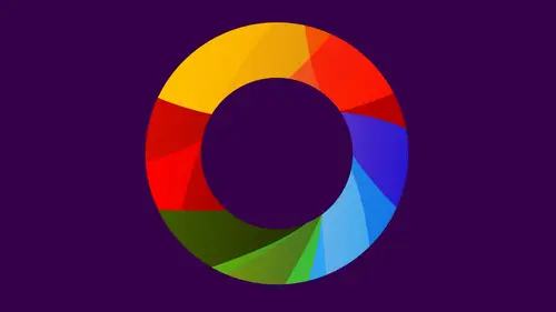
Expression of Color & Opposites - Part 2
Lesson 16 from: Color for Designers: Exploration, Theory, & ApplicationRichard Mehl
Lesson Info
16. Expression of Color & Opposites - Part 2
Lessons
Day 1
1Why Study Color?
20:52 2Natural Awareness of Color & Playing
21:25 3Colors and Their Relationships
38:42 4Color Contrast of the Color Wheel
19:59 5Hands On Color Grids
44:31 6Color Illusion in Practice
13:10 7Interaction of Color Practice - Part 1
08:47Interaction of Color Practice - Part 2
18:27 9Illusion of Transparency
16:39 10Hands On Free Study Experiment
26:43 11Color in Action: Designer Pablo Delcan
26:37Day 2
12Color in Design: Tangrams
18:01 13Hands On: Tangrams
18:11 14Hands On: Leaf Composition
22:53 15Expression of Color & Opposites - Part 1
23:55 16Expression of Color & Opposites - Part 2
28:23 17Learning from the Masters
25:01 18Hands On: Cut Paper Illusion
27:04 19Everyday Found Color 2
32:02 20Colors in Nature with Rachel Gregg
42:39Lesson Info
Expression of Color & Opposites - Part 2
It's interesting you chose a black background, though for love. Let's talk about that. I thought I thought it would. I don't know, work better with the colors. I was thinking Are you making the heart with those shapes? I haven't decided. Okay, I was. When I was thinking about it last night, I was thinking maybe like half a heart. So it's like an open shave, but I don't know, whatever in late. And I know you're still playing with us, but look at this. Really interesting little centrepoint right there That becomes a focal point in your composition. Yeah, and so you have a very strong sense of visual hierarchy. Your eyes driven to that point. All these lines are converging. Yeah, And look what else is happening. You're making triangles. Yeah, and so you're creating another principle of design, unity of form. So oftentimes, when you look at paintings and designs, there's a repetition of a particular form. If you see even in painting, maybe it's a brushstroke that's repeated over and over a...
gain. If you look at Van Gogh's paintings, for example, the same breastroke over and over and over again, even though the colors change he's showing us a sky. He showed us a field showing us trees, the same brush growth over and over and over again. So for him, unity of form comes out of that little brush stroke, even though the colors are changing. So I find the unity of form. Repetitions of triangles or squares of circles add so much value in so much harmony to a composition. And that's what you got going there. Yeah, combinations of triangles. You lied to other triangles. It's It's one of the characteristics of that form. And then on the other side it looks like you have this kind of chaotic and dis harmonious discord. Not quite sure where to look first, although that or in shape is really important up in the corner now, they're very beautiful colors together. But you made managed to make an arrangement where they tend they are very expressive of this idea of discord. So your ideas, maybe even, you know, the the original idea of love and hate might even shift a little bit as you work with us. Yeah, well, I was thinking very much of like a particular interpretation. Also, do you remember back to what Pablo was talking about with the book covers and how you enter into an assignment. Yeah, you know, and things begin to change. And that's how art is. Art art is this process where it's very informative. You go into it with a particular idea in mind, and you kind of have to stay open minded instead of saying I have to follow my vision perfectly. Well, maybe you do that, but it leads you in different directions. You're open to accidents. Yeah. Yeah. Um, you're open to improvisation. This almost like a square spring. Yeah, I used this in the last activity. Um, I come into play some point free to you build up you want. You know, we think about two dimensional design is being flat, but then we have, like, relief sculpture of If you think about a sculpture is being minimally dimensional. Could still be a flat representation, but have a little bit of dimension to it. So if you want to build up the surface slightly, you can do that as well. So, like a little bit of a spring into the paper or crumple feel free. So I started with the idea of hot and cold, and I was already thinking, I'm going to do the symbols But then, you know, it changes. Like when I got into the illustrator file, the Tang Grams from the earlier exercise were still there. And like I think I want to play with just these shapes and having maybe using triangles for the hot and maybe circles and stuff for the cold and just playing with the different colors and the layers. I'm just right now. I'm having fun with it. Um, it's It's a super refreshing because as a designer, I'm always like like a Serena said earlier. I'm always like Okay, but what's the message I have to? It has to be something and I'm like, can be anything and I can just play and it's Yeah, having fun with it right now, I really like how the white is becoming such an active part of the design. Yeah, right in the middle, you have ah, white rectangle. Yeah, it's really attracting me that that one right white rectangle, even though you have other white elements but my eyes going right at that point that I didn't even notice that white triangles trying to make the white. I mean, sorry rectangle. I was trying to make white triangles around, but that's figure ground, and it's very easy to forget about the ground. But once you tune into it and becomes an active part of the composition yeah, you have, You're something you're trying to express. Yeah, And I like the torn paper shapes in contrast to the very geometric kinds of Yes, that's the quince, the art versus the structure. Why did you choose Blue? Um, it's my favorite color. And it's, uh, left brain for Yeah, Yeah, it's an intellectual color. Do use it a lot in your work. Um, I dio yeah, because I just I just tend to gravitate toward it. And I think especially with business clients, they like blue. Very trusty reassuring color. So yeah, it is. It's a color that a lot of people respond to in a very positive way. How is the leaf the least? Playing into this. Um, So I was playing the whole idea of, you know, left versus right. Structure versus chaotic. Every one of these is actually precisely cut its, but it's in a disordered pattern. And so this leaf is kind of the centralising. I found something that was half red and half grey. So it's and it's a central organic figure. It's the integration of the left and right, Very interesting. So the leaf itself is kind of this expression you go line from. Na'Abba is joining us. Thank you so much for your question. If you're working on a design, do you tend to come up with shape first or the color scheme first? And how would that choice change your work? Well, it's a good question. Um, I would probably have to say, In most cases, I'm working with a shape. First. I'm thinking of a shape first, Uh, but that's that's a graphic designers point of view. You know, a lot of my shapes are letters, and now if you think about logos or driven by letter forms, so I'm locked into the recognition of a letter Ah, letter our letter C or letter D that it has a very specific kinds of shape, but very quickly you have to go to color, especially now and again. When I was coming up, color played an important rule, but it wasn't a decisive role. So many things had to work in black and white first cause that's how things were printed in one color, black and white. And now we were. We live in an RGB world and you know, my now cliche is that there's no black and RGB. Well, there really is. We make it black With RGB. It's the absence of color. It's the absence of light. RGB is based on light, so you take all the movie everything. rgb. That's black. And but how often do you see black now on a computer screen? Other than the typography that might be text, you know, below something. Most of the time you're seeing colors. So now when my students air designing logos or when I'm working on ah se ah ah brand for ah trade show or something like that. Um, I'm thinking about both things simultaneously. I'm really thinking about color at the same time that I'm thinking about form, and I don't find much separation in those things anymore. Now it's to the extent that I used to literally, I used to be able to say I could develop a design in black and white first and then apply color. And now I really feel like I have to do with things simultaneously just because of the fact that we're delivering these messages and electronic environment where color is not It's not a luxury anymore. It's there all the time. RGB is all the time for us, right? Yes. This is my This is my attempt at private and public. See if I have succeeded Richard, you and guess which is which. So So, um, little snowmen. It could be. Yeah, they are. I did just want toe make some kind of symbol of some kind of human figures like that, um trying to apply a couple of things we talked about. So over here I was shooting for as much contrast as I could possibly gets. A contrast of shapes of organic versus, um kind of more more symmetrical or lined up contrast of Hugh intent and color. And to just express the idea of the public. There's lots of different voices in lots of different things going on, and then over here, only having one. So it's just one hue, and then there's different. The contrast is on the light to dark basically, and I also tried Teoh from our first exercise, where we had the same color that look different in different players. This guy is the same yet on each ones. But here you can't really you can't really pick him up and he kind of just fades into the background is what I was trying to go for. Where is over here? He's He's popping out more. She's a little bit more significant, kind of in his in his home and his family. He's a little contrast. There were using Albers one color looks like to. And what a great way to express this idea of public and private, you know, one person having two different personalities or two different ways of expressing themselves privately and publicly. Well, I liked it. I liked the analogy to the idea that you had talked about yesterday how the environment can actually affect how you view the object in the center of the subtraction. And so because I thought that we're kind of like that in real life, like saying something to your friends or family at home in a closed setting might be interpreted very differently than if you said the same thing in public it might not be appropriate or it might be funny or people might not might think there's something wrong with you. And so you have the environment kind of effects. Exactly how the actual object is interpreted, which is the same color comes up to him and you've got So you have these really very abstract shapes that are symbolic of humans. And there's a large shape in a small shape. I'm just looking at the black, white and gray composition. There is that, um, a parent and a child. Uh, it was going for you and then on Lee on the other side, we show the larger form. So the child is a child president. No, he's not so just the parents of the child. Interesting. And these other shapes that you have were you thinking about those also in the same symbolic way? So I didn't want Teoh. I didn't. I guess I wanted to express how it could be totally different from the from the person in the middle. And so they could be. I guess I was thinking that could be kind of other people or the public. But maybe they're just so different that you don't even notice kind of similarity or different personalities or anything like that. Do you think you're ready to glue? Uh, sure. OK, we take a look at what Christine has on the computer. Yeah, right. Well, this is what I came up with. Hot and cold fire and water. I had fun with the It was so much easier for me on the computer to play with, multiply and have the overlapping colors to come up with new colors. So I had fun playing with that, and I like limiting myself to just using. I'm circles for one and like sharper shapes for, like, triangles for the hot one. Yeah, On one side, you have overlapping forms that are transparent. Yeah, and we still have to think about. This is an illusion of transparency because they're not really transparent, even other computer. We call it opacity. But what's happening is that that's that intersection shape. It's just a different color, and it's it's telling our eyes, which is telling our brains that that's overlapping and we're seeing through it versus on the other side. All the shapes are opaque. Yeah, you don't really see through. Not much. Oh, yeah, I didn't. I did for some, but a few. Yeah, it's kind of hard to see it. Like those three colors. Right here. Right here. Yeah, a little bit. Yeah, but really pronounced on this side. Yeah. Huh. And funded that. You just you don't have to do any gluing. Yeah, it's done. Virtues print, uh, pushes over. Do you wanna walk us through a little bit and talk? Just repeat what she said before about this. So here we have springs. So again, working with one hue and different shades, Um, so here this spring and I was thinking of this is sort of new growth and plants, which to me are symbol of spring is right, greens. And, um so starting with sort of the darker leaves at the bottom and then coming up to these really bright break greens that represent new leaves, a new growth on a plant, Um, and then on the right with full, um, it's sort of the opposite there. Actually, I was thinking, this is starting at the top where these air believes that air greener to begin with, and then they eventually sort of die off and change color and become darker and and they're almost black when they when they're on the ground there. And that's sort of the end of their life cycle. I really like how the the stripes you can think of them as stripes, even though they're very irregular but at the bottom and what we'll call the bottom is closer to that edge of the table. Syria. There's almost like a sense of continuity across right through here. It does break down right up here, right in this area over here. So that idea, the striped kind of goes away. Um, at that point, and what I would do at that point is maybe a few of a few fewer of these very light. So you have more of a definition of that top edge to match the definite of this top edge. But again, I love this idea of integrating a little white lines into it. Active. It has this energy feels like it's pulse E and a great looks like overlapping leaves true on a tree. And just, you know, all variants of one hue really beautiful. You get unity from that harmony and yet contrast. So tell us a little bit about the concepts again. We kind of know what this is, love. And this is hate. Um, for this one, I was thinking, you know, the triangles, Airil drawing into the center. Yes, but it also expands beyond the base because, I don't know, I guess for me love is like it's all about connection rate in the middle, like with all the colors. But then also, it influences everything around it. Great. So is simultaneously moving inward and outward. Yeah, that's the great, I think one of the great characteristics of the triangle, it does point to a center. But then you've got this spreading idea, which is very much like a perspective when we think about perspective, like, yeah, the cliche of ah Raila trucks. They start out wide and they get narrow as we look down. And that's like a triangle. Yeah, very dimensional. So, to contrast that I intentionally moved everything in from the edges on this because I feel like hate is very internal and contained. Dauphin, I really like this composition. I think this is really nice. Uh, yeah. I like the way the forms move and how my eye moves. Shoot. You've used those three dark triangles to really anchor the composition for me, they're very important. There are elements in there that I'm not that attracted to. But those three dark triangles are very important. I also really like the linear elements, and I don't know if we can see this, but like, here, this one little literally element is so important in that competition. And then you have this one up here. So this is a different kind of unity of form. Your pea eating several different kinds of shapes. Yeah, but keeping, but it's a lot of there's more different shapes. Yeah, and, well, if you look, I don't know if you can tell on the screen, but like some of these oranges, thes two are different texture than this one. Yeah, like the paper has a different text. Yeah, that is hard to tell, but you can definitely tell looking in person. Yeah, so, yeah, it has a little bit of ah, like a tooth or a texture to it. And very active white spaces as well. Like you look at this white space in here, how important that is in the competition. Figure groaned, you know, bringing the ground into the composition. Very nice. And you have orange and blue. You have the compliments there, This brown color up there is really a combination of orange and blue. For those people who have actually mixed those colors, you can find a way of mixing. The green is very similar to the blue kind of is in the middle in a way, if you think that the oranges like yellow and you have a yellow piece right here. So the green is the intersection of blue and in blue and yellow, the colors actually, even though it's an expression of hate, their fairy harmonious, the shapes air really provocative. Was this supposed to be a hand? I don't know. Maybe it's like for thinking of, like, exploring different ways of making jagged edges. Uh, I kind of like that idea of it being a hand and reaching in from the top a little bit and almost like your hand, and they're making the composition. Great abstraction. Yeah. Um, so this is the human side on the white side as a kind of like a representation of purity, and so usually because their their natural. Um, Then I put the tackle on the dark side, and this is supposed to represent like a screen, because a lot of like, whether it's a computer, a television or a cell phone, this the screen is. I made it three dimensional, too, because a lot of things or dislike like to show, like the connection that we have to are like we're John to it, how it's kinda with this everywhere kind of pops out, and then I like these green just remind me of kind of like the Matrix that, um, that lettering and then here these, this here shows like the conflict. But this shows our connection to technology, and I use thes thes colors because they represent, like the cores in the back of a device like the yellow. Why in the red corner to show that connection that we have to acknowledge. But then, yes, the conflict there. Oh, and and I took the head off the body. Oh, because, um, technology can make us lose our minds. It represents disconnection from human. Many added the shadow to it, because when you look on screen, it's like it looks like a different call. It looks like different paper or color like a different color. And this is actually a great way to look at, you know, even somewhat dimensional work. Does it take a photograph of it? Yeah, flattens it out. And so now we're reading that shadow. And you know what we're really talking about is this? Yeah. So you can't really see this at home, but this is lifted off the black surface. The weight is lift off the black service by about an inch. It's given us this really shadow. We call that a drop shadow and typography and look at how it plays with these three green stripes over here. So you go from very vivid green into a dull green. Yeah, it's gonna like what we talked about with viewing colors at night, in the dark versus colors during the day and how much they change. There's also a really interesting design thing happening here, and you started off with that leaf over there that has this really kind of active edge. And you have an angle, right? You carry that angle down, come down here to the triangle triangle is angle to, and it informs us to move back up in this direction and then back down. So this competition is really driven by this zigzag which tends to unify it. This element up here, it's so important. It's the only, like circular form and the composition. Really? Because this leaf over here is still made up out of triangles, even though they're circular kinds of triangles with very trying to like and that leaf up there. And this is the one that really represents humanity to me and of this this watchful figure that's up there and again flattened out. It almost looks black. It's kind of area of a black ground. Here you have a black form that in itself is a representation of figure and ground reversal. And then those triangles right in the middle that tie it all together. It's beautiful, very smart. And then finally look at how powerful this white shape is. Was the n the idea of an end part of it? The letter N no. You see that now? Yeah, yeah. Could it be part of it? It could be. I love that idea of seeing letters in things and seeing shapes sometimes in places where we don't normally see things. So we're Serena. What was your inspiration. So this was the right brain left brain, and I used one unifying color, um, blue to just civilize the brain in general. And, um, every one of the boxes are percent have precise dimensions. Um, and every one of the cut out people on a little doesn't. There's a line in the middle. And then there's a line that's cut out. And then that unifying sort of leaf shape, which is kind of the right brain, well, kind of emotion. And in nature, I mean, somehow it seems to have to me equal parts red and green, and there's no like distinct line of work emerges. Were you thinking of some kind of a progression with those colors? Um, I think I was going from cool toe warm. It's hard with blue because it's hard to find warmish blues, but yeah, when we think of a warm blue, it's it's moving toward the purple. So, like the blue violet, for me is more of an expression of a warm blue. And that really has to do with his position on the color wheel. More than anything else, you also have vivid colors and dull colors. All right, So, like this blue here, right in the middle. That blue grey is very dull compared to this color over here, which is very vivid. Same thing down below. Very dull, vivid. The idea of a progression, though I think is a very important part of design is about transition and expression of time. And I also like your abstraction of the human shape. It's basically just this little plus sign. Yeah, ahead to arms, a body kind of like, you know, the top of body Essentially very nicely done. Beautiful. And the leaf actually contributes a lot to it. Now, it's one element that feels very, very different. If you were to take it out, I don't think the composition would have as much energy as much power. Wow. Just working with what I had here. Um, so I got beware of cliches coming up. So this is the the shame and what I've got. So this is supposed to the honor which is gonna have most the elements in this side and kind of one of the core is the nature, Um, and the colors here, I mean, this is definitely work on this and take so much of it out. Um, but I just thought that, you know, the basic elements of the cult with basic colors two uses is scattering out from the center and keeping it, Um, let's see, is keeping all the elements air, Earth, um, fire e um, I think it's but the black lines underneath the leaves for honor. Well, what that represents You know what the I just sleep black better than white for a contrast. So it's kind of broken part of the the lines here. They're shattered in this this side And I also thought about the load is growing out of the, you know, the mud with this. So that's why you apart unifies the two. I like those gray stripes. They're a bridge between the black background in the leaves. And you mentioned about doing a little editing. So what? What would you take out of that composition? Uh, well, this one, I would probably re dio um I mean, it might just have, like, this one leaf, which represents to me, it's like color to the heart. That might just have that. That cluster Liza did kind of get the sense of, like, the flame or the fire. Yeah, yeah, I would. If I were doing this, I would start to eliminate some of those little small specks of color, especially the blues and the greens. Yeah, um, in order to unify the competition on both sides on the other side, you have red, white and black, which is very, very clear and kind of structured is a compositional, um, idea. And the colors are very clear. So the blue and the green kind of enter into it and maybe fewer. Those elements? Yeah. Tell us a little bit about that side, though. The black, white, red. I think that's really beautiful. It's really my favorite part of this piece. I take these start, have some of these elements take them away. Um, again, Just basic, because it is a shame. It's the black and white thinking. It's the bars. It's the, you know, the my God, I sound like a teenage girl, but the blood, you know, that comes good. This part of part of getting through that being in it, um that's necessary. So one of the things I see happening in these two compositions is contrast of direction, right, So horizontal, vertical and one. And then really, lots of diagonals spreading out from the center and the other? Yeah. Repetition of form Still Yeah. Little shapes repeating themselves. Yep. Nice.
Class Materials
bonus material with purchase
Ratings and Reviews
Nabha
The course was great. Richard was a very good teacher, appreciating the students’ work and helping them expand and improve on it. I learned from that alone. I feel more confident in choosing colors, and hope to bring a greater sense of fun to my design work. Thanks again.
PETE
How wonderful to have such an experienced, thoughtful teacher, who takes educating others so seriously. The depth and breadth of his teaching skill is matched by his knowledge of the subject. I studied art in school, own some of the color books he recommends, and learned far more than I thought possible. And he does it all in such a kind, affirming, supportive way. What a calm guide. How lucky are we to have access to a class with him!
Joe Loffredo
I was concerned that I wouldn't like watching everyone work, but I found that it was the best part! It allowed you to see Richard's lessons being put into action by the various students, each of which is talented in their own right. And Richard is great. Knowledgeable, intelligent, and supportive, he's got the attributes a great teacher should have. I'm a painter, not a designer, but the class really helped me a lot. When I go back to the canvas, it will be with a much deeper understanding of color, and how colors interact with each other.