Everyday Found Color 2
Lesson 19 from: Color for Designers: Exploration, Theory, & ApplicationRichard Mehl
Everyday Found Color 2
Lesson 19 from: Color for Designers: Exploration, Theory, & ApplicationRichard Mehl
Lesson Info
19. Everyday Found Color 2
Lessons
Day 1
1Why Study Color?
20:52 2Natural Awareness of Color & Playing
21:25 3Colors and Their Relationships
38:42 4Color Contrast of the Color Wheel
19:59 5Hands On Color Grids
44:31 6Color Illusion in Practice
13:10 7Interaction of Color Practice - Part 1
08:47Interaction of Color Practice - Part 2
18:27 9Illusion of Transparency
16:39 10Hands On Free Study Experiment
26:43 11Color in Action: Designer Pablo Delcan
26:37Day 2
12Color in Design: Tangrams
18:01 13Hands On: Tangrams
18:11 14Hands On: Leaf Composition
22:53 15Expression of Color & Opposites - Part 1
23:55 16Expression of Color & Opposites - Part 2
28:23 17Learning from the Masters
25:01 18Hands On: Cut Paper Illusion
27:04 19Everyday Found Color 2
32:02 20Colors in Nature with Rachel Gregg
42:39Lesson Info
Everyday Found Color 2
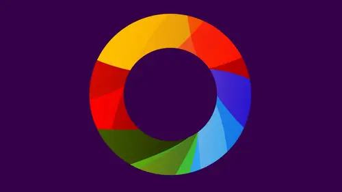
phone color, and this is stuff that's been collected from the studio and we're going to be utilized in this later. Let's go back to the presentation. So that's all phone color. And, um, this is inspired by a really great project that one of my students did many years ago. Actually, no, not many, but enough years to call it many complimentary cupcakes. And, um, basically, it's kind of fun. Uh, I gave the assignment to explore complementary colors to my freshman foundation students, and the majority of them came in with projects like many of you have done with complementary colors, color grids, different kinds of color combinations, red and green, blue and orange, yellow and purple, etcetera, and exploring these color options. And one of the students, uh, came in with this. It was really kind of a beautiful exploration of this idea of complementary color. We call the compliment cupcakes. It's kind of fun. The cupcakes themselves on the inside ranged from contrast ing light and dark, so u...
sing food coloring to colorize the actual food product, it was really beautiful. And so this is very much like contrast of light and dark, monochromatic grid. It's kind of excellent This inspired me to with some friends of mine. Ah, collective of people called the feed me collective in New York who get together and produce dinner parties based on themes. So I proposed the idea of a color theory dinner party, and what I did was give assignments to all of the people who were coming to this party to create food based on color theory concepts. It was really super fun. And part of the idea is that we're assembling the food kind of on the spot. So when you start to think about food instantly, you know, we think about color in nature. We think about found color, and you can go to the super work and you start to see these wonderful rays of color combinations. Of course, the green in the red, which is a great complimentary color concept. The a little bit of purple in some of these leaves, along with the yellow of the tomatoes. You find these expressions of color theory in food. Here we have the secondary color cord, so orange, green and purple in these little orders. We were served really beautiful experience, a drink. Contrast of light and dark. A little bit of warm and cool. The yellow, the red, the orange that we're looking at. A segment of the color wheel. Tareen again. Contrasts of of compliments red and green, but also just sort of a warm and cool experience. A little bit of purple at the top, this wonderful little desert. This is actually an expression of the Albers idea of mixing color, finding the color in between and that brings us to the creative life color wheel. So these are all things again that were assembled here. And you see this beautiful a range of colors and actually really beautiful photography, too. I love the he and focus out of focus nature of this to restart the see these parts, and you can recognize these colors on the color wheel. If you're doing this project, have you ever want to try to construct ah color wheel or a color theory dinner party out of all the colors, The hardest color to come up with is blue. I think about it. How many food products can you think of their blue blueberries? Its closest thing we can kind of come to when we did the color theory dinner party. We used blue chips and blue tortillas, I believe, and it still didn't quite give us the blue that we wanted. All the other colors are beautifully represented, just naturally, with food. That's what it looked like. Many lovely, that incredible. A little bit of celebra blew up there, but a really beautiful color wheel special thanks to you guys were assembling this mentioned lowers actually are teaching assistant from the online community. And she put this together. I mean, how inviting does that look apart from any of the beauty of it? On the fact that it was such up work, we all enjoyed it. And then we were able to come along and pick wherever we wanted from here to create a smoothie. Wow. So it was. We've got to enjoy it not just visually, but it may well, force got tasted as well so that Laura deserves huge kudos. For that was a wonderful idea. Beautiful piece. And also, we all got to share and enjoy it. Yeah, it's a great collaborative piece. She cut some of the fruits like, for example, the watermelon shit, the green, the outside of the was used for the green, but the inside was used for, like the pink area. It same with the pineapple this super created and the irregularity of it is also one of the things I like. Of course, when you're working with food, it's a natural product, and so you're not so determined to get these perfect geometric I shapes anymore. But this is a really fun project, as was the color theory dinner party, and I highly encourage you to start to think about color as it relates to food. And maybe if you're thinking about how to, uh, set a plate, um, perhaps how to think about a dinner party? We've got all these holidays coming up. This is an ideal situation to start to employ some of your color theory principles in your food presentations. And I know that that cooks and chefs and people who are preparing food do think about this. Certainly photographers. Food photographers are always thinking about color theory and how that engages people, how it makes what you end up eating. Memorable now in my own experience with the color through dinner party, and we talked about it afterwards and everyone said that Uh, yes, by all means. They were going toe. Continue to think about color and color theory when they prepare their foods. But nothing ultimately stands in the way of how it tastes, you know? So there's always that balance with fresh fruit like this. We don't really concern ourselves with how it tastes, cause it's gonna taste Create, no matter what, When you start to cook things, obviously, if you're trying to maximize the color effect, maybe that gets in the way to some degree of the actual taste of the food. So there's some kind of a balance There have an interesting concept, but Superfund, um, you might try it yourself today, we're going to be trying to create in a collaborative environment with all of us a color well, based on objects that were created are found around the studio. So I guess we can all kind of move up here to the we'll move the chairs back, move the waters off. Sure. And perhaps the way to approach this is, um, we can just kind of start the process. Set this down right here. Uh, and maybe all leadoff. I'll just make one move and then we can just kind of go and linear order here, and we can continue. And don't feel like you have to, you know, Uh, uh, sort of adjust your move. If you see something that inspires you and you want to begin to play with it, just go for it. So the first thing we have Mr Rand's book here and this is going to be an expression of the blue part of the color wheel. We have several other blue elements here we may even think about as we go with this how all of these blues relate to each other. So I'm just going to, um, set this down in one corner. If I think about blue, it's often in that part of the color wheel, sort of where the yellow pieces are right now. So I'm gonna put this over here. I'm also going to put a few other elements of blue near it again. These things are going to shift. Have as we go, this is a very dimensional piece. Just mention that you know, that's where balloon goes in the color will. But is there a I know there's an order to the color wheel because they were right side up, right? You know what I mean? Like blues, always in the same degree that makes sense. Like blues always on the right versus down here. No, actually, you could spend it if you want. In my head. I think of yellow appear red over here and blew over here. And that's kind of how I'm visualizing this for the camera. So blues over in this area, that's definitely going to inform whatever decision comes next, which is you. Yes. I don't feel like you have to go in order. Okay. Another question. So the standard color real seems to be the one that we learned in school with primary colors Some rich green blue with that go with paint but in, like computers and so much of work computers. Now RGB is there. And but even though knowing that every time I encounter color real, it's always like the paint color real do Is there a different color wheel that goes with RGB or do we always do We even try and simulate this one? Ok, we do not try to simulate this when in the big difference is we're talking about light projected light versus reflected light. So the regular blue color wheel is the painters color whale. Traditional painters called it will That was invented by Geert A back here, you know, over 100 years ago, well before this idea of, say, digital technology was coming about. But the RGB concept is actually pretty old, too. You know, that's informed any kind of, ah of display, like a vacuum tube display. The early TVs were made with vacuum tubes. So in, actually, if you look at like these old Sony Trinitron, have you ever seen one of the little TV sets? The logo had RGB on it. It was a red, blue, green like icon, so it's a different kind of a color wheel. But it has to do with projected light and the difference being that it's It's what referred to have his additive color as opposed to subtracted color subtraction color not in the sense of color subtraction, but subtraction in in terms of as you mix paint together, you lose the identity of the color. It becomes darker and projected light. RGB as you mixed colors together and becomes lighter and lighter and lighter, the exact opposite. But if you look at the mixtures of the RGB color wheel has the same basic idea. You have these three colors that make up all the other colors, just a different color model. I see okay as it is, C M y que. And there are a variety of different color models. RGB is very, very important to us. Obviously, I wish it was a color theory song that we could played, and they're saying or something. You know what? I'll challenged the online. Who's watching to actually come up with one of those? Because I'm sure there's lots of people who got lots of singers in our online communities. Maybe, maybe by the end of the course, they'll come up with that for us. The only one I can think of is Jimi Hendrix is Access Bowlers Love, which is one of my favorite, you know, got that when I was very young and but he talks about the emotions of colors, but he lists a lot of the colors in there. It's kind of interesting. And of course there's a singer Rainbow that was a very big hit in Britain in the sixties. Rather tacky song, but lists I think every single color. Yeah, every day. And of course, sir Andrew Lloyd, what's his name's song from Joseph? Oh, technical around. I think I ever, ever, ever invented. So that way we could. I don't know that. Let's hear some suggestions from online, but your gym is actually begging them to be no song. Sorry, Jim. We're not been actually play them. How do we know now? Actually, that little pin there has its blue with orange. That's gonna be an interesting little feature. We actually work with that. Everyone's gravitating toward that end. Okay. Are we going in the color? We don't have to go at all. Not at all. You just started moving things, thinking about the color wheel. So for the, uh, protected colors, even even though the primary colors are different way still do have the same concepts of the complementary colors, right? Like like even if it's being projected on, like a reminiscent billboard or something. Orange still goes with blue. Yes, right. So those don't change one of the things we didn't talk about with complementary colors. So that's nice. So we're actually going in a different direction here now, with so is, we don't commit it up. But as we move from blue to purple, that means that, um that red is going to be somewhere over here and yellow is going to end up over here someplace. Well, let's just keep going in that direction. But yes, eso Have you ever been in a room that's filled with white red light just saturated at the red light and then immediately gone out into another space that's just white light in your eyes somehow see green screen? Yeah, so that's what happens in our heads when we see red, we're activating. I guess the receptors in our eyes that generate that color are, says the suggestion of the color. And the more were we're sensing that color. The more saturation we have of that color in our heads are I start to get tired and get over sort of saturated with that one particular color. And so our brain brings in the opposite just green. The compliment, and it tries to flood our eyes with that. And so that's why we'll see green. Same thing happens with purple and yellow to a lesser effect, and blue and orange to a lesser effect, but it's actually been measured. Is kind of interesting. My next. Ok, so we're here with the red. We're moving in this direction. I'm just make some space. I'm gonna push things this way a little bit. Oh, I'm sorry. Thank you. We're gonna have Teoh is a little bit of a distorted kind of color wheel and peace. Okay, Yes. Have any other color wheel questions while we're focusing our attention on this is the Is the color real the way that it set up? It's it, is it, Um that's right. We did say this was it. Was it someone's decision t put blue on the other side of orange or are there other, like, different directions that could have gone? And now we're just kind of used to it Or is it kind of just a fundamental fact of nature that they are in the orders that there, if we think about those relationships of colors, right. So oranges in the middle of yellow and red and red is, uh, well read occupies a space that's connected to purple. So and then we have blue. So that order is really determined by the concept of color mixtures. So one color leads to another, leads to another, leads to another, and you can actually see this progression of color as you move around the color wheel. The opposite thing is kind of to some degree coincidental now the fact that complementary colors are opposite each other, it's It's a beautiful concept, right? It enables us to see these of relationships that perhaps we wouldn't necessarily understand. Physically, we'd be aware of it because of that effect that happens when were saturated with the red light. And then all of a sudden we see something else or the idea of after image, which is kind of interesting thing, and we've all seen after images. I'm sure you stairs something, and then you look away and you'll see a little impression of that image, sometimes with a little bit of a coloration. If you're looking at a color to see an after image of a color, these air physiological events that happen in our lives and that definitely is part of the reason that were informed by the color. Yep. So the greens and the rids we're still talking about something over here back. You just This is fun a few pieces left here. I guess someone has to bring Yoda into the equation. No, that's nice. I like this idea of bringing those pencils into the piece we had him. So yesterday we talked about adobe Cooler. It's now adobe color, so that basically gives you a color wheel and the you can kind of pick do you want? What kind of relationship would you like to find? And then it will let you drag around and then kind of pick those colors. And so I assume if you pick complementary and you put it on blue, then it will just give you orange is the other one? I think so. But there's Ah, my question is, it seems like there's there's other things going on in terms of tent in terms of hue saturation. Do you know? Do you know what is going on there in terms of what makes colors go together? Is it just trying to match them up, or is there some formula? I haven't studied it enough and work with it enough yet to really figure that out. I'm sure there is there some kind of a logic. Obviously it's it's it's driven by programming. And so they're really thinking, in very objectified ways, my sense of it. I can't wait to really start exploring that, though. I think it's gonna be a really useful tool. And I love the idea of sharing pallets to and having pallets that are available kind of, ah to other people, Um, and going, maybe being the browse three pallets. Yeah, it's been Really I was looking at it after, of course yesterday. And it's so interesting how, just with a couple colors, you can I put so much personality into something like Someone will say something like, You know, birthday. And they'll have some brightly colored blue. And maybe, like Pinker, something like that. Or, um, you know, dinner party or money, and it's just a couple colors. But you get so much personality with just the colors and no design. It all really just just the colors. This, yeah, because those associations are so strong, and that's something we always are going to be dealing with with colors. Those associations, how can you get away from that right on? And if you remember back to the very beginning of the workshop when I showed all those different words that are things that I just associate Barney with purple, you know, bananas with yellow fire trucks with red something we all experience to some degree. So I think it's kind of important to embrace that, you know, that concept of association. But then I always say, Okay, well, what next? What else can we possibly do with this? All right, this is kind of looking like a pretty nice color wheel. What do we have in the middle? Brown's? Yeah. This is, uh Maybe we can eliminate a few things if we need you that are quite fitting in. We don't have to use everything. Well, just just curious. I mean, brown is a color, and so it would. It would fit on the color wheel somewhere. Is it just a Is it a darker or a shaded version of orange? Is that what's going on? So, um, from color mixing, we know that brown is a neutral color that exists between two compliments, and I know from experience that brown exists between the compliments of blue and orange, particularly that kind of brown in particular. So another way to envision the color wheel is as a sphere. So rather than just a flat shape is a three dimensional object. And this idea goes back, I think 300 years, this idea that you can visualize colors a sphere. So think about the North Pole is being the very, very lightest tints of a color and the most saturated. The most pure colors air out the equator and the darkest very and so those colors at the South Pole. Right. So you have this entire array kind of like kittens. Color star late, full saturation to dark all the way around. Now go inside. Right, So that's where we get the mixtures. The very center of core of the sphere is great because that's the mixture of all these colors together, especially the compliments that are opposite each other. If you think about a sphere is not three dimensional, you might have purple over here in yellow over here as they come together, they mix orange over here. All right, blue over here, come together. They mix and as they spread out the center is is, um, dull as non vivid as possible, as neutral as possible. As we move out the colors progressively more and more saturated, more pure, even to the polls this way so that brown is somewhere inside the core, right? It's inside this the earth or inside the sphere. Someplace is not on the outside because it's the mixture color, and it's not an expression of light or dark. It's an expression of mixture that's inside the three dimensional model is kind of interesting, Richard. Let's just ask you if I may. How does this exercise apply to working with designers? This? Yes, we're just thinking about color. We're putting it together in different ways. Um, where I want to go with this next to sort of see. Well, okay, now we have common objects we have. We have this color wheel made out of food. We have these colors now made out of objects so we can extend this principle to, for example, other kinds of colored relationships. Uh, maybe doing the same thing with contrast of light and dark, with a range of colors, maybe a monochromatic range. We kind of see a little bit of that like there's various blues over there. But now let's say we're putting together a group of pieces of furniture in your house And how are you arranging these things? Right? You're making relationships. This is a very rational relationship. It makes sense. One color leads to the next to the next to the next to next says. There was sort of move around. We have all the colors that we understand related to each other right here. So it's another way of becoming aware of colors and found objects may be thinking about associating colors together when you're assembling objects in your house in your day to day life. So when I was trying to come up with names for the segment, you know, found color was one of them. But I was also saying everyday color kinds of things we use every day and how would we put together colors on an everyday basis? And this is sort of what that is, finding ways to put together a ranges of colors of things. So let's just say you are based with a still life, and you're trying to put together some objects that are different kinds of colors. How do you arrange them? What are the decisions that go? This is one way of arranging them a sequence of colors all right. Similar to the color wheel may not be all the colors of the color wheel, but you can start to think about these relationships in response to the color wheel. You almost finished here? I think we are. This definitely belongs in the South. We know that. Okay. One of Brown's You hear a little bit of green. Nice. Okay. Yeah. Feel free to just kind of reaching at this point. Don't feel like we have to go in order anymore. Spacing do that. Beautiful Blue Green. This is nice. A one representation of Blue Green. Uh, it's getting better. You look like feel free to eliminate things that we don't feel like necessarily belong. Okay. Oh, poor Yoda. All right. Are we finished? Looks pretty good to me. That's very good. Okay. Yeah, my simple little collaborative piece. Very nice particular shoutout, actually, to our production designer, Melissa, because she found all the objects and she's got a great I. She also designed the table today and everything. So thanks, Melissa. This looks really wonderful. Student have done a great job of putting this together. Now, that's just to finalize it. One last time since I started with blue over here. Um, got a white piece of paper here. We could do a little drawing on it. You feel so compelled? We can do this so each of us can now have sign. Our names were an initial with one of the colors. Perhaps just to interrogate that little experience into it. Or make a drawing of your pet or your boyfriend or girlfriend Something you love? The smiley face. Nice. Nice edition. Very good. We're not getting that purple in screen, Unfortunately. So we need to, like, bring that down somehow. Maybe color I inside the wires. It's visible, like right in here. I'm going to start art directing. That's good. Yeah. Oh, this is nice. I like that. Is that a number two or a spiral? What is that up there? The purple thing. Ah, the A. Got it. Nice. Nice, nice. Nice. I like the little drop Shadow era. Nice to someone. I add a little bit of a red thing right here. Right in this area. Looks good. I think we're done. Yeah. Nice work. This is a really fun experiment, I think to find, and again, you know, if you're at home because something to think about when you're arranging objects, maybe the color wheels, one model, maybe some other kind of a color principal contrast of light and dark, warm and cool. Other ways of working with materials. You look at the materials and you get inspired by it. And you do something with it, Yeah.
Class Materials
bonus material with purchase
Ratings and Reviews
Nabha
The course was great. Richard was a very good teacher, appreciating the students’ work and helping them expand and improve on it. I learned from that alone. I feel more confident in choosing colors, and hope to bring a greater sense of fun to my design work. Thanks again.
PETE
How wonderful to have such an experienced, thoughtful teacher, who takes educating others so seriously. The depth and breadth of his teaching skill is matched by his knowledge of the subject. I studied art in school, own some of the color books he recommends, and learned far more than I thought possible. And he does it all in such a kind, affirming, supportive way. What a calm guide. How lucky are we to have access to a class with him!
Joe Loffredo
I was concerned that I wouldn't like watching everyone work, but I found that it was the best part! It allowed you to see Richard's lessons being put into action by the various students, each of which is talented in their own right. And Richard is great. Knowledgeable, intelligent, and supportive, he's got the attributes a great teacher should have. I'm a painter, not a designer, but the class really helped me a lot. When I go back to the canvas, it will be with a much deeper understanding of color, and how colors interact with each other.