Color in Design: Tangrams
Lesson 12 from: Color for Designers: Exploration, Theory, & ApplicationRichard Mehl
Color in Design: Tangrams
Lesson 12 from: Color for Designers: Exploration, Theory, & ApplicationRichard Mehl
Lesson Info
12. Color in Design: Tangrams
Lessons
Day 1
1Why Study Color?
20:52 2Natural Awareness of Color & Playing
21:25 3Colors and Their Relationships
38:42 4Color Contrast of the Color Wheel
19:59 5Hands On Color Grids
44:31 6Color Illusion in Practice
13:10 7Interaction of Color Practice - Part 1
08:47Interaction of Color Practice - Part 2
18:27 9Illusion of Transparency
16:39 10Hands On Free Study Experiment
26:43 11Color in Action: Designer Pablo Delcan
26:37Day 2
12Color in Design: Tangrams
18:01 13Hands On: Tangrams
18:11 14Hands On: Leaf Composition
22:53 15Expression of Color & Opposites - Part 1
23:55 16Expression of Color & Opposites - Part 2
28:23 17Learning from the Masters
25:01 18Hands On: Cut Paper Illusion
27:04 19Everyday Found Color 2
32:02 20Colors in Nature with Rachel Gregg
42:39Lesson Info
Color in Design: Tangrams
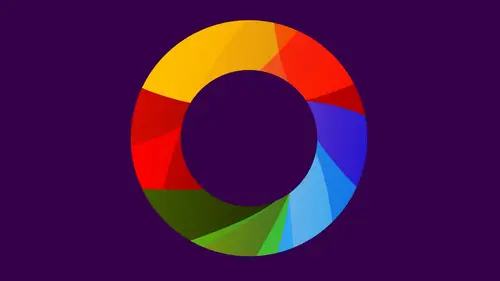
we're going to be working with some interesting concepts. Um, Tan Grams, we're starting off with this. And some of you, uh, may have worked with Han grandes before. Those of you who are at home, maybe you have a gram, uh, laying around someplace. Kids tend to work with him a lot. My first experience with 10 grams was not when I was a kid. I was 26. I was in graduate school and I was introduced to this by a guy I mentioned before Paul Rand. It was one of my teachers, and it's kind of an interesting idea. Tan Graham is I said, geometric form. And it starts with a square and it's divided into seven pieces, five triangles, a diamond shape in a parallelogram. And the idea is to move these shapes around and to create designs using these shapes. It's a wonderful way to explore geometry, geometric forms, and also to think about compositional concepts like figure ground, which is really the idea that when you design something two dimensionally that you're thinking not just of the shapes themse...
lves, the figures, but also the spaces between the shapes and the spaces around the shapes. So when typography we've heard to this is form and counter form in drawing, we call it figure ground in composition. We might call it positive. A negative space. There are many different names for this. The important thing is that we're considering all aspects of a composition from corner to corner, side to side, top to bottom, edge to edge. And so you can kind of see that from the diagram here, how a tan Graham is constructed. It's a square divided into these pieces. And the points that are very critical are the corners, obviously, but also these halfway points here, in here, in here. This is halfway between this. This is halfway between that. This is halfway halfway, so it's very, very mathematical, but very easy. Mathematical, Um, and totally based on geometry. As we go through, these examples will see these various expressions. And when I say an expression, I'm really talking about, ah, way of thinking about the composition in kind of, uh, human terms. Um, so stability and balance So we might see something like this where the pieces are locked together and they're all in alignment. Now, when we look at this We're aware of the white space around this shape because it's very, very grouped. But we're also aware of the shape in the center, the white shape. Excuse me. So the town Graham itself is made up not just of the seven pieces of the original square, but also the spaces and beyond. And that's what we really think of when we talk about figure ground relationships. The relationships of all these forms together because they all come together to make the composition is one of the most important ideas in visual composition. Two dimensional design, three dimensional design to. But here we're dealing with two dimensional design. Now you notice the colors primary colors you learn this yesterday red, yellow, blue. So today, when you're working with Tang Grams, you're going to be interested not only in putting the shapes together but also in putting colors together in interesting ways. And you can think about these colors and the color combinations, perhaps using some of the palates you explored yesterday but also just kind of going back to color theory. Primary colors, secondary colors, complementary colors, the various color contrasts, contrasts of light and dark contrasts of warm and cool, contrast, so vivid and dull, complementary contrast as well. So here we have secondary colors purple, green and orange, another expression of stability and structure. Here we have a kind of a monochromatic palette. All one Hugh variations of light and dark and visual hierarchy, comes into play. That's another term we used when we were talking about some of the ideas yesterday. Look how this one shape The parallelogram really stands out as being different from everything else and has to do with contrast of light and dark so you can use color contrast to create visual hierarchies. Yes, higher. OK, good question. So we're talking about creating a visual structure of an order in which we look at elements within the composition, parts of the composition and directing the viewer's eye to those parts using contrast. So, being aware of the various positions now, the tan Graham is great because it offers us Onley these seven shapes but also the shapes in between the figure in the ground. So it's kind of limited. You can't use any more. You can't use any less. The rules, basically are. The shapes don't overlap. It's okay to maybe believe the shapes outside, but keep the shapes hole so we recognize them another expression of stability. But that means that stability doesn't necessarily mean locked to the edges or perfectly horizontal and vertical. So you can have an angled composition like this where you might have a point here in a point down here that locks to the edges of composition but still expresses this idea of structure expressions of movement. This is one of the most interesting things. How can a static composition express movement we can do that typically with an expression of movement? There's some part of the composition that is very structural, yeah, and then other parts where the pieces seem to be moving or flowing away. So if you have part of the composition that feels very tight, structure to the edge, other elements that are not structured to the edge there's a contrast. It's a compositional contrast. It's a great expression of movement. Also contrast of large and small. You know the compositional contrast that we have one element down here, and then the other elements are grouped at the top. Notice how you can put these pieces together and actually form larger pieces. We call compound shapes, so your compositions can be a simple Is this a background color? A foreground color? Yeah, a figure color in a ground color. Notice how the yellow plays against the red. Very different from the black. The weight is kind of similar to the yellow. So in a way, the black calls attention to itself differently than those other colors. Some of the ideas you're exploring, another expression of movement. Now, when we're talking about figure ground, look at these red shapes in between the town Graham shapes. They're very important. Yeah. So your design is dependent on all of these elements. Look at this little red triangle appear that exists between the black and the white. So those three shapes are framing this shape. These three shapes are framing this shape. These two shapes are framing that shape. So I want you to be aware of these is your working with the 10 gram shapes now the great expression of movement primary colors, plus white and black And then finally, symbolic expressions. Compositions that actually look like things that we can recognize. A person sitting down, perhaps reading something in a very sort of determined way over here. A structure of a chair. Something like this may be a laptop or a computer. The head of this form is called out in red, so I really close to that point. But the yellow is clearly the most important element. Person sitting. The background is very dominant, right? Very, very powerful. But then you have all these other shapes that kind of move together, Poppy. So when we talk about symbolic expression were really thinking about an abstraction of something that we can recognize. Do this on the computer. Christine's gonna be working on the computer on again. Those of you at home, you can work with cut paper. You can work with the computer cut paper takes a bit longer, says you have to cut out all the pieces we've pre done that prefinished out. So we have all these pieces cut out here in the table, and the students will be working with those in class. You'll be doing this on the computer, and actually, when you're working on the computer, feel free to apply some background effects. It doesn't have to be a solid form. Contrast of light and dark. Yeah, within the background from red to black and finally work hard to make the composition looks simple. All right. Okay, um, keep in mind. And especially the audience at home. If you want Teoh Google tan grams and do an image search, you'll see lots and lots of these things. People have been making 10 grams forever. Um, I think the history of the Tang Graham goes back perhaps several 1000 years. It's another Chinese invention. Uh, but you can also go to a toy store and buy these things made out of wood. Very interesting. So I think we can get started. We're just starting with the board will push things to the side. For now, we have all these pre cut shapes. Great. We have the overhead camera. Fantastic. So it looks like each one of these little groupings is the seven shapes. So there you see the seven shapes square a parallelogram, too small triangles, a middle sized triangle and into large triangles. And the idea here is to put these shapes together in ways that express stability movement. Oh, are some kind of an abstraction. So you can choose which one of those three ideas you can you want to work with, and I'm just going to start pushing these around. Actually, since it's yellow, I might start with a black, a little bit more contrast. You see how much contrast years with the yellow against the black. And if I'm thinking about structure and we'll start by locking one of these shapes to the edge, I began to think about the spaces in between the shapes and again. I want to emphasize the idea of play. I don't know what this is going to be. I'm just starting out and I'm improvising as I go now. I've made not a 1,000, of these things, but many. So I might have a slight advantage. Look at that. It's kind of sometimes you get these, ah, moments of serendipity, and if you see that, you definitely want to go with it. The shape, skin touch or not touch Okay, like that kind of a relationship where there's an alignment of an angle is kind of interesting. I have this one other piece, but maybe I'll try a different color just to see what happens. And I'm gonna go back to that small triangle. Keep in mind that you never want more than the seven shapes. Uh, you always want to just work with those particular things and then think about some kind of contrast, so soon as I put, that element in there starts to change the composition. But this is a good example of stability structure. Again, kind of accidentally I have is very strong central axis that runs right up the center, measured here to here. Things kind of floating off of that, very aware of the figure and ground, the yellow forms, the red forms and the black forms resigning all of these things. And it's a good idea to, um, take pictures along the way. It's a good expression of structure, but I'm thinking about movement. I can maybe work off of this. So part of the composition has a very strong structure to it. Other parts of the competition don't. They're more free form. And of course, you can also express movement just by pushing all the pieces in some kind of ah, an array or an arrangement where they're not locked it all into place. And there's a sense of, ah, kind of a dynamic energy to the composition. Because of that and thinking about the spaces in between the shapes as well as the shapes themselves. What happens if I bring in another piece? I think this is much. No, that would be the bigger piece. That's correct. Oh, yeah? So you see how different the expression of movement is from an expression of structure. Yeah, that makes sense. So far, Yeah, and then some kind of abstract symbolism and the easy thing to start with his, perhaps the human form again. If you do an image search you'll see complete, almost like fonts of tan Gramps in different human forms, almost like Olympic symbols for runners and skaters. And you have these shapes that really kind of lend themselves very well, two human forms. And maybe that was the original idea of Tang Graham. Who knows? Have you ever seen the color forms box, which is something again? We played with his kids. The local looks like it was made out of 10 grams. So when you get Teoh, say a human form, it can be very structural. Can express movement actually doesn't look like a human, and maybe a little bit more like a bird. Something like that. With that black space on the inside. It's kind of interesting, and if you want to bleed off the edge, that's perfectly fine, too. So the nice thing about this is that it gets very close to say symbols and logos, and actually, this is a great exercise. If you're designing a logo or symbol, do something like this just as a warm up and it will give you some ideas. You may not be the end thing that you end up with the end design, but it'll get you places. So is that enough to get you guys started any questions before we begin? Yes, you mentioned local design. I was gonna acts. A question related to that, Um, I think it's called the Golden Circle. But are you familiar with the Golden Circle Golden section? Maybe, but use similar shapes, but they use some circles instead for local creations. I was just wondering how this compares to that, or if it does, it's It's another structural system here. It's based on the square, so you start off with a square, so it's very, very structured, perhaps like the system you're talking about. I'm not familiar specifically with what you're talking about. but like the golden rectangle is an old, uh, proportional system. The Greeks used it. It's been used by architects and designers throughout all. These kinds of systems are very interesting to explore, and this is another one of them, a very simple one. So, Christine, when you get on the computer, you're gonna start working with these shapes. And I've designed this in a way so that all the all the shapes are in different layers, and you can again, just kind of pushed them around in different ways and then assign each of them a color. Give me very aware of the shapes in between thinking about structure, movement, symbolism. Okay, let's get started. Oh, sorry. From an P. And she's asking, The number of shapes is set at seven. Yes, Can you mix the colors and mix the shapes? Do they vary, or do you have to use the one square to large triangles? You have to use those shapes. You can mix the colors, so feel free to use any color, so you want again thinking about color. Contrast the color ideas we talked about yesterday, but definitely keep these seven shapes and don't mix up the shapes you should always have. The exact ideas of these shapes. Otherwise, is not a 10 gram
Class Materials
bonus material with purchase
Ratings and Reviews
Nabha
The course was great. Richard was a very good teacher, appreciating the students’ work and helping them expand and improve on it. I learned from that alone. I feel more confident in choosing colors, and hope to bring a greater sense of fun to my design work. Thanks again.
PETE
How wonderful to have such an experienced, thoughtful teacher, who takes educating others so seriously. The depth and breadth of his teaching skill is matched by his knowledge of the subject. I studied art in school, own some of the color books he recommends, and learned far more than I thought possible. And he does it all in such a kind, affirming, supportive way. What a calm guide. How lucky are we to have access to a class with him!
Joe Loffredo
I was concerned that I wouldn't like watching everyone work, but I found that it was the best part! It allowed you to see Richard's lessons being put into action by the various students, each of which is talented in their own right. And Richard is great. Knowledgeable, intelligent, and supportive, he's got the attributes a great teacher should have. I'm a painter, not a designer, but the class really helped me a lot. When I go back to the canvas, it will be with a much deeper understanding of color, and how colors interact with each other.