Lessons
Lesson Info
Three Methods of Image Transfer
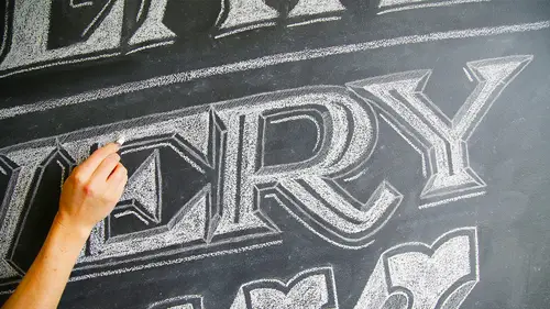
So now that we have our image and we're ready to go, I'm gonna talk to you guys a little bit about how it is that we want to transfer that image from the computer or from the piece paper onto what we're gonna be working on. There's three different methods that I'm gonna cover today. Uh, use whichever one is easiest for you. Um, and you can also try and find your own, um, the first way that I'm going to go over to transfer the images using something called transfer paper. The stuff is super easy. It comes in a whole bunch of different colors. So if you're working on a different colored surface, if you have a used green chalkboard paint, you don't wanna have either black or white. They have yellow, they have blue. Um, I tend to use when I'm working on a chalkboard surface. I tend to use the charcoal based one because you ca nbae rarely see it. Um, you can also use white. If you wanna have something a guy that's a lot more visible and easy to follow. I prefer it to be a little bit more su...
btle, so I'm gonna use the charcoal based one, so it comes in a role and you just cut off a little piece and you're just gonna tape that there's two sides to the transfer paper. There's a side that has the charcoal on it, and there's the side that does not. So you want to tape it, do a little quick test and tape it charcoal side down on top of your surface. You really only need a piece that's as big as your image area itself. I could have used a lot smaller piece. Um, the great thing about transfer paper is that you can use it over and over again. It lasts you many, many uses, so don't throw it away. When you're done with the first image transfer, you can keep using that same piece for quite a long time. So then I've taken my image, and I printed it out to be the size that I wanted to be to work on this board. Um, if I'm working on something larger, either I can get something printed at Kinko's or Staples, or any place where you can get stuff printed on larger paper or you can just tile it yourself by printing out different sections of the image and taping them together doesn't have to be pretty. It just has to all all the information just needs to be there. Um, you can do the same thing with the transfer paper itself. Um, I recently did a piece that was four feet by seven feet, and I took an entire one of these things and I unrolled everything, cut it up into pieces and made one giant giant piece of transfer paper for myself. Um, so don't worry, you can scale it up, or you can scale it down. However, you are most comfortable. So then I'm gonna tape down my image on here, and now you're just going to go over the image itself. Um, with anything with a hard, hard tip, you can use a ballpoint pen. You can use a pencil. Whatever you have available is gonna be fine. Um, you want to press down fairly hard in order to get it to transfer a nice, clean, solid line. I recommend doing a little test first. If you want to see what does it look like when you press light? You know you press too hard though you break the lead in your pencil. What does it look like if you press harder? Do you need to go really hard so that you can peel it back and take a little look and see? OK, you know, I'm actually going to be okay with this latest line. I don't need to go super dark, but it's nice to test that before you trace your whole image because otherwise, that's a lot of work. And if you get done and you peel it back and your images and there, um, got to start all over, So I'm just gonna trace the word create here on I'm not gonna worry about being to exact because this is a piece of hand lettering. If I were doing someone's logo, I might be a bit more concerned. I might want to take out some rulers to get straight edges and stuff like that, but ah, for this piece, I wanted to feel like it was done by hand. Um, so I'm okay without them, Transfer paper is a wonderful choice. Ah, if you have an image that you need to replicate exactly or if you have something that's super detailed um it's also a really great way to start in this process before your super comfortable working in chalk. It's nice if the first thing that you dio you feel that you have a little bit more of, ah, solid guide toe work from As you get more comfortable in the chalk, you might do less and less of the transfer, and you might do more and more just trying things by hand. So one thing done tracing over this word before I take off everything completely, I'm gonna want to peel it back to see if there's anything that I missed. I'm only gonna take off to thigh and take a quick look. It looks like it looks like I missed part of the ease there. Okay, so let's put this back. Do the crossbars on my ease drop shape. They're all right. So that covers the first method using transfer paper. In order to get your image onto your chalkboard surface, the next method that I'm gonna dio Ah, it's gonna be using a projector. Um, there are all sorts of different projectors you can get. I got a simple mini pocket projector. Um, there's a bunch of different. A bunch of different options. But the pocket projector is not that expensive. You can't go super huge with the image, but you can certainly go big enough. Um, it's really small. It's really easy. It's a great tool. Tohave. Okay, so I brought up my image on the projector, and I'm gonna get that pretty much in place. It's not super exact. These air, different methods. Obviously, I suggest you use one method per mural instead of multiple ones. I'm just trying to show you all of these together. Um, so at this stage, you can either block it out using chalk using chalk pencils are just using a regular pencil. I'm going to continue using pencil. Since that's what I started with above on. And I'm just gonna lately trace this. I don't tend to worry about my pencil lines going into this space that I'm gonna be filling on lee out of. So if you notice a lot of my lines, come in further into the letter and the pencil really won't show up at all, uh, in your final pieces, um, I say keep your lines is as light as you can while still being able to see them well enough that you can to the illustration on top. But but the pencil really blend right into the to the chalk background and in terms of getting your choc surface to begin with, um, you can use chalkboard paid that you paint on with a brush or with a roller. You might get a smoother surface if you use a roller, um, or to get a really smooth surface, you can always use a spray paint. There's up. There's an outcry on makes up black chalkboard spray paint that I used to do these small boards here. If you're doing something like a wall, you're gonna want to roll it out and you're gonna want to do a bunch of coats to for sure. Um, at least two coats. If you're doing this spray paint, probably more like three or four. You want the surface to be pretty smooth, but it's nice if it has a little bit of tooth to it. A little bit of roughness to it, Um, really gives the chalk something toe. Grab on to you. Okay, so now we've got our 1st 2 words. One done with transfer paper, one done with the projector and then for the last one, I'm just gonna do it freehand. So I'm gonna bring out my sketch again so that I have this to look at, um, and something that you might notice about this versus what was on my computers that this has, ah, grid on it. Whenever I'm sketching something Freehand, I like to work with a grid and they'll often transfer the grid on Teoh the surface that I'm working on. So if it's a super large mural, it might be one foot by one foot squares. But whatever it is, it helps control the spacing. Um, as you're working. So if you've already figured out how much space each one of these takes, that makes a big difference. I think because this is so small, I won't be doing a grid on here. But when I move on to do the mural on the wall with you guys, you will see me do the entire grid, um, on the wall. So whenever I'm doing stuff Freehand, the first thing I always do is draw in my baseline on my height, my my cap height, and then I'm gonna block out roughly where each of the letters goes nice whenever you can to sort of think about and look at the images, the whole make sure you're spacing is going well. So when I first start sketching, I am working super light. Um, still trying to figure out if I've got the letters in the right place, and once I have everything blocked in, I'm gonna go back over it so I can see it a little bit better. But this first pass is just super light and making sure there's enough space for all of the letters. Okay, so the spacing is feeling pretty good thinking about where the three D is going to come in, Mr. To go over it a little bit darker, and you can try using a different different kinds of different softness is of lead in order to get, um, a darker line versus a lighter line so you can play around with swapping out different lead in your pencil. Tend to always use mechanical pencils because I can't be bothered to stop and sharpen them. Really love sketching with mechanical pencils more than anything. Only when I'm feeling super confident and I go into my last round with artwork that I usually switch over to markers. So I realized that the pencil can be a little difficult to see, particularly on camera. So I'm going to do this last past of the word day with the charcoal white pencils that I have rather than the regular pencils. Just so it shows up a little bit more clearly. But again, even with this, I'm gonna keep it. Super light. I'm really just blocking this, then. Okay, so now I've got my image ready, and I'm gonna move on to talk to you guys a little bit about materials that you can use.
Class Materials
bonus material with purchase
Ratings and Reviews
Manish Gupta
Annica obviously has great talent, her method needs patience, truck loads of it. Of course, if you don't have patience, you should not purchase this course. This is a great course for someone starting off in chalk lettering. I would personally love to have a segment on the actual techniques used in photoshop to fine tune the chalk lettering done on paper/pencil. I especially loved the technique of doing it with paper pencil and just inverting it in photoshop. Overall, a great class. However, I felt, portions of the video could have been time lapsed ( like the wall mural segment) to save the students some time. Looking forward to seeing more from her.
Letter Shoppe
What a great class! This was the best online education I was able to find on Chalk Lettering by far. Annica's approach is fresh and she does a wonderful job of showcasing her process in a easy and fun way. Highly recommended!