Lessons
DAY 1
1Class Introduction
13:24 2What is a Baby Plan?
29:09 37 Steps to Baby Plan Success
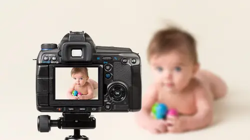
26:59 4Shooting Prep for the 4-5 Month Old "Smiling Stage"
14:33 54-5 Month Olds: Tummy Time and Headshots
21:02 64-5 Month Olds: Basket Shot
20:34 7The Baby Plan Structure
28:28How to Price Baby Plan Sessions
19:23 9Exclusivity and the Product Line
37:46 10The Annual State of Mind
20:31 11Pre-Consultations
43:15 12The Art of Language
08:04 13Designing for the Annual Product
15:00DAY 2
14Pricing Step-by-Step
09:29 15How Much Money Do You Need?
15:32 16Building Packages
22:54 17Shooting Prep for the 6-8 Month Old "Sitting Stage"
11:23 186-8 Month Olds: Chair Shot and Baby Food
14:28 196-8 Month Olds: Bucket Shot, Set Design, and Coloring
19:35 20Creating Efficient Systems
09:04 21A Shooting System
08:49 22Client Systems: Database, Workflow, and Session Tracking
34:34 23Client Systems: Communication Tracking
25:33 24File Management
09:17 25Policies for Baby Plans
41:00 26Customer Service
34:19DAY 3
27What is Collateral?
26:32 28Collateral: Printed vs Digital
31:39 29Designing a Brochure
18:52 30Shooting Prep for the 1 Year Old "Standing Stage"
07:50 311 Year Olds: Using Different Props
10:45 321 Year Olds: Cake Smash - Lehan
13:12 331 Year Olds: Sitting and Standing
07:59 341 Year Olds: Cake Smash - Alexsy
17:09 35Retouching Workflow in Photoshop
38:23 36Creating a Panel Series
26:16 37Designing Wall Products
19:37 38How to Launch Your Baby Plan
14:41 39Targeting Your Ideal Client
11:49 40Marketing Your Baby Plan
35:32 41Effective Promotions
24:46Lesson Info
Designing a Brochure
Okay, so let's kind of get into a photo shop here and I will show you guys a little bit about uh just I'll break down some of my design materials and I think that will help you see how simply things can be done in photo shop so I'm not sure if you guys here in the audience are going to see my lovely messy desktop okay, so this is my, uh, baby plan folder let's see here I was going to go into the brew sure there we go. Uh solder the this's the outside was just open both of these this is just a basic pusher that I've created that gives information pricing information about the bees you baby plan okay, so the outside of it is just that this is sorry this is the inside of it. So you open the you can see the guidelines here around the outside uh, this is template, a blank template that I got from god print. Okay, so got print is one of the places that I print mass brochures. So thie little outline here is just the the guidelines it's the bleed lines and cut lines for where things are going ...
to fold and where we need to make sure we keep stuff in the lines up and I can see I have a little error here we're going to fix that so I really just you want to think about sectioning things off so I've got three panels that I need to fill for a tri fold buscher right? So uh how am I going to do that in a way that's effective, simple and clean now I could just go you know, think of each panel is its own individual unit but when I spread an image across two panels I create mohr impact that's like doing one image across the entire spread of an album you know what has that really like strong impact on how how things appealed to the consumer and it guides their eye to a very specific place on the page okay, so what I'm doing by doing this is guiding people over that they initially look att the image of the little girl with the cake and then there I goes from left to right to land on the pertinent information on the right which is pricing and products that is the last page of the brochure if you look at the outside so this is the outside if purse over imagine imagine the brochure close I wish I had though I have a trifle in there yeah would you hand me inside that digital kit hon? I don't have the actual brochure I think I left it at home but you know, in the digital box the kit over there so for example rip this apart this is a trifled card, right? So the brochure I'm showing you in photo shop right now has the same folding appeal it's just long and skinny ok, so the front of the card is where little trinity is sitting on the ground with the baby food in her hand going oh my god look what I did okay, so that's the cover of the brochure when I open it up here this page on the left is this one here okay? Is this inside fold right here so first information they see will be the picture of kenley with the cake on the left and then the ages and stages and how much it costs to enter the baby plan on the right so very basic information with an image that appeals then when the client opens they see inside photoshopped we'll be there go the entire inside spread with the image of kenley over here on the left and the prince and products pricing over here on the right which is the very last thing that you see so I'm drawing them in with imagery a little bit of information maur engagement with imagery and then the pertinent information is the last thing they see on the right so there's some strategy to the design and composition you want to still think compositionally when you design a piece okay, you want to lead the viewer's eye through the piece in a successive order that makes sense and helps the viewer engage with the product with the peace does that does that follow so you don't want to vomit all your information and one spot because it's too overwhelming to the client they will look at it too much and then they'll just hold it up and put it away because I don't want to read it okay I see so many photographers make huge mistakes by putting tens of information on all pages and then it just looks like it's filled with words not beautiful imagery that shows off your work okay so that's the first thing you need to consider now second less is more okay on my right paige here this is the most information I have right? This is the most wordiness that's takes place in the entire brochure I tried to pare down my create a collection prices and information to as little as possible but still give enough information for the client to determine if they want a book or not. Okay on the backside of the brochure over here on the left thes brown boxes here that's where I would put in imagery and I'm going to go ahead and do that today to show you how imagery would be put in so I'm showing the sitting upstage the sanding stage and then the family session that would go in at the bottom down there as that free complimentary family session okay, so the client sees right away what stage is we're going to cover and the fact that they get a family session out of it? Because that's the lure that's the draw initially to my clients to want to join the baby plan. The only thing that's not in here that I need to get in here is if you are a newborn client, you get into the baby plan for one hundred dollars instead of two hundred fifty, okay, so to design this kind of thing you want teo, obviously download the complimentary template, the empty templates from your lab or designer, you just go on to their web site, they'll have blank templates there for you to be able to use in photo shop, and then you open up the blank template and start designing according to their guides. So to do something like this, I'm just going to kind of break it down and show you show you how it's organized and what it is. So over here on the right is my layers palette in photo shop. It has the back page, you can see I've got it grouped into the back. I haven't I'm not sure if I'm super organized about this or not, I probably wasn't images yeah, I'm not that organized, I should have it grouped into the back, the front and the inside and groups and my layers here so I don't get things confused but if I unchecked the layers you can see where the text is located okay and really it's just a matter of filling in the text and being mindful of the design so you can see here on the left ages and stages I'm supposed to have two photographs here that I haven't put in yet but I'm creating an appealing geometrical design that forces the clients I to go down and read everything the ages and stages at the top just really appeals to that okay this is the age and stage that were photographing this is the time that you don't want to forget that memory that's fleeting okay so to put an image in it's pretty easy this is kind of probably pretty trivial for some folks who already do this kind of thing let me see do I have any? I'm not sure if I actually have any baby plans what's to just image of a baby there we go that's uh to sit or do I have a sitter in here? Uh I should there we go actually that's I need a more horizontal image for that space space okay molly's in my thing here where you are wait okay here's a center perfect okay, so I can take this image and just on open it up first of all there's ten thousand ways to skin a cat photoshopped right on dh then using my wiki move tool on and in the tap mode I can drag the image was on the outside to the outside and then pop it over here and you can see it's in the wrong order it's not the right layers so I have to find the rectangle here that that works with me because I'm not organized oh it's under the images folders and thank you dear you're more organize and I am okay so it's right here so then I'm going to go ahead and drag the image wherever I put it above that um and then use what's called clipping mass to make it fit into that little box so if I you can either right click and go create clipping mask or you can press the option key and that little symbol will pop up and it will clip to that ok obviously it's too big we need to resize it down but now the image is clipped to that square there I'm going to go ahead and press command tea and command zero to zoom out so I can see my entire image here and make it small enough to fit in and see the little guy in the right spot and the image is going to be a little too small for what I wanted to do waken fix that so there is my image the way I want himto look, but clearly he is, uh, not feeling the whole frame, so the way I could fix that is get on the image layer, which is the slayer here. I'll put image of johnny, I keep track of my layers here when I could do is take my marquee tool, highlight the area I need thio act that's too much the area I need to cover and part of the image press command tea and just stretch it out now I can do this because I shot it on seamless paper and so stretching out my pixels is not a big deal. There we go now, he's sitting there and it looks good like you fits in the space. I can even move the image around a little bit complain that means like images. What do you mean? Move him around inside there, something compress my wiki and move it over that he's nice and underneath that text and go ahead and stretch again. A lot of people telling me what you're doing, you're doing that. I know that I just don't have a lot of time going over all this kind of technique again in the segment after lunch, so please be patient with me as I move through this rather quickly. But putting an images and clipping mask on and if you ever need to change out the image you can keep this template and then if you want to freshen up the brochure or change anything it's easy to drop new images in to create a nice looking piece that has fresher, fresher portfolio content in it so designing clatter as you can see I don't have like a bunch it's just images and boxes and text there's no like fancy swishy graphic or grungy border or stuff that takes your eye away from the imagery in the content you're selling an experience you're selling her imagery your contract content my brand is a very simple clean organic earthy brand so I use design collateral that reflects that okay, there are tons of designers out there that sells supercute fancy stuff you have to decide if it works for your studio and what's the message you want to convey I strongly encourage you to think about the target market and what kind of core value you're trying to lure you're trying to connect with to the client is that humor is it you know my family and the pride I have in my family the lessons I'm teaching my children what are those core values you're trying to get at and is the marquis materials that you're creating helping or hurting that? Okay sometimes all this fancy design and stuff tends to distract from the real core value marketing and it's also super trendy, and we'll be out of date in less than a year. When I first started, I was super into that damask pattern that was that was so rampant and there was leopard print everywhere that was super popular. I'm like, oh my gosh, that's so cute, so pretty you'd be perfect for my market materials, yada, yada yada, and then after about three years and changing my market materials like crazy all the time because of trends getting old, I realized you know what less is more keep it simple don't try to be something that you're not and focus on the imagery instead of the other random graphic design stuff that's cluttering up your images. And so when I did that now, doing something simple like this, I've had the same brochure for three years now and haven't changed its designed. The images have changed but haven't changed its design because it's, so timeless, easy to produce and appeals to the imagery rather than the collateral. Does that make sense? Canada joke question way could if we can get in a few question, of course I'm going to stop right there because okay, way can talk about what's coming next if you want, but maybe we'll take your questions, okay, awesome, so I asked people in the chat rooms if they were printing materials yet and then also what some of those hurdles were if they weren't if there were just not designing them themselves or what have you and the thing that came back the most wass price and thinking that it was a big investment to make and not being sure like you said, if they're like at the right place and their branding or what have you so what advice do you have for somebody who is is in that place it's totally understand that because you create this marketing piece of material and you're like, is this gonna last? And you're like, I want to order five thousand of these because what if I don't use them in my prices change or whatever right you have like this commitment phobia of wanting to order I I had it too, but when I changed to a simple clean design that was timeless, I didn't have that fear anymore because I knew that they would last you know, I'm saying that I could keep those brochures I have ordered a thousand of these brochures for my studio probably every six months for the last three years and the images I might get sick of the images and go oh, I would put new imogen but the content and the design has not changed in three years, which gives you know and that's strictly because it's so simple and clean and and that in itself helped me not worry about not committing cost wise you have to hunt for resource is thatyou confined that do it cheaply? You guys all know I'm a cheapskate but my products I'm all about low cost high dollar but my products and marketing materials don't make me look cheap but trust me, they're not printed that expensive I mean my little bees you baby kit I think costs about seven dollars apiece to print, which is pretty cheap considering the complex city of how it looks like a wedding invitation you know it looks like a gorgeous wedding now granted that's on ly for clients who are actually in baby plan so brochure that I'm working on right here this is the template that I use for just general market information people who are thinking about it that cost me two hundred bucks for a thousand which, you know that's cheap that's like lesson is that what it is that I can't add in my head that fifty cents apiece or less? No maybe you lesson that super cheap and got print has beautiful paper I print on their mat recycled will cover and it's super thick and pretty and it's matt, which I love because matt suits my brand I don't have anything shiny in my studio there's like nothing shiny I don't like shiny I'm organic earthy I love the mat products uh so printing on that mat don't cover is really effective and you can order I think the minimum order is fifty they go up in price as you order fewer but I think fifties maybe fifty bucks forty bucks p forty for total and then you've got to ship them but the more you order like a few order five hundred it's like I forget the exact pricing but when I want to say is that there's if you order five hundred one hundred dollars if you order a thousand one hundred twenty dollars you know they say like the more you order the less incrementally they go it goes up in price so but I'm sorry but ordering a thousand of these at two hundred bucks and that is cheap marketing right there very chief you're not gonna get much deeper than that but places like this to print and got print our great resource is I have found that got print has the best paper and the best color quality and printing but just print your materials that you're using for promotion as cheap as you can but with his high quality as you can print your marketing materials for your clients with a little bit more generosity when it comes to spending but don't ordering huge quantities you know this is from white house custom color and I order it in quantities of twenty five because you know I have maybe twenty five baby planners in six months. So, you know, twenty five bucks over six months is pretty cheap marketing. That makes sense to help, I guess. Profession. Thank you, thank you. And I like this comment from melissa, who said, I assume that people who have already committed to working with me don't need printed material, that digital would be okay, because she's, the type of person that would throw that several way but she's realizing that it could be really good for finding potential clients. So I think you just have to think about the message that did digital versus printed sense, and they both have positive and negative messages. They really dio, you know, like a lot of people, the restoration hardware catalogs have you gotten those in the mail there's like a huge staff, there's a lot of people out there who complained that that's ways to paper and killing trees so there can be negative connotations with printed material, but they're also could be negative connotations with just being digital. So I think a balance of both print and digital shows the best of both worlds.
Class Materials
Bonus Materials with Purchase
Ratings and Reviews
Natalia Malinko
I just finished to watch this course. And I confess: I've been struggled all the time during the viewing to say already: I LOVE IT! So, I LOVE this course! Julia is so nice teacher, and photographer, and person. And she is so incredible organizator of whole child's photography business. She is amazing, so meticulous, so persuasive trough all and each one of the important points of this business. And she is just great in the part of studio´s shooting examples with the babies. This is one of the best and most valuable courses I found in Creative Live, thanks!
Dawn Potter
I've been so fortunate to be able to be a part of the Live audience experience with Julia. She is an amazing person, photographer and teacher. She does a fantastic job of explaining in detail, the steps she has taken that have helped her success as well as the steps that have set her back. We are so lucky to be able to learn from her experiences and to have someone who is willing to put herself out there to teach us and help us to grow as photographers. For anyone considering adding a Baby Plan to their portrait offerings, this class is a MUST have. Julia, you are #awesomesauce !! xoxo - Dawn Potter www.dawnpotterphotography.com