Lessons
Introduction to Astro Landscape Photography (ALP)
25:29 2On-Location Demo: Composing, Focusing, Exposing & Mobius Arch ALP
27:44 3Post Processing: Mobius Arch
16:23 4Gear for ALP
28:09 5How to Use an Intervalometer for ALP
07:51 6Camera Settings for ALP
20:24 7On-location Demo Focusing Demo for ALP + SharpStar 2
33:06 8Determining Exposure for ALP
17:00On-Location Demo Lathe Arch Light Painting & ALP
17:02 10Post Processing: Lathe Arch
17:41 11How to Shoot Moonlight and Star Trails for ALP
16:17 12On-Location Demo Star Trails Stacking
07:09 13Post Processing: Star Trails Stacking
29:44 14On-Location Demo Panorama for ALP
10:19 15Post Processing: Panorama
23:56 16Close-out for ALP
01:23Lesson Info
Post Processing: Panorama
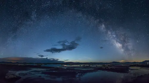
Okay, let's see what we can do with the eight images that we shot for the Mobius Arch panorama. I've isolated those files here and now I'm gonna select one of them and go over to the Develop module. The only adjustment that I'm concerned with before merging them is under Lens Corrections I wanna make sure to check Remove Chromatic Aberration and Enable Lens Profile Correction. Now I'm just gonna confirm that we are using the right one and that is the Nikon 14 to 24 and that's correct. Okay, so now back to the grid module. I'm gonna select the rest of the images, back to the Develop module, synchronize them just to make sure that they all have these two adjustments. Now, I will go through the images and yup, just making sure that the synchronization worked, and it seems to have just fine. Okay, so now I've got these eight images, I've applied the lens corrections and I'm gonna go up to Photo and Photo Merge, Panorama, and it's gonna automatically generate a preview and it will select th...
e projection by default which most likely is gonna be spherical. Now in Lightroom six or CC, the photo merge for panorama and HDR is just fantastic, and the end result is a raw file as long as you started with one. So, really great. That's why we don't have to do these local adjustments or any adjustments before we do the merge. Okay, so yeah spherical, let's see what cylindrical looks like, it's a little bit taller and a little bit not quite as wide, perspective, doesn't work for perspective, we're just gonna go ahead and use spherical because that is what they're suggesting. Okay, now just to turn off the auto crop here and see what the image actually looks like. Another new feature in the latest version of Lightroom is this boundary warp which will basically stretch out the image to minimize the amount that we have to crop here. So I'm gonna just pull it over here just to show you what it will do. Give it the maximum and it almost, yeah it does, it actually eliminates the need for cropping, but it is introducing some distortion and it's also, well it's throwing the stars out of whack, too. So if Neil deGrass Tyson happened to see this image, he would not be very happy about it. So let's go back, we'll not use the boundary warp and instead go with the auto crop. All right, we'll just hit Merge and let Lightroom do its work. It's gonna take about, I dunno, 30 seconds to a minute or so. So we've got eight images, 6400 ISO, F 2.8, 30 seconds, shot on a Nikon D750 with a 14 to 24 millimeter lens at 14 millimeters. So here we go. Here's the resulting image. Let's go over to the develop module, take a look at it. Okay, so now it's time to get to work on this and do some adjustments. So, let's see, I believe we had, yeah we had it set for 3600 Kelvin and it's lookin' a little bit warm and maybe a little bit green here. So, let's try 4000, see what that looks like. Ya know what? I didn't like that too much, I'm gonna just use the manual slider, go down here, get a sky that we like a little bit more, add a little bit of magenta in there but not too much, warm up those rocks just a little bit. All right let's see, where did we start? Yeah, okay. Not bad, 3200. Take it down just a little bit lower. (humming) 3000 Kelvin. Just scrolling back through the adjustments here. All right, that looks pretty good. Okay, so let's see, what do we have to do here? Let's take a look. And as you can see, Lightroom did a great job blending the images. I don't really see any sign of distortion or any weird overlapping artifacts. All right. So let's see, first thing I wanna do perhaps is bring out the rocks a little bit. Go back and for that I'm going to take a local adjustment brush, double click on the word Effect to reset it. I'm going to increase the exposure just a little bit, about a half a stop, increase the contrast a little bit, and increase the shadows a little bit, add a little bit of clarity. So I'm just kinda boosting it up here. I'm also going to warm up those rocks a little bit more, so I'm adding some temperature and tint adjustment. Gonna move it both towards the yellow and the magenta just a little bit, and I'm gonna close this tab so we have a little bit bigger area to work with. All right, let's go down here and take a look at the brush. At this point I'm going to turn off the auto mask and have a rather small feather, about 25, take the flow up about half way, so about 50. Now and at this point I'm just gonna go for kinda broad strokes over the rocks, and careful not to spill over too far because I do not have the auto mask enabled. By pressing the O key you can see the mask that you've applied, or I can see the mask that I've applied here. See what I've missed, where I need to make up for it. Okay. All right, so being able to visualize the effect of the brush that we're doing here is real handy. And I've left the arch itself because I don't want to spill over into the sky. So for the arch I'm going to click on the auto mask button and that should prevent most of the spillover, but it's not perfect. So, let's see what we've got here. A little bit of edge effect here, let's kinda fill in this edge. All right, I don't have to be super careful here, you know, I'm just kinda boosting up the contrast and the color of the rocks, but I don't wanna spill over into the sky, so I'm gonna magnify the image. Let's go, let's go up to one to two, make it a little bit more readable. Now you can see just a little bit of spillover into the sky. It's hard to read this green against the blue, so if I hold the Shift and the Option key, I can change the color of the mask to red, and that's pretty good for me. So, I dunno who can see this little bit of red in here. I wanna get rid of that so I'm gonna hold down the Option key, which turns the brush into an a eraser. I am going to check the auto mask, and then reduce the size of the feather, and just kind of scroll down to make the brush smaller. Basically I wanna get this mask out of the sky area. A little bit of spillover here. Scroll down to make that brush a little smaller. There we go. A little bit over here. Okay, let's take a look at the rest of the image. Looks pretty good, I'm just gonna add this, a little bit to this edge here. All right. Shift + Click to go back down to normal size and looks like we still a little bit of spillover there. So, Option key turns out brush into an eraser. You erase the mask that spills over into the sky. Okay, all right, press the O key to hide the mask. Press the H key to hide the point and I'm gonna go back over here to our tab and just kinda go back to the point where we changed the white balance. See what kind of effect this had had. All right, that looks pretty good. So let's see, let's try boosting it up just a little bit more, really make it stand out. And it looks like this side here didn't get quite as much light. So, we might have to do a separate brush on that section there. And just kinda boost up the contrast a little bit more, lift up the shadows a little bit more. So you'd take the exposure up just a hair more. You don't want it to be totally unrealistic, but we want it the rock formation to stand out. Okay, I'm pretty happy with the way this side looks, but I do wanna bring this up some more. So I'm gonna create a new brush, I'm gonna double click on Effect to reset that, and I'm going to increase the contrast a bit more, I'll add the exposure a bit more, and the contrast, and I'm also gonna warm it up a little bit more. Basically, I'm trying to intensify and build on top of the brush that we did previously. So, press the O key to show the mask and yeah, all right. Again, it doesn't have to be super precise here. But I just don't wanna apply the effect to the sky. Okay, toggle off the mask and okay. Well, now I've made it a bit too light, so let's bring this back down a little bit. And I'm still gonna warm it up a little bit. It's looking a little bit redder than the other side, so I wanna go back on the magenta slider. There we go. All right, that's lookin' pretty good. Okay. So, our rock formation is looking good. The sagebrush in the foreground is a little bit prominent, so I wanna tone that back a little bit. I'm going to select a new brush, double click on the word Effect because I want different adjustments in this case, I'm going to reduce the highlights, the whites, and the exposure just a little bit, and I am gonna go down here and make sure that I have the auto mask enabled. Let's zoom in so we can get a better view of what we're doin' here. Press the O key to show our mask. Okay, hide the mask, go back down to the full image, and let's see. That's better. Let's increase the contrast a little bit more, or a lot more. And, let's add some green to it because it is sagebrush after all. We're trying to differentiate it from the rocks a little bit more. Also move that warm temperature slider over to the blue. Okay, and let's see. Where do we go from here? Back, there we go. So that's before we started adjusting the sagebrush and here afterwards. Looks pretty good to me. All right, so this little bit of plant matter in the foreground here is standing out, it's kinda prominent to me, so I'm gonna choose yet another local adjustment brush, click on New, double click the Effect tab to reset all the tools. In this case, it's just showing a lot of color so I'm gonna reduce the saturation and the exposure and highlights and let's see. Maybe that's whites. So, bring that down. All right, so that's kinda too much, right? All right. All right, that's nice and subtle. Bring down that saturation way down 'cause I don't want that little bit of color in the lower right-hand corner to distract from the rest of the image. Okay, that's lookin' better. Pretty happy with that. Let's see, oh what do we have here? We've got this sign that's indicating where the hiking trail is and we don't want that there, so I'm gonna make that go away. I'm gonna take the spot removal tool and the brush is conveniently sized for this sign. I'm just gonna drag straight down and see what kind of job Lightroom does at selecting a cloning point. Hm, not too bad. Where'd it choose from? Mm that's not too bad. I'm gonna just move this around and see if I can get it looking a little bit better. Yeah, press the H key to hide the effect and yeah, now we've got this little light colored spot right here. Let's see if we can make that go away too. We'll just drag that over here and yup, looks good. Okay let's put that away, go back and take a look at our full image. Let's go full screen. Okay, looks pretty good to me. I like that overall. All right, let's go back. Now, to make the stars and the sky stand out, well I know, let's put a gradient on the sky and I've got a bunch of adjustments in here already that I don't want so I'm gonna double click Effect to reset the tools and I'm gonna basically apply a little bit of clarity, about 20 points, I'm gonna increase the contrast, and what this is gonna do is make the stars and the Milky Way stand out a bit more. So I will drag that gradient, starting right about here dragging down, press the H key to reveal our gradient, the O key to show the mask, all right. So, the leading edge, the first 50% of the gradient really has minimal effect and most of the tapering or the gradient is applied in the back edge here. So I'm gonna just stretch that out just a little bit, and press the H key to hide the gradient. Now we don't want the gradient adjustments applied to all the rocks in here, so also new in Lightroom six or CC, we've got the brush option in the gradient, which is a really nice tool. I can add to or subtract. I'm gonna subtract by pressing the option key. Gonna go down here, make sure auto mask is selected, and I'm just going to erase that adjustment from the rocks 'cause I don't want the clarity added to the rock formation, that's really just for the sky. We're running a little bit slow here and a little bit hot, but once Lightroom catches up with me we should be able to remove that. Again I'm holding down the Option key on a Mac or the Alt key on a PC to turn the brush into an eraser, and you see it changing from a plus to minus there. I'm going to Shift + Click on here, go down to, let's try one to two, yeah that's a good amount. All right, then, oh you see our flow is really low down at 17. I want it to be much stronger. That's gonna make this disappear more quickly. Again this isn't really a hard edge adjustment so I can afford to be a little bit sloppy 'cause the effect's not gonna be super strong. A little bit of clarity won't hurt too much, but. All right, let's see. Let's move across the image here, and we'll just take it off this rock edge here. And again we're just kinda removing the mask from the rock 'cause we only want it applied to the sky. And you can see I accidentally erased it from part of the sky here, getting a little bit sloppy. So, no problem, I can just go back in with a brush, add it back. Add it back. There we go. Okay. Let's go back over here. One last time just clean off this edge. Okay. Toggle out of that mask and there we go. Okay, so let's see before we added the graduated filter and need low res. The effect is pretty subtle, let's go up to full magnification, toggle it on and off. There we go, it adds some punch and some snap to the sky. Okay. So, let's see. Here is our image. I'm pretty happy with the way this looks right now. Let's go back and see where we started. From there, to there. Looks pretty good. One last thing that we might consider, I'm not sure that it needs it but I'll just do this just in case you wanna take a look at it. We can go over here to the Milky Way section and take a local adjustment brush, let's create a new brush. We're gonna increase contrast, increase clarity, make a fairly large brush, definitely not gonna use the auto mask on this time 'cause there's no clearly defined edges, I'm gonna reduce the flow, increase the feather, and just run it across the Milky Way here just to add a little bit of punch to the core. Press our O key to show the mask, there it is. Okay. Let's go back and see what we've got. There we go, without, and with. Just a little bit more snap to that part of the sky. The tendency is for people to really go overboard and just make the Milky Way so heavily processed it's kind of unbelievable. And I think it really doesn't need it in this case. There we go. All right, let's go back to full screen, take a look at our final image. And there we have it. Here is the core of the Milky Way rising over Mobius Arch and the Andromeda Gallery up here in thee upper left-hand corner. So, there you have it. Pretty simple. We did the whole thing in Lightroom and our end result is a DNG file, so totally nondestructive imaging.
Class Materials
Bonus Materials with Purchase
Ratings and Reviews
user-1ff946
The classes are full of extremely important technical information that is delivered in a concise, clear manner. It is very difficult to grasp it all in one sitting. I have taken classes before in photography and I love the learning model with Creative Live .I can go back and review the information at my own pace and take notes as I go- I can even rewind and review if I miss something. This is a great collection of material and I would highly recommend purchasing the entire bundle - great job on the selection of fantastic teachers and putting together such a fabulous package on night photography.
Zorka
A tremendous amount of information crammed into one single course - it can be only done by CreativeLive! Along with having such a profound knowledge and skills in a particular field, Lance Keimig has an amazing teaching style as well - he is very clear, concise and thorough. I strongly recommend this set of classes to anyone who is interested to acquire some general (or expand their existing!) knowledge of astrophotography and night sky shooting. Last but not the least, I want to congratulate the CreativeLive for teaming up with an excellent instructor to create and deliver this STELLAR and production-wise very demanding course!
Student Work
Related Classes
Outdoor