Lessons
Day 1
1Different Aspects of a Good Image
22:17 2Exploring Composition
29:24 3Looking for Light
25:45 4Realities of Shooting in the Wild
26:41 5Essentials of Travel and Equipment
32:14 6Elkhorn Slough - Getting your Settings
12:22 7Elkhorn Slough - Pelicans
35:05Elkhorn Slough - Seals
27:24 9Elkhorn Slough - Review Image
14:14 10Image Review Part 1
27:02 11Image Review Part 2
29:24 12Image Review Part 3
19:57Day 2
13Every Picture Tells a Story
18:12 14Shooting for Publication
18:57 15Making a Difference With Photography
18:43 16Collaborating With Others To Get The Shot
25:29 17Field Trip to Santa Cruz Beach - Pelicans
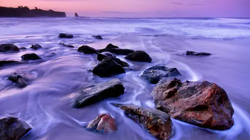
41:13 18Field Trip to Santa Cruz Beach - The Rocks
32:52 19Image Review Part 4
26:39 20Image Review Part 5
37:20 21LIFE Project Intro
14:01 22LIFE Project Story
19:42 23Where The LIFE Project Story Went
15:04Lesson Info
Image Review Part 2
now this one does anyone recognize this then someone like community online ville will claim this so let's take a look at the settings thirty seconds at is a one thousand apertura fight open thirty seconds is just about the cut off if you do longer exposures than thirty seconds the stars will really begin to express themselves a stripes instead of us pinpoints so we're right at the margin so that looks good on you a thousand eyes so we don't see what but the camera details are but this whole looks very nice I don't see a lot of noise in the frame it's probably some more detail that can be expressed here at the bottom on the history graham looks good I see some nice color here that's what do you think I dreamed of getting to heart losing details when I am because it's uh yeah it begins to look a little grainy here yeah I see the noise come up s so let's not take that too far it looks like it's a uh you know landscape from could be north america's feels a little bit european but what I've...
it but I like here is that it's not just totally black you know the three is grounded in a real landscape here so could we do something mohr of it increasing contrast here in the sky said that the stars are better expressed and then I like that farm building there that really iss is part of the appeal it's the tree to farm building and the night sky there I wouldn't crop a thing about it it's just going to settle tweaks in the color in the contrast that could make it even that are obviously you shoot this from a tripod nice very nice this looks like it could have been made in a in a famous wildlife refuge in new mexico called bosque del a punch on where men evolved life photographers go every winter of and cranes and waterfowl converged there on dh ah beautiful image beautiful light you expertly executed twenty five hundred of a second um so the birds are very crisp uh but I'm wondering why d I s o is at one hundred because any photographer vera six hundred millimeter lens probably has a serious camera attached to it so that means that the centuries of high quality so you could easily boost that to four or five hundred eso if not higher and increase your safety margin so as it isthe no criticism against the image this is beautifully done now I would like to see that this would look like if we flip it whores only kind of get an impression of the image as it is and then let's see if it appears any different than the van we flip it pardon another whole image eh uh can I rotate it horizontally we got a photo you khun go back up to photo and then go here go into the photo then dragged it down flip horizontal sometimes images seemed to work better than the motion goes from left to right as opposed to from the right to the left does this have any effect on you like this better so there's no traffic signs there's no references to anything specifically that it make me feel inhibited about this so is there anything else we can do here black and white that could look gorgeous as well asking how they look black and white yeah and you khun keep it as a high key image you could make it very graphic you khun turn it into pure black and white or retained a great tones just like that previous image of that lake scene you can take this in a number of directions personally I will keep the color really like that and I don't think we can we can do oh the only thing that changes is the signature uh I would leave it almost exactly the way it is except for the invitation him this looks really beautiful intricate composition the light is good um it looks like it's been processed um maybe a bit too far but I don't know what the original file looked like so we don't have it because this is a derivative j pack right so I am in a situation like this I tried to verified at the horizon is absolutely level because it's a scene that you know express a serenity so we can perhaps tweak it a little bit on dh but beyond that on I didn't do much I might back off a little bit from the blue because that feels a little bit over saturated but this is like a really beautiful print images that are serene tend to last longer on the wall stand images that are very dramatic less blue but him you know it's a little less blue so maybe a little less pink pam because it's got enough going for it that we don't have to overwhelm it with extra color beautiful so let's look at the setting fifty millimeter f eighteen uh said that the field is maximized gorgeous how we doing on time jump good forest scene this uh comes from elsewhere or from it in the room okay knowledge of this but I'm gonna guess that's new zealand because it looks so like so many forest that we could of course it could be really in the world but I'm just going to take a stab at it just looks so familiar I was trying to guess at it myself that uh I don't know these look like they could be red boots because they're going straight up but I'm not quite sure um can we see the technical details here this is a we don't see an aperture would you see a shutter speed on dh er this is a little bit cryptic as a as a focal length um it's a it's a nice forest scene but the composition isn't quite pushed this as far as I would like to see it here um you know this looks a little bit over exposed here which is often a problem enforce scenes than you have light coming through the trees so that I get typically look for is for a tight composition that crops that out let's see what happens if we do that that's that goes too far we just need to sh maybe lose a little bit like that and maybe the town that down just a little bit we feather it a little bit um and I think we can probably town that down a little bit is well it's on the verge of over exposure see here we do need the highlight here because you want your ride to go to that to that stream that goes through there do we like this better that's about all I ever do here all right so were you on your way to uh to churchill here or no this is just outside of death valley okay it looked like it had uh at an element of the mojave tell us about this um I was coming in um to do some photography and death valley but I was getting there late so the sun is setting to my left and I had stopped to read the sign post roe and this gentleman um I saw me get out of my car he immediately got in his car and drove away looking at me so I took his picture uh okay so it was a moment uh did you have any other thoughts when you made it that uh made you compose it in a certain way of is literally just a moment um man I had been following his car um not quite a stalker is just that sounds but as he had pulled out of the parking lot I was taking his pictures because uh where we were a couple of hours away from any gas station or restroom or anything like that so to see this old beetle way out in the desert I found it wonderful um this looks uh you're a very artful that open landscape feeling the I'm a little bought about a rock there because it uh you really want to lose yourself in that in that space so the rockets they're so what you could do is lighten the rock and then it would be less noticeable or you could crop it out but you know I like the way you've composed it on so two choices on dh I I'm reluctant to suggest it's because you've rebuffed me on the earlier dropping of the sky out but uh yeah the horizontal lines are so strong here and I feel that this expresses it a little better but what do you think I love it yeah e think um when I read that when I revisit this image probably I would just take out that big rock because I do like the space at the bottom underneath the roadway which is why I had left it full frame I wasn't quite sure what I wanted to do with the rock I'd probably just remove it so we could to do all kinds of things with the color and the contrast here but this reminds me of you know of a style ofthe composing landscapes and human human scenery a that is very invoke in in modern art photography very colors de saturated rather in saturated so if you like to make your image belong in that style then you don't do too much to it it was ah it's also a tad bit overexposed yes it's pushed a little bit to the right so you could bring it down a little bit but it's that I like that really like quality and really feels like the mojave to me not every landscape needs to be a sound said good there's only one place in the world it looks like this can and that is the grand tetons so really it's breathtaking when you come upon it it it spells out the american west in capital letters um it's my the rich and famous all have homes around jackson hole and that's why jack sorry that's why tom angleton has lived there for many many years so uh this is almost too good to be true as a landscape not much has happened here in in a in a direct creative sense this is what it looks like but it's expressive it out any clutter on dh I feel it may have been oversaturated a little bit in the greens not so much in the pink I really except that color there but this looks a little bit too too much uv backed it off a little bit so what are missing is one moves of on grizzly bear standing right there at that like that happen but you can't force that on lee on li tom would take the time to to sit there and wait for such a moment to happen so the blue also looks a little bit over saturated so backing off I think is the way to go do you like this better okay you want to go back to the saturation I'm halfway there okay but as a composition totally there you know I wouldn't take anything out it's just that moves that needs to be the o right can I make a comment sure a picture like this could be used as a note card cover something like that in which case the oversaturation might give more of a romantic feel or a fantasy field sure so I couldn't like the saturation okay um yes the uh the way you can process an image needs to be done that with the application in mind indeed ing in in the in a calendar and a poster and in the car market yeah you can't go wrong that's over saturating images nor for the for the travel magazine business um but yeah I feel those things are a little bit overdone and it creates false expectations for what the world looks like so nothing wrong if you want to do that if you're a professional or a commercial photographer but I'd like to be a little bit more restraint in my color palette myself but as I said earlier everything is subjective does anyone claimed this image was this uh in uh in samburu by any chance nuts and malamala south america and we spent all afternoon with about one hundred and twenty five of these elephants on this side of the river milling around and then as the sun got really low in the sky they all started filing back across the river and disappearing and it was just surreal yeah it is really beautiful the way their spot lit by the uh by the sun and cross lighting it it looks like your lens may have been tilted a little bit to the right so maybe see if that indeed it's just a tiny tweak to restore that balance there not sure what else we could do here you know what it looked like um but um put it improve things if we open up the blue sea here a little bit and the town down the highlights on the elephants a little bit but the way this monitor program here has a has a lot more color expression in it on this one here too so I don't think we're doing justice to your image by looking at it on the screen so and that is also why if you if you do this work on your own computer you really want teo make sure that you're ready that your screen is calibrated and do that periodically using using the right software monitors are calibrated for the viewers at home so that's why there is a there is a difference so what do you think doug I liked the highlights brought down and this is how it looks more on my computer but in the background I actually like how the light yeah I like how the light fades in the back he actually okay so then we stated that yeah but that spotlight situation instead of trying to create more lighter I definitely wouldn't want to seymour here in the bushes but that blue is so lovely here but it looks even better on that screen it's a beautiful image thank you d'oh nobody recognizes this uh sam trying to found him but this could have been made I can't figure it out but it doesn't matter where I run looking at it as if it's ah it's a universal scene um let's take a look at the technical details two seconds at half ten shot at a low I esso using an eighteen millimeter lens obviously it was done on the tri ponte professionally executed everything is tack sharp nice detail here nice detail here there's a distant hillside now I'm seeing a setting sun here is well I would stroke this a little bit because it looks a little bit hopped and I think we can express the water a little better um so a bit more contrast in the mid tones might help not contrast overall because then it begins to block the rock so the simplest thing to do you would be to reduce the exposure a little bit but then you were beginning to lose the detail in here so you know one way to do de vidi to reduce the exposure and then simultaneously you pull up the shadow detail the color temperature seems a little bit too yellow um in the in the water I like what I'm seeing in the sky but there's something not quite right about the color in here I'm not sure what we could do about it's beginning to share a little purple in here uh cece tricky on almost yeah I'm almost wondering whether there was something a little bit off about the white balance setting but I'm not entirely sure about it just the color toning over the whole image so it may not be when the balance like color balance tools it's just color overly yeah I think yeah it could be a filter or something else that it's done um it doesn't look like quote through color to me and that's perfectly fine yeah you can do whatever you want to get your brand get your image but it just feels a little bit off to my eyes but it's beautiful composition all right this looks like the share in nevada to me that could be half dome okay so on it's one of the places that hooked me on on on california the range of lighters tellme you call it um gorgeous scene I really liked a combination of that strong shape of the three here and then at openness of the rest of the landscape but I wonder whether there would have been enough space here to the left to include a little bit more than three it looks just a little bit pinched off there um here on the right I like everything about it so we can't bring any more of the tree in know that decision's been made um we can maybe increased it now from here did you already play with the color nothing I wouldn't do much more I think then it becomes un riel uh so it is what it is and it's not bad at all um let's take a look at the settings f sixteen twenty six millimeters we do not see that the shutter speed is but uh I'm sure of us you're done from a tripod because otherwise you don't get you know a crispy mention like that cool all right the opposite northern lights um yeah there's a couple of subjects that have really benefited from your new sensor technology one of amiss you know you know auroras and the other one is milky ways yeah there's now a whole new specialty in landscape photography called astro photography and photographers flock to the to the far north in the winter tio you're fairbanks alaska or to iceland in hope of capturing this kind of shimmering glow of the northern lights on this monitor it it looks oversaturated on this monitor it looks just right it's not a great composition it looks incidental somebody saw this and then said wow this looks really cool and that's often the trouble of in order lights yeah the the experience is amazing when you see that in front of you the shimmering pulsing light but you have what do you do with it it's light in search of a subject so the most fanatic or the most passionate yet on northern light photographers you'll look for landscapes and they tried to pre visualize what it could look like of it uh yeah vin order light shimmering above them and there's you have one bringing image in the bbc wildlife photographer of the year competition that is just quite extraordinary I invite you to go to the bbc evolved life photographer of the year website and take a look for yourself it's an image made in iceland of a of a waterfall and a river and the mountain and then this amazing northern light shimmering above it so um great situation not quite the greatest image this looks like a really ethereal some bryce I can't figure out where it is but that doesn't matter and let's look at the settings one hundred twenty five eleven I feel that there's something more that could have been done there it's it's a really beautiful ethereal scene but and it looks to me like the photographer push the shutter I would have tried to walk in there if that was possible it'll cause I think there's something else in here you see a ll these rays emanating either going to the left or going to the right shooting through those trees um photographer did not go quite close enough so as it is I'm not sure what we could do about it on I wouldn't change the color I've been changed the contrast because it's ethereal you don't start messing with something that is a soft is that so um
Ratings and Reviews
Melissa
I was very excited to be chosen as one of the two students to be in the field shooting for this course. I have been shooting for a long time, but to be in the field with a world renowned nature photographer like Frans Lanting is a bit intimidating to say the least! However when we met that morning at 5:30AM to start shooting, Frans could not have been more charming. He put everyone at ease, and his enthusiasm to go capture fantastic images was infectious. He is an excellent instructor and has a way of sharing his knowledge that is very effective. It was truly inspiring to be involved (in a small way) in creating this course and also being a part of the live studio audience. Thank you again to Frans and the CreativeLive team. I have learned so much in a very short period of time and have been truly inspired by being around all of you. It was an invaluable experience that I will not soon forget!Keep up the great courses – clearly you are filling an important need for many people all over the world. CreativeLive rocks !
Kyrana
In response to the person who made the comment about the attendees not taking a lot of notes: I was an attendee. I believe every person had something to take notes with. I can't speak for anyone else, but for me, when I was told the attendees would be getting the class in our "My classes"; area and I could review it anytime I wanted, I chose to focus on the moment and not take a ton of notes. The Art of Seeing isn't a class chocked full of camera settings and gear guides; it is about figuring about what impact you want to make with your images and then creating those images followed up with examples and then refining your vision - telling a story. If the presentation had been more of a technical how-to, I might have taken more notes in class. I would encourage people not to be distracted by attendees not taking notes and I would hope after 2 days of instruction, if I enjoyed the presenter, that an informational list of his/her work or upcoming events would be posted so I could find out more. Frans Lanting is a fantastic storyteller. His willingness to show his vision and share his wisdom says much about who he is. He is one of the greatest photographers of our time. His desire to be eye to eye with the animals shows us the humanity in them, and in doing that, slowly helps to erase the line between Them and Us, making us all One. Just like Ansel Adams exposed us to and charged us with the knowledge of things we didn't know existed, therefore making us responsible for their safekeeping, Frans reveals animals to us that most of us will never have contact with outside of a zoo. He takes us into their living room, introduces us, enchants us, and then exposes how our actions impact them. But more than that, he doesn't just take us to far off and fantastic places, he looks in his very own community. Not all of us can be a National Geographic photographer, but this class shares with us how we all can make a difference in our own communities. And THAT, well, we are all capable of that.
Robert Felice
This was a very good course, I learned a lot from the lectures, and I also picked up some good tips. Frans spent a bit of time trying to convince us that being a National Geographic photographer is nowhere as glamorous as you imagined it to be. He also emphasized just how much time it takes to capture a great image. I found the Field Trip lessons were useful demonstrations of how to work a scene, The last three lessons were about Frans' LIFE project, which I found interesting, but somewhat incidental to the main subject of the course. The images were breathtaking, however, and perhaps they will inspire me.
Student Work
Related Classes
Outdoor