Retouching Workflow: Male Model Continued
Lesson 30 from: The Art & Business of High-End RetouchingPratik Naik
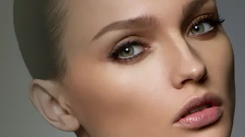
Retouching Workflow: Male Model Continued
Lesson 30 from: The Art & Business of High-End RetouchingPratik Naik
Lessons
Day 1
1Introduction and Pre-Shoot
19:30 2Shooting for Retouching: Beauty Look
27:52 3Shooting for Retouching: Beauty Continued
36:58 4Shooting for Retouching: Fashion
35:04 5Shooting for Retouching: Fashion Continued
27:47 6Shooting for Retouching: Male Fashion
23:13 7Culling for Retouching
16:47Annotating for the Retoucher
37:27 9The Retouching Industry
15:19 10What to Know Before You Get Started
27:07 11Tips for Retouchers & Gear
36:16Day 2
12Overview of Photoshop Workflow
37:29 13Photoshop Workflow Continued
43:34 14Retouching Workflow: Camera RAW
38:29 15Retouching Workflow: Beauty Image
30:31 16Retouching Workflow: Healing Brush
24:29 17Retouching Workflow: Content Aware
32:55 18Retouching Workflow: Dodge and Burn
31:08 19Retouching Workflow: Frequency Separation
31:03 20Retouching Workflow: Frequency Separation Continued
16:04 21Retouching Workflow: Color Correction
26:08Day 3
22Retouching Workflow: Contouring
34:56 23Retouching Workflow: Sharpening
17:39 24Retouching Workflow: Color Toning
28:54 25Retouching Workflow: Color Picker Table
20:24 26Conversion to Black and White
27:10 27Conversion Q&A
13:54 28Retouching Workflow: Luminosity Mask
14:31 29Retouching Workflow: Male Model
30:01 30Retouching Workflow: Male Model Continued
39:26 31Retouching Workflow: Fashion
28:39 32Working with Clients & the Business of Retouching
46:15Lesson Info
Retouching Workflow: Male Model Continued
Now let's go on to the next step which is going to be our cleaning not cleaning I'm sorry it's just going to be our dodging burn but before we do that I realized that felix start talking my head again he said would you please fix the background that will gap? I have a feeling that someone's going to ask on dh he's here with us even though he's not so so let's go ahead and see how I fix this now obviously there's multiple were to do this but I'm gonna show you how we do this I will stay in my cleaning folder and use emerge visible step temporarily okay I'm thinking as I go along so don't don't judge me I'm going to use this sample of the image and copy paste so I just use this temporary selection to grab that portion of the image so what we have now is where you get a layer you have his head floating on such a child you know that's funny so I will head command and click on that layer and what it does it makes a selection uh the what we basically have on that layer now did you know and t...
his is probably something that you may or may not know the cool thing about selecting before you liquefies you khun select an area and then go to filter and liquefy and then it only brings in that area this is important because if you have a camera that coming that has I guess a lot of demand for a computer and you go find the end and just thank you for every liquefy what you can do is just make a quick selection knew cliff I that portion you don't have to load the entire file again and again I just want to bring up that side point okay? So I'm going to select the layer itself hitting command and the thumbnail and I'll go to filter and liquefy and I will either do this or I will do another transform option and I said look, if I first because there's always a really cool feature here which is a show backdrop option so he'd show backdrop all theirs and I'll use bass exposure as a backdrop but a passive you be left down now I'm gonna start looking fine what's going to happen is you notice that as I moved my layer over you can see the backdrop and you can see the gap you can see where the border is see where it's going to be filled in and now you could just bring it over nudge it and okay the problem being sometimes your lines get wonky because you're losing liquefying afford warped full however you can use this guy right here which is a push left tool and then thanks to jessica we can go ahead and just move up push left keep wishing left and more left a little bit more and match the gap itself second you could do the same thing down here and do it accordingly so that's one option we can push it left and match it all up and then just mask it so it blends together let me show you another option I can basically to transform command tea and bring it left so everything has moved identically so I'd enter command d d selects and I will basically check out and see if everything's aligned and it is it's a little bit over that's okay come back here dropped the passage even see the overly area where it's aligned and not aligned so they go back in can t you can see that as I move this along you see where it's gonna align perfectly which is just about there ok now I'm going to mask it in so I use the mask invert that and then I will use my white brush I'll just say two hundred for now and bring it in however there's a little issue here and that is you have to get the mascot just right but as you do you can line it up so you just see a little bit of a gap and if it doesn't match up again now you can go back into this layer here it command tea and then bring it over like so or another option you can do is unlinked the mask. What this link button does here is let's pretend that I have this layer here, let me move this around like so what happened? This list little piece is showing you what's visible through the mask but as I move this layer around, the mask follows with it when you unlinked it. What happens is when I move this around, the mask stays in place but the layer underneath moves around so the reason that's been official is in original situation. We don't remove the math, but we do want to move underlying layer so it lines up perfectly so I'm going to uncheck the link hit command tea and essentially just move it over so you can see it fills in just a little there and does a good job doing self. The other issue we have with this with this section here is some of the hair has been brought over as well and that's okay, because we can do is still make the mess as it should be. And then we will go back to original air with our clone brush and just simply mask it out and what happens is the gap in the background is gone it doesn't have a little whole anymore and I would do the same thing essentially for the bottom, just using clone brush in peace take from inside like around his head instead of the outside where there's more information toe pull from her like what made you choose that specific part those because I selected really wrong theo theo theo backtrack however you're right you essentially one slept outside in this situation and there's a bring it in because right now I was like, oh my god, the hairs coming in everything's coming in that's a good question and it makes it even easier because once it's like this portion and bring it in you can mask it much quicker and much easier so that's basically kind of what I do there if I was going to be piecing it together now let's see here let's go back to our original function where we're just going to be dodging and burning so I will use another fuller they're blank ful blank folder and named that dodge and burn and here is where we're going to essentially just a production burl ears so I had used my critical actions here we'll have her dodging burn and we'll add a d saturated they're here now with our dodging burn again we used a de saturate layer just so that we can see the tones of the image and we will be essentially dodging bring so we make him look even more presentable then he is at the moment so again right brush set a flow down low to save one percent or so I find if using a mouse to dodging burn it's better to double whatever value that I'm using to be two or four percent instead of one or two and I am basically just going to be dodging burning now the thing about dodging burning is, you know, whenever you get really, really close, you could actually dodge and burn every single dark hair if you want to, but the reason I don't is just to essentially say that for, you know, using frequency for micro transitions. However, if you want and most people you know typically would recommend is actually spain and time just even out there's a little bit quite quickly through your dodging because it is not actually that long free to do so if you know how to dodge on dh spend more time practising with it this's why a tablet is so cool otherwise it would be really impossible toe do this with the mouse as efficiently and as quickly and you can see hear them saying you lighten up a lot of these dark areas so let's go back out again and focus on what we started, which is just our larger areas I'll start dodging on the shadows in the transition so that we get a beautiful fall off and some of the air is here next to his beard, so it's not causing us a lot of attention on may be the brow for line here, which is showing showing us that you know, the curvature of his brow line and the bone let's see here, there's this little piece here that's got to me just now and maybe some of the areas under the lip, so I'll turn on enough and you can see quickly that were able to just neutralize the ones that stood up. What when we talk a little bit about when felix was shooting about clothing and like the bulls and stuff in it, would you use the dodge in bern? Tio teo kind of smooth that out here. Is there another place that you do things like that? Sure, if I was to actually move, the clothing falls on the clothing, I will do it, including step however, I'm going to save that till we get to the fashion file. That way I can demonstrate better because it's a little bit more challenging over there instead of, you know, a couple of quick fixes here, so I'll definitely but yes, I would say that in the cleaning section, when we remove things in case there's something where client says, hey, you know what, I could use light in the folds instead of, you know, taking out completely this's where you do it essentially just going into your dodge and I'm coming here on dh just quickly lighting up these little folds to give the illusion that they're still there but less prominent and they had okay if they're deep deep fools and their complex patterns nothing which I can do with that unless there's good areas the source from word but light falls like this are no problem it's just awful when you have this whole short with wrinkles you get a steamer really helps use it at home so you know dual purpose business expense and personally sorry iris okay there we go uh move it more here quick little nauseam it's there you can see that you know when you dodging burn what happens is you still keep the realism of his face without going too far you don't have to be at the mercy of using things like frequency just even out something thistle I always recommend get really good at dodging burning you're able to really find tune things without messing it up you know for females there's like kind of the contouring guideline that you see is there any equivalent for males? I know that you're not using contouring at this point but is there kind of like a guideline as foreign lot of places that you want to add teo absolutely for guys I'm following the same guidelines as the female in regards to where to contour however I think my contract men are a little bit more aggressive because I found that the more you emphasize the shadows on a man's face the better his structure looks I think a lot of I've even in creative life I watch a lot of videos that say the same thing you know let's um enhance more the shot in the face to give him more masculine look emphasize because you read on soft light on men usually and so I did those principles from photography and brother over to the retouching side and use the same thing to emphasize it move it further it really chisels out you know a lot of their structure okay fantastic and uh jeez I should not have such fantastic but you know that's one of things it's my wife's what can I say way like it don't listen to him yeah all right I think contouring is more important for men than it is for women because what happens is when we dodging burner use frequency to even out his little micro transitions in the same in the same process you're flattening off their face a little bit even if you try not to so country becomes mohr of importance when you're dealing with men's faces okay dodge and burn now once we have something we're quite happy with her dodging we can start burning and you'll notice that I don't dodge and burnt the same time it's typically I set myself to dodge first and then I will go to burn leader also important to note is you can also start dodging a lot of the jewelry anything you want to stand out and bring focused here on dh maybe even some of the areas of the garment if you wanna bring attention to that maybe enhance things in the shadows okay so let's turn that on and off you can see essentially what happened was we can see and validate what we've done or not done do you notice over here that the color changed because underlying color of the hair is there? Is there anything you do with hands like if people have like the veins in the hands and they're really tense or anything yeah with the vase in the hands uh you see if he has an example here he doesn't but what I would do is during the dodging burn process our first focus on the structure of the veins because the vein will have a structure meaning on the outsides of be darker on the inside they're lighter so first I will dodge that outside the vein to the point where it blends in with the rest of the hand and then in my color stepper frequency I will just use the same color and blended in together that way the vein is still there but it's not there the same time so you don't removed completely but because there are some images in your movements completely the hand looks like a puppet you know that looks very bizarre because you're taking me the natural bone structure of the hand the cartilage, whatever it is and nothing's there so I tend not to remove everything but I tend to just lighten up to a point where it's not as visible, not distracting and sometimes if the image isn't a detail you can heal it out and then just bring it back with fayed because sometimes the veins are really small you can get away with that that's also another option? Well, you're looking around critique there's also a couple questions about apparently he's got a small scar in his right eyebrow uh I don't know if you wantto maybe show yeah, there you go, chair and this is a perfect setup for a couple of things in that case you can either burn it or clone it's you much the underlying layer let's see if this works to our burning process although lady think he looks good with you had a discussion back there we are way oh, you women all seen that. That is funny though. You know, uh when I was when I looked at this image with someone, I didn't notice that as much but I was pointing out I can't stop looking at it now it is an interesting question that it is him and that is not a transient yeah, yeah um so so those air hard questions to answer it is exactly because it comes onto the fact is where's image gonna be used is going to be his portfolio is going to be used for a fashion is going to use for commercial use an actor, the other questions you must know prior to actually attempting that because you notice way tried burning, however, when you burned it, it actually blended in, but you can still see there's a gap of hair, so in that case, what you'd essentially do is let me go in reverse that, okay, now I'll go back into my cleaning step let's say, over here, I'm gonna put a new blank there and kissing, too adjusted her moving around. I'll take a low flow said to twenty percent, I have my clone brush selected, and I will select mary over here and brush it, and what happens is it fills it in very subtly, but to the point where it could disappears and maybe some over here as well. And what happens now is you don't see it as much, and it still allows you to then control the capacity of how much you want to bring it in or take it out it's amazing how well the clone brush works at a low flow with a white soft brush. Phil's things in really naturally and you'd be surprised to know that the edges of the stunning areas don't bleed together as much as you think it is there you have it the um that part there is gone we have our dodging and burning and see what else will we burn uh what else do we do here? Maybe I'd continue dodging some of the areas on the neck one thing that I know has happened is once we start dodging burning and re touching the things that we want to remove the most other things start standing up to you this is also why people over retouch is because they just keep going and going and going this is why your original game plan is very important don't keep going further then you know you really had instinct for in the beginning because it lends itself to going too far okay no we have our dodging burn done I want to go ahead and fix let's see either we're going to go toe frequency right now or we're going to go to car fixing a color I'll only go to frequency if there is something that I want to blend in terms of our transitions I think because he's a guy and we need to keep a lot of texture and poor structure there we're not going to use the frequency of this moment since it makes no sense for us based on what we're working on and again you can see I did everything through dodging burn frequency wasn't needed and you didn't take a long time either so let's go ahead and use our colors fixing method next and so bypass our frequency and we'll go into color correction so go color correction and he would go and do our same step we'll we'll have our blank layer I was set to color we will take our brush said a low flow make sure blankly selected and we'll sample the color right outside the patch of gray area and blended in and so you can see what happened was the actual gray area became the became the area of the skin tone which is exactly or what we're trying to do is blend those here together this is why I worry about light and color separately because I could easily say hey you know what I'm going to worry about that later it's not a problem because easily fixable sablikova here and just blend that a little bit also I will sample the color down here and fix this up just a bit so it's not so great out I tend to notice that the camera captures this area much duller than it actually is in real life so this allows me to fix that real quick as well I may even start to fix some of the colored regarding the veins so you can use the color in the eye to basically fix that up just a bit remember that isil has texture. You don't to completely remove everything about the eye. You want you just the most obvious bits that are noticeable to you don't use a wide brush and just wiped out everything because it's kind of very obvious no matter what you think, because again, the ideas have texture so pretty just a point where your color correction it's not true in this image actually wasn't true in the woman's image either, but frequently you'll get a portrait where light's coming in through the year, and it's bright orange red. Yeah, and is this where you correct that exactly? Another really cool thing about smart objects is you can also do in small objects, you can use a different white balance, or you can go into the hyun saturation portion of the rock inverter and use a conversion that is less red or moves the reds to oranges, or are just yellows, whatever the case, and then overlay that for years, and that will fix really deep transition. So in case it doesn't work here and you know that it's going to be probably there, you can go and do that as a smart object, because, again the smart object and the brothel has much more color information. As well as light information so you can tweak and expand things much more so exactly in that case, if it was a minimal effect dude here, but if it was a grand effect, I'll do through camera be a good way to fix like, discolored hand. Exactly, and I tend to notice that the discolored hands appear to be more red than the actual body of the face, and the reason for that is there's more blood flow that goes to the extremities or there's less blood flow. So you get either, you know, colder, darker hands, you get really warm red hands just based on the way the models positioning. So in this one object, you can say, hey, I notice it's more red than it is neutral and go to your human saturation adjustment panel in the rock converter weaken, treat colors in move reds, oranges and then overlay that just for the hands and then takes care of everything. You could even adjust the lewins value of each individual color in the rock converted to so it basically allows you to shift colors left and right. I'm going to go and show you that because that is something that's really critical, and I don't want to skip out on that limb he should everybody understood that portion, so let me go and say file open recent and this is if you're not aware of open recent uh I used to go and manually find my files again and again and then some toy open recent oh my god. You see what your time now let's pretend that you know not that he has anything wrong let's say that you know, maybe we wanted to bring his ears down well, bit more neutral color we can say okay I mean first opened it as an object smart object and then now we will create a new small object via copy and in this portion uh we can go into this little tab here that says h s l hugh saturation ruminants you can say okay, you know it's too red that shift over you can see the ears going red to orange and anything between you can say hey, you know, these eminence it needs to be a bit brighter or darker just based on how cold or warm the hands are and then we can overlay it with a mask and that fixes grand changes. So again a black mask and then we have a regular brush we consider really, you know, gentle flow that is a little quick and essentially overlay it it's not a perfect conversion yet, but the emphasis being that you can go in tweak the ear to whatever exact tone you're like where models so pale and as she has like blocked yourself like bluish and pinkish at the same time so do you just tackle it one by one the blue and the pink or huges yeah what I would do then is within the color correction folder I would use that blank letter said to color and then just sample that pale color and then just brushed over because then those blues and those greens will all become that pill exact color or if the color mo doesn't work you can select uh I think it's hugh file open recent so instead of the color mode here in case that doesn't work you can go into hue and that will take care of it in case you know, the difference is that the color mode has both light properties and hugh properties so you have the color that you selected as well as how saturate that color is that you selected so in case the arm itself has different total saturation we're gonna keep those levels can just select you instead and so the pale colors will come in but the saturation will still say the same from whatever it was underneath. All right, well let's see here did you do anything at the moment? Yeah, we did that's right? We did some the cheek soul d select diesel like that real quick and now I'm going to see the kind of image make sure everything I sense you want to do is think air which it seems to be the next part is essentially the extras so if you want an electrifying and sharpening and color toning, I will go ahead and demonstrate the difference with sharpening because everything else is about the same but with sharpening what we can do is go back into our extras folder and set that up extras and we will then merge visible so we have a copy of everything we've done so far and I'm going to selectively sharpen so again filter other high pass and I will use a value that illustrates a lot of the clothing and so the hair and the eyes and from this level I've noticed that it quite does quite well even though there's some color coming through which is okay as long as we get most of that detail present and that is fine well but less maybe okay, okay select soft light use a mask and then just brush it in you see what's happening here very minimal if it's minimal I always got a hard light and see a pronounced effect and that I think is more apt for this particular image I'll definitely do it his watch, jewelry and washes and anything else works amazing with the high pass especially the higher value it tends to make it more um pronounced considerably so maybe not on the hair that didn't so great. Okay and again since he's a guy you can also go in and and handsome of thie facial hair too, which is totally fine okay also go and try some of the levels as well I think that effect was quite nice on the other image and I'll go in tampa round and focus on more the clothing more so than his face, so don't worry about that we're gonna mask it out a bit, okay, maybe not so much in shadows more so from the highlights and I like the way the jackets really coming out now so I'll go on mass that in and bring that back ever so gently and keep that to luminosity so our colors on shifting so much maybe a little bit higher flow then that together okay, see how that looks so these two areas here really emphasize a jacket in the clothing this's something that's great, especially if you're doing more fashion related images where you want to bring attention to more of the clothes than himself. This will do that for you. It really brings together a lot of the attention and that little one percent extra that really makes image pop see here the thing I did forget to actually mention was this area here where I would typically just go ahead and burn it out or save that layer on cloning out just depending on which ever option you prefer but that's how we take care of that now colored twenty wise for men I think it's about the same but what I would do differently in regards to him let's go let's practice and feel it out with men I typically stay away from color tones are two over the warm I think cooler tones look better for men it really defines him out so perhaps we can go into theater curves uses option here thinking there's no rhyme or reason wipe use curs rather than selective color and so forth was just you know, personal preference and just experimenting I couldn't introduce a lot of booze into the limiter booze into the shadow thing that looked quite nice uh here bring it back, bring it back down the highlights maybe so it's just in the shadows on dh let's what else we could do with the greens? Maybe a little bit of magenta overall so what we get is instead of a yellow cast we have a more unusual cast on the image and maybe if you could do a diy situation overall so I'll go ahead and put hugh saturation and de saturated overall just about at minus ten or so so it's not oversaturated it also brings attention mohr to the colors that we have and when you when you see such an image and take away the colors it focus more on the expression and also on a lot of the detail within the image. So whenever you see a lot of fashion we just to be clear there will be more d saturated then um saturated to normal levels that makes sense. Now let me do one other thing let me double check and see that secular correction color toning that's my mistake now in her levels I want to double check we had all the areas that we wanted to bring out, which we do ah clark crecion set there and her shopping's done says you can see working on a male image isn't so much different terms your workflow but the mindset is over different in terms how airport skin and what you leave, what you don't leave clearly it's much faster than working on a typical image because there's less work to do so that's pretty much everything I have for this portion and regards to working with males I wanted to see if you guys have anything to clarify. Yeah, I see a lot of photographers doing this they adam noise at the end of a very touching image you feel about that and have you ever and do you usually do that are good question I particularly don't because I find that when you retouch correctly to start with the end result really speaks for itself and I seem to find that people who are doing a lot of the times not all the time will do to mask mistakes or mask skin that's overly blurred or mask things of that nature with their blurred and admit that was a really old technique people used to do uh sometimes it still is taking some people do to, you know, kind of quickly work on image, but I'll definitely avoid doing that for the sake of hiding something, maybe adding a little bit of gray fur texture in the background and things like that maybe an okay idea, but I would never consider adding green overall tone image unless a class specifically asked me to do so excellent and the other questions in the room. So one thing that we haven't really talked about much, but we've been getting trickle questions on is the question of file size yeah, and then how smart objects of affect that layers affect that how big deer files end up being and how do you minimize that as much possible? Sure so let me give you a good example. Yesterday we worked on that face on fall and today from the point we left off yesterday it was one gig, however is one gig with everything, and it was a phase one five, fifty mega pixels, so it wasn't that big in relativity to what we're working with however, if I'm working with an slr image that would essentially amount to half a geek or under half a gig sometimes if I don't have to do and liquefying, which is where a lot of file size comes from because I'm doing a duplicate copy or if I'm not having to do sharpening on many levels, the false leads can be extreme small three hundred meg's or less or two hundred fifty megs because essentially creating blank layers my adjustment leaders don't have any weight my healing cloning or just blank layers that I work on I'm not duplicating the background and even dodging burn are essentially just adjustment layers so from doing things by the book and I'm just hearing your cloning dodgy and burning and then doing a bit of color correction it could be really light and starting off a p s t would be around hundred meg's on entry makes maybe defending and at the end it may be doubles so a clean workflow benefits you not in just time but saving space and efficiency and another way to check is sometimes you know, seeing what layers you have and just figuring out what happens when I double the book it'll air how much is it increasing so again um my mind stay under four hundred makes I would say just depending if it's sixteen bit ill you know, increase obviously, but I never have follows that over two gigs or anything of that sort, so if you do have files over to gigabytes, you can say it as psb b as in boy because that will allow you to go over to gigabytes and I don't know if that has changed or not, but I do know that was the case prior to when you save a really large cities great one from the elusive green cup, which is along the same lines do you do you save different progressions of the edit as different files? Or do you just always keep the individual layers and does that actually slowed down photoshopped as you're working to have multiple layers like that? So basically, I don't say multiple copies or anything like that everything, captain one psd, any revisions are then done either over the psd honor on the top or if I feel really easy, I'll flatten everything and saving is their copy and into revisions hopper that that's really the interests? I would recommend doing that, but most of mine are literally one pierced e and then one that I'll actually sort of answer for you, but I'll give you a chance to answer it if you want we got rid of god town, he says hey critiquing amazing session that's far totally worth waking up late night flora believes in india says my question is, what is the checklist to make sure you've done the basic retouching? And more importantly, what is the checklist of common efforts, which khun spoil common errors, which can spoil all the efforts you want. Talk a little bit about the work workbook notes that you have included for people who purchased the glass. Exactly that's. Why include a brilliance of notes? Enable people to see a checklist of what you shouldn't should do as well as kind of an idea. What you work for should be, and what it should include.
Class Materials
bonus material with purchase
Ratings and Reviews
Valentina
Pratik has been a revelation and a revolution at the same time, even kinda a benediction because of its huge generosity to show us such an efficient and powerful workflow. His genial approach turns impossible things into possible. What amazed me most, was Pratik ability to see further the shot and take the best of it to reach the perfection. The original photo is still there, very recognizable, but through a precise and meaningful workflow, it becomes eye-catching, high quality, high impact. Pratik is a wonderful person, very genuine, high talented, with a sophisticated sense of the aesthetics and arts. This course changed drastically my way to look at photoshop and at the retouching techniques. Thank you!!
peter
Really wonderful course, thanks. May I suggest a fantastic idea for maybe those who purchase the course? It would be extremely useful to be provided with a summary of the content of each video segment, perhaps a 30-60 second video with written 'dot-point' sheet at the end of each segment, to be reviewed at a later time. It just takes too long to replay each video to get the important messages. The notes provided by Pratik were a step in the right direction but they need more detail of what was presented, including tips and tricks, in each segment. In this way, once having watched the entire course, you could go back and review the nitty-gritty aspects of each segment quickly and efficiently. These quick 'summary' clips could make up a separate 15 minute video, recapping in detail the hard-core content of the course, without interruptions from questions. This would be extremely useful and hopefully not take the presenter too long to film. I feel this would be a wonderful 'added value' aspect of buying the course, as it would not be available for for free viewing. It would certainly encourage me to buy more of the available courses. Keep up the great work at Creative Live! I have stopped my Kelby subscription and just watch you guys now!! Well done!! Peter Bourne Australia
user d3cdf7
I have been a retoucher since 1992 and a commercial photographer and I am amazed at the wealth of information Pratik is teaching us. Love his great sense of humor. Yes, retouching takes me way into the early part of the morning...up to 4 am. I've learned to listen to Books on DVD from the library which help my attitude much better. Several degrees behind me and I know I was meant to make a difference with portrait photography. NO ONE wants reality, especially at elder ages. So I continue to learn to retouch professionally and not use a quick retouch filter which renders a fake look. I may incorporate a light retouching filter, but I find I must always do some manual retouching first, in order to have the appearance look real. Which is the old first rule to retouching itself. In the film days, I use to make my own texture screens in order to create more beautiful faces. My photographer friends would ask for my help in using them, when they had blurred an important celebrity shot. The texture screen would help spread the dots and give the appearance of your digital noise now. The results were the image looked more focused Thank you Pratik Naik, for being so generous with your techniques. I am interested in how to price out retouching jobs, as I have been told I give my retouching away with my photography. Thanks,, Jeri Goodwin-Akari cherished moments photography in walla walla, WA
Student Work
Related Classes
Portrait Photography