Retouching Workflow: Color Toning
Lesson 24 from: The Art & Business of High-End RetouchingPratik Naik
Retouching Workflow: Color Toning
Lesson 24 from: The Art & Business of High-End RetouchingPratik Naik
Lesson Info
24. Retouching Workflow: Color Toning
Lessons
Day 1
1Introduction and Pre-Shoot
19:30 2Shooting for Retouching: Beauty Look
27:52 3Shooting for Retouching: Beauty Continued
36:58 4Shooting for Retouching: Fashion
35:04 5Shooting for Retouching: Fashion Continued
27:47 6Shooting for Retouching: Male Fashion
23:13 7Culling for Retouching
16:47Annotating for the Retoucher
37:27 9The Retouching Industry
15:19 10What to Know Before You Get Started
27:07 11Tips for Retouchers & Gear
36:16Day 2
12Overview of Photoshop Workflow
37:29 13Photoshop Workflow Continued
43:34 14Retouching Workflow: Camera RAW
38:29 15Retouching Workflow: Beauty Image
30:31 16Retouching Workflow: Healing Brush
24:29 17Retouching Workflow: Content Aware
32:55 18Retouching Workflow: Dodge and Burn
31:08 19Retouching Workflow: Frequency Separation
31:03 20Retouching Workflow: Frequency Separation Continued
16:04 21Retouching Workflow: Color Correction
26:08Day 3
22Retouching Workflow: Contouring
34:56 23Retouching Workflow: Sharpening
17:39 24Retouching Workflow: Color Toning
28:54 25Retouching Workflow: Color Picker Table
20:24 26Conversion to Black and White
27:10 27Conversion Q&A
13:54 28Retouching Workflow: Luminosity Mask
14:31 29Retouching Workflow: Male Model
30:01 30Retouching Workflow: Male Model Continued
39:26 31Retouching Workflow: Fashion
28:39 32Working with Clients & the Business of Retouching
46:15Lesson Info
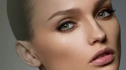
Retouching Workflow: Color Toning
Let's talk about color toning big topic, right? Like how do I get my pictures to look like stephen myself and again she don't shoot like seeing myself it's not like that, so color joining the color tone is not the answer for the reason why images don't look like top tier images. If you notice, for example, this image, I'm still going to get questions from people. How did you color tones image? Did I call too soon? You know we had our capturing workload, which had these minor tweaks right for white balance and shadows and stuff really didn't color tone anything. This was done because felix took the due diligence before to actually have presets and within their capture process to have a really good look, and it wasn't too far from base, if you remember his tweaks were so minimal, but the reality it's all about the planning stage, a lot of the tones come from the planning stage, so eh? Either the color is influence from the planning stage or b it's thought off on what palates are going to...
use. For example, we spent two hours the day before the shoot actually planned what backdrops we're going to use and what color the dress was going to be, as was the makeup we also plan what type of materials, each material, what materials each element was goingto have so for example the background had this really beautiful texture which is all upon backdrop if you remember so the texture in the backdrop was actually on set is from the backdrop now the dress itself contrasted really well with that backdrop because it had a lot of elements that really pop on camera and then as you can see the makeup and here matched all of this theme and all this place into effect if you ever curious about this theory look at a behind the scenes video of your favorite shoot because a lot of them have them whether it's, gucci or any of these brands or products you notice how much work they've actually done sometimes they ask me how do you get the model looking so tend on the photo and they showed me a model who's really pale I'm like look at this bison video they spent the time doing the makeup and making her really bronze and ten as much as possible before getting on set retouching is not an afterthought it's a thought that comes before the actual shoot it's all thought of its not guesswork okay so think about things that you can do part of the shoot for going for it with that said what do I do on my side or garcia color tony a few things color toning is three things for me number one walk colors going to be in my shadows what color is going to be in my highlights and what color is going to be in my mid tones that is what I'm going to teach you I'm not going to teach you how to transform your image is something magical that is not what I do what I do is I can color grade and color tone just like you'd see in the movies very cinematic look looks that are inspired by cinema ok so just important fact because I get this question all the time next you can also change the tint of the color or tone of it so what I mean is if a new images blue how can I change it more to science or how can I change agreeing to a more of a yellow those are the two ways you can essentially color tone aside from that good luck to you I'm just kidding but again do your due diligence and it will make sense when you when you keep this formula in mind okay now let's go ahead on and I say this image I am going to go ahead and continue with my process here using a new folder we're going to set it to color toning and over here is where I'm going to get all these options on how to color tone your image is first and foremost how do you know what to tone your mba ages? You know color tone is actually the most individualized a form of expression, right? When you look at two photographers, no two photographers have the same color tone unless they're copying each other. Or unless it's very trendy to have the same color tone. So I have something that I use that I find really interesting to help your color tone and it is something, but only for shallow seas. He just added back into their extensions in which is called adobe cooler. Okay, cooler is fantastic because it gives you fantastic ideas in how and what colors to use. Just based on a random starting point. So first and foremost under window, you will see extensions and cooler. Now, if you don't see this extension, what you can do is I have miss little j pick that essentially will show you where to get it. Um, under creative that odo creative dot adobe dot com slash add ons, you can go and search for doby cooler, and that is something to bring back into photo shop. See, see it's actually redesigned and it's actually really beautiful and much better than what is now in the version I have. So there you got funny enough. This is one of those things that I never really discovered. Recently I said, what was that I saw someone using in their video on dh. I was really treat and finally I said it and I got so excited it was like the reasons for, like, ten years you should know that by now. Sorry, he's. Ok, now, um, the way this works is that over here, when you load cooler, you will see under the create top you will have different options. So it's a select rule and you have this different options if you want to keep a tone very monochromatic, you have all these elements that you can play with. So just based on the tone you're going for, say you want a more cooler tone, and I think that toning should be based on whether or not you wanna have a particular emotion. So saying this image, the emotion seems very warm and engaging. So you go something like a warm orange tent, for example, I'm gonna show you how I use this in a minute, but here's something quick overview of what I use now triad essentially goes into the three points that air, you know, corresponding to each other on the color wheel, so it gives you very nice colors that complement each other without being too similar. And I really enjoyed this feature because triad is something I can use for my shadows, tones and highlights so let's, go ahead and do that let's pretend that we're going to use triad as our method of choice for our killer twenty the other cool part about this is you can adjust the luminosity of the color so you say if you want a darker version of that color you can adjust that and so forth insulin so the options are quite vast which makes it fantastic okay also you have other ones just letting you know you have a whole list of them compound so forth and so on so let's say that we want to use triad again all right now pretend that we want to go ahead and let's say you something like this what we'll do is add justine tore swatches someone going to window ah swatches and say add this seem to swatches so I'm gonna click this little guy here and adds it to the swatches however if you have a bunch of swatches and you wanted to clear everything I learned this recently too and I guess because I never really huse watches so much you go on your preset manager you can click on one command a and then delete and had done and clears all your swatches for you fantastic now going back I mean at this time to my swatches and I'll have all these colors loaded so I'll go ahead and close out of color and I will use what is known as ingredient map to map out the tone of my image and it's the most uh I guess it's the easiest way to go ahead and twenty mitch is because you just have to input points on where you want your shadow highlight in mid tone color and then it just tones it for you which have any guest worker anything now I can go under great map here under the just mint uh distantly a paddle and when it starts out it's going to start out very funky it could look like this it could look a whole very, very different kind of ways, but the main important takeaway I'll bring this panel up here is once you load the grady in't map adjustment there don't freak out because people tend to freak out for some reason they don't want to do this are calling the moms you know, really unsure of their life they decide they don't want to forget anymore and sites like calm down we can fix this and we're going to do now is under the great mountain bar you will see that there's a couple options what I want you to do is double click on the actual bar itself when you double click on this bar you're gonna get your going to get what's known as a great editor this is where you edit the points based on whatever color you want where so again I'm gonna repeat that one more time because it's very important and because I want to see my swatches good double click on the ingredients bar. No, I have this editor is beautiful editor like using all sorts of options and beautiful presets even. And so this really lends to playtime. Now, here is where it gets really fun at the bottom. When you click on these points the bottom left and right, this is essentially your history, graham. You have the black representing all your deepest, darkest shadows and deepest, darkest heirs of the image. And your white is your white point, your brightest areas of the image. I don't know if it's actually really hissed aground, but it represents your shadows and highlights. Okay, now, with his greatest editor, we can also add more points we can say, you know what? In my mid tones, I'm gonna have this point right here, and what just happened was in my mid tones, I added a whole bunch of highlights and blown out areas. It looks really disgusting. That's okay doing. We're not applying this as it is. We're going to be playing just the color values from whatever we just entered. Now, who want to use a great editor and cooler together, we have wristwatches, which is going to bring to the gap between the two elements were going to click on our shadow color, we can double click it or you can just click on this color option here same thing and we're going to click use a color for our shadow so let's say I want this beautiful sayin e blue color for shadows I'll say yes so say for our highlights I want something yellow so I'll double click that quick on the yellow hair okay? Or I can click on it once and then just come over it's like the yellow so a bunch of option same thing doesn't matter again clicking on my mid tone color and I'll either say select this red color and I probably won't translate walter skins I'm gonna override that manually and say I'm going to just add two maybe something neutral and warm like so and again this is looking really disgusting I know relax I came to see the collins what did you do? And you're done right now. Yeah, I'm done. We're done thanks to you guys. Okay, does it now with the gravy editor applied? I hit okay. No. When I come here and move this panel over just so it's on the way I'm going to go and go back to this adjustment layer here with the greedy map again and go in time blending mode and said it too color and then I'm going to de saturate two zero percent and bring back and gently and what happens is you get a tent and tone based on your shadows and highlights just based on where you want what color the cool part about this is it's not permanence you if you like you know what I hate the way that renders that color we could go back and change it we can say right now we'll go back in the great editor picks color we didn't like and then move it around because now it gives us a live preview of what's going on and this is fantastic because it really tense and tones exact value that you're kind of after and so you like this color actually works a little better for the skin on in case you don't want it you can neutral it put it back to neutral gray and it essentially want to play any card in the mid tones or you can have the color back in and so I'm gonna keep a little bit of warmth maybe just a little bit here and this will render differently based on what screen you're looking at so if it looks jaundiced to you, I'm really sorry it's not what I intended and that's not what it is okay, so brilliant so over here we have our shadow color which you can make even more vibrant but increasing the saturation did you know that the saturation actually goes from right to left over here on this color you have something unusual gray but over here yes something that's vibrantly blue appear going up and down is your luminosity from dark to light so that's why the color panel looks like this so brilliant so it okay all right okay and I will then just my capacity even more and you can see that it's very powerful because if I go two hundred that's not really pretty at all however if I go back down to say ten or fifteen percent it looks quite reasonable and it added and emphasized the feeling look, I felt that even should have this is what makes it so personal everybody's have a different opinion on what it should be what shouldn't be okay this is definitely one of my favorite techniques for color toning I'll show you a couple more because I think some of them even easier to use in regards to toning and some people just have preferences you know with foolish up you can get to the same point in various different ways it's never a knish you of sticking to want to just one tool color options are so vast in photo shop it's just based on what you liking what sticks to you? Okay now before I go to the next step in regards to other techniques I want to show you some pre sets a really fun to use uh within the grated editor grated map okay so within the greedy map itself going back and clicking on the bar you have these look presets here just his color harmonies one and it builds in and you can click on this individual um presets and they give these individual looks it's almost like their own individual actions for your great an editor and it completely changes everything about the image we have neutral densities and it replaced it completely oh that's just unusual colors and things of that nature you're the pastels which are really beautiful and they present a really harmonious way very soft way to look at images so you can see the actual image changing as adjusting these variables just because my capacities quite low and you can see the color is going through so see that you don't like anything you need counsel and reverts back to whatever it is that you had originally set too okay now let's pretend that was stupid and nobody liked it ok like this is way too complicated to create something easier we're going to go in and use my second favorite method which is probably more technically accurate method to see so I'm gonna say it's my favorite method but it isn't curves now with curves what happens is that you have the ability to let's see here I'll go in here and make it easier for you guys to check it out to go into these each individual channels so say you have red, green and blue as your channels and if you're not family with curves or what red green blue is it's essentially your channels your color challenge that have been imaged thes three color channels make up all the colors in your image we combined them together so that's what it is okay red has two colors and they both they all have two colors under each individual channel so red you have green or science or so for some reason it's rendering green but it should be science you have read going up and you're taking the reds which is adjusting to science so say you make a point on a curve the way to delete that is either hit delete or you can just drag it off the curve and it pops right off sometimes have people making multiple points they can't get out of one and really create a big problem it's next um under green we have green or magenta tze and then under blues we have blue and yellow so when you combine that with the no that's what I wanted to when you combine that with the power of curves what you can do is control the individual areas that you can apply colors to so say for example you want a particular color in the shadows but you can easily do is go under the individual color channel and adjust the color based on where you want it to be sure what I mean let's pretend we want blues in our shadows we will go ahead and come under the blue channel first and foremost and apply level of blue within the shadows. They're two ways to do this we can either um I'll show the easy way first we can either come here and add points to the intersection to each intersection and the reason I did this is based on the corresponding air the image so say the point in the middle this would be essentially kind of your mid tone range ish just based on your history, graham because if I look at my history I'm here you'll notice it's going from here all the way to hear so your highlights air here your mid tones are about here and your shadows and deep here is about here, so if I bring this point over to her, my dark areas are along the same curve and then I start bringing the curve up like this. This point is going up where the shadows are. And so what it's doing when I turn on and off is adding blues into the shadows without really contaminating many of the other colors of the image because these points are kind of anchoring them down and so what this allows you to do is really create fine color tones just based on knowing word chord you want where you can say, okay great now I want more yellows in my highlights you can bring that down over here and you're creating a more, um cinematic cinematic look so two ways to get to the same point, okay? And similarly you khun build and add other effects like you if you want the image overall more green or you won't take away the green because you realize that you know you want it to be more of a magenta cast, you could do that you can also use your arrow keys to control the points on your curve because if they're minimally they're quite sensitive, so if you're very gentle with it, it becomes much easier to control. I want to show you something else aside from curves in case you didn't like that either you said you and that was stupid I want to see more things, okay, great. I like the attitude that's what we want to hear all right, so pretend that you know these two things justin did for you you know, just didn't click with you you want even easier your tires nonsense. Okay, so I want to go into my adjustment lear again and it's selective color now selective color also has a three ranges of shadows highlights and mid tones because if you go into your drop down menu, you will see that black has a couple of options black has the ability to adjust the dark areas of the image and this is how sometimes you can fade out and image so if you see a black eye means that looks kind of faded this is also a very easy way to do so along with using curves issued like as well so for instance let's pretend in my shadows I want more of the same thing a bit more science in the shadows maybe I will enhance the luminosity of the shadows is to bring out a little bit more a little bit of yellow to me with a green cannot green green's kind of nasty so it goes all the way on dad somewhere blue yeah I think blue earth quite nice and again you know you could use a dhobi cooler to see what works what doesn't before even going to step if you are really bad with having color choices because you know not everyone's born with or has an eye to see what clothes they like it's a very expensive experimental process so again now go back to our whites which is our highlights and then adjusted from there as well. This is what I love about this is you have these will sliders to go back and forth there's no fine tweaking your guesswork it does it for you it's very I guess process uh you don't have to think very much and sometimes when you're three hours into an image, not thinking is a good thing sometimes, okay, so I didn't do so much, and I think the reason is most of our image is currently in the mid tone range of our instagram, so goingto neutrals and just like I expected, you can see that a lot of the skin and so forth is adjusted based on me shifting colors in the neutrals so there we go. I think this is something that has come out quite beautifully good turns on and off, and you can see that it has gone from something that is quite nice, too, something that has a really beautiful tone. I like this tone, there's something I think I want to stick with, so the end, you know, this tool work better in this situation, but it may not work better in all situations, so you can see that when I look at the background, it has this really beautiful blues and one thing that I like to study my client's work or whoever you're, you know, whoever it is that you're working for and see what their preferences are like, for example, I know when I look at phoenix work, he likes that really cinematic tones are rich and intense, and I like to transfer that principal over when I retouch for him, so when I'm when I made my choices with color I realized that when I selected blue attended to remind me of something and it reminded me of his course of soup rice when they had a lot of his work posted and and he chose one of his images that had a lot of blue tint going on said I really like that image and stuck with me so therefore I will lend to what I know about felix and applied here so that's my thinking process regarding uh color toning I do have one more cool thing to show you're going color toning which will do after the break one of the thing that james uk miriam m and a number of other people were asking about is specifically shifting orange hue skin tones to brown like when you know aye somebody goes tanning and its or use fake tanner's really awkward also you know brides with farmer tans and their dresses I'll talk about the farmers ted at the moment although I don't have an example of farmers ten what I would really he recommend doing is they're two things that well typically happen with skin and hans if you notice with the ten with farmer's tan for example you will see that there's a white stripe on the skin and the surrounding area is much darker it's what I recommend is actually just dodging that out using their curves or you can go on your frequency again frequency and sample the color of the darker area and then paint that in over the white area and what will happen is it will take the exact color blended in but keep the texture and that has saved me so many times usually I would have tried to take the patch tool and you know, patch over the farmer's tan in mood for it so with that typically it doesn't work very well another thing that could be very important to do is I'll show you real quick is going and selecting say either you're hugh saturation and this is shifting tones so if your town looks very fake and you want your tend to still be tan but also keep it much more of a natural color because spray tan is very obvious you would essentially go into red channel and with your red child you khun tweak your hugh left or right so if a model for example let's say this was the model and she came out like this with a spray tan this would resemble something very close to spray tan where the town looks very orangey and very golden but you want to push it back to unusual tone you're going to your reds and then shifted left right accordingly the other cool thing to do is in case your tennis too dark or light you could go into your reds and shift how light or dark that tan is and then it encompasses for however darker like tennis as well as the color so those two options and combine them will allow you to really take care of tans and color shifts in regards to skin tones love it. All right, we have a question from joe topping photography who's asking why you use relative instead of absolute when the reasons I use relative over absolute under my selective color is why I believe he was referring to let's pretend that we have a shift to magenta in our black tones. A lot of the reason is the mount of shifting that I do within each area is essentially very minimal so that what happens is my difference is not necessarily that vast and I think for example it may be down to personal preference let's say that I'm shifting my black tones in my white channel or I should say that black slider in my white channel left or right with relative it pronounces the highlights quite nicely with absolute what happens is if you notice it's quite unnatural so although absolute seems like a good option in many cases I think relative seems to do a better job for most of what I do just because I have more texture in my file it may differ from filed off also it's worth playing around with however I've seen to notice that most of my experience has been set to relative
Class Materials
bonus material with purchase
Ratings and Reviews
peter
Really wonderful course, thanks. May I suggest a fantastic idea for maybe those who purchase the course? It would be extremely useful to be provided with a summary of the content of each video segment, perhaps a 30-60 second video with written 'dot-point' sheet at the end of each segment, to be reviewed at a later time. It just takes too long to replay each video to get the important messages. The notes provided by Pratik were a step in the right direction but they need more detail of what was presented, including tips and tricks, in each segment. In this way, once having watched the entire course, you could go back and review the nitty-gritty aspects of each segment quickly and efficiently. These quick 'summary' clips could make up a separate 15 minute video, recapping in detail the hard-core content of the course, without interruptions from questions. This would be extremely useful and hopefully not take the presenter too long to film. I feel this would be a wonderful 'added value' aspect of buying the course, as it would not be available for for free viewing. It would certainly encourage me to buy more of the available courses. Keep up the great work at Creative Live! I have stopped my Kelby subscription and just watch you guys now!! Well done!! Peter Bourne Australia
Valentina
Pratik has been a revelation and a revolution at the same time, even kinda a benediction because of its huge generosity to show us such an efficient and powerful workflow. His genial approach turns impossible things into possible. What amazed me most, was Pratik ability to see further the shot and take the best of it to reach the perfection. The original photo is still there, very recognizable, but through a precise and meaningful workflow, it becomes eye-catching, high quality, high impact. Pratik is a wonderful person, very genuine, high talented, with a sophisticated sense of the aesthetics and arts. This course changed drastically my way to look at photoshop and at the retouching techniques. Thank you!!
user d3cdf7
I have been a retoucher since 1992 and a commercial photographer and I am amazed at the wealth of information Pratik is teaching us. Love his great sense of humor. Yes, retouching takes me way into the early part of the morning...up to 4 am. I've learned to listen to Books on DVD from the library which help my attitude much better. Several degrees behind me and I know I was meant to make a difference with portrait photography. NO ONE wants reality, especially at elder ages. So I continue to learn to retouch professionally and not use a quick retouch filter which renders a fake look. I may incorporate a light retouching filter, but I find I must always do some manual retouching first, in order to have the appearance look real. Which is the old first rule to retouching itself. In the film days, I use to make my own texture screens in order to create more beautiful faces. My photographer friends would ask for my help in using them, when they had blurred an important celebrity shot. The texture screen would help spread the dots and give the appearance of your digital noise now. The results were the image looked more focused Thank you Pratik Naik, for being so generous with your techniques. I am interested in how to price out retouching jobs, as I have been told I give my retouching away with my photography. Thanks,, Jeri Goodwin-Akari cherished moments photography in walla walla, WA
Student Work
Related Classes
Portrait Photography