Retouching Workflow: Color Picker Table
Lesson 25 from: The Art & Business of High-End RetouchingPratik Naik
Retouching Workflow: Color Picker Table
Lesson 25 from: The Art & Business of High-End RetouchingPratik Naik
Lessons
Day 1
1Introduction and Pre-Shoot
19:30 2Shooting for Retouching: Beauty Look
27:52 3Shooting for Retouching: Beauty Continued
36:58 4Shooting for Retouching: Fashion
35:04 5Shooting for Retouching: Fashion Continued
27:47 6Shooting for Retouching: Male Fashion
23:13 7Culling for Retouching
16:47Annotating for the Retoucher
37:27 9The Retouching Industry
15:19 10What to Know Before You Get Started
27:07 11Tips for Retouchers & Gear
36:16Day 2
12Overview of Photoshop Workflow
37:29 13Photoshop Workflow Continued
43:34 14Retouching Workflow: Camera RAW
38:29 15Retouching Workflow: Beauty Image
30:31 16Retouching Workflow: Healing Brush
24:29 17Retouching Workflow: Content Aware
32:55 18Retouching Workflow: Dodge and Burn
31:08 19Retouching Workflow: Frequency Separation
31:03 20Retouching Workflow: Frequency Separation Continued
16:04 21Retouching Workflow: Color Correction
26:08Day 3
22Retouching Workflow: Contouring
34:56 23Retouching Workflow: Sharpening
17:39 24Retouching Workflow: Color Toning
28:54 25Retouching Workflow: Color Picker Table
20:24 26Conversion to Black and White
27:10 27Conversion Q&A
13:54 28Retouching Workflow: Luminosity Mask
14:31 29Retouching Workflow: Male Model
30:01 30Retouching Workflow: Male Model Continued
39:26 31Retouching Workflow: Fashion
28:39 32Working with Clients & the Business of Retouching
46:15Lesson Info
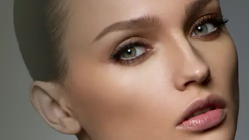
Retouching Workflow: Color Picker Table
First and foremost, I want to show you two more things on color and then we'll move on now, um, going back into our little color twenty panel let's pretend that we want to include, say, a blue tone across the image, but you only want to include it in the shadows and you want to really easily? Well, there is a quick and simple way to do that say I click on my curves um, I'm gonna go into my little blue channel little beutel not a big one tiny blue channel, because I am a tiny torture and I will find what I came from, sorry I'm gonna lift my blues collectively across the image, maybe even going into the chateau region and even the highlight I don't know where spontaneous like that, and now we're going to use blend ifs to make it easy for us to do so and blend ifs are really awesome because they just looked cool first and foremost, and they're fun to operate, I'll show you what it does. I'm sure where it is. Once you have included this adjustment layer for curves on your color toning pane...
l or your color chewing set, you can click on the adjustment layer right click and goes to blending options, and this typically is included within every layer blank layer and so forth now on this layer style panel which we're not going to go over in completion because this is something that is unnecessary relative to retouching whoever for graphic design and so forth I were I would recommend looking more into this now over here at the bottom it says blend if now what this means is I'm going to go ahead and show you that first and foremost this blend if is what we're going to be using and this bar represents the areas that are being affected at the moment the curve that we have, clyde is applying the color tint and tone to the underlying layer based on the values of wherever the highlights and shadows are know for example, let's say I move this underlying layer underlying point to the left and you notice that the area of her face is melting weird we, you know, orange, you look and the reason why it's doing that is when you turn this curve on and off, which I'll do really quickly, you'll notice that the skin tone is what we're showing through this original um I guess you could say orangey, you know, neutral skin tone is showing through let's go back into our blended area and we're going to shift the point over past the highlights and mid tones so this means is this curve that we apply is only being applied to the chateau region now there's one particular problem it's creating this really disgusting edge around the image and no, that was not intentional, so please don't do that. What we're going to do is we're going to feather that edge by holding all the option and clicking on that highlight point and what it does, then feathers that edge all into the shadows, and you can see that this allows you to really control where a particular color effect or exposure effect is going to show through. So for example, when hit, okay, and I'm going to go ahead and turn on and off that there, and you notice for most of the image, it's just applied into our darks and shatter region, which makes it very effective to control various, uh, techniques. Similarly, you can go into the shadow area and adjusted accordingly by moving the shadows to the other side and then essentially just fading out that portion into the highlights or whatever you'd like. So it's, a very powerful tool one I think I wanted to show you guys in case for those who are not familiar and gives you options to incorporate that into whatever it is that you're doing. Okay, beautiful moving on now I got questions about c, m, y, k, rgb and everything like that most of my work was based on rgb. So I don't have any particular preferences when it comes to see m y k I know it's a whole other topic seem like a printing and things of that nature. So most of my work flow, if requested and seem like a well either we converted later because I think the conversion is a pretty good job for my purposes, maybe not for whatever is that you do if it's more intensive to printing. But for me, based on my client's, ninety nine percent of time will be requested. Rgb if they want to see my k, I will then converted the end this by going to image, uh, mode and cm like I don't have any particular preferences because I'm not as knowledgeable on that side, but there are a couple things that I do in regards to printing because I got questions about proof setups and gamut warnings and things of that nature. How do you know where shadows will be clipped? How do you know if has got clipped? Typically you're printer's if in that depth and if they're knowledgeable, we'll send you what is known as an icy cia profile that you can load into your computer and within four shop to allow you to show what the printer will typically see as close as possible, then you can make your tweaks accordingly. Another really cool feature is what's known as a gamut warning feature now under window actually know under view there is an option called gamete morning and what this does is once the gamut morning is applied it shows you the areas that well typically be clipped or show you areas that won't or to saturate maybe and things of that nature basically color using or the exposure. So let me go ahead and say put a curve trying to stop and what typically happens as you notice on the fringe of the mouth you see these little bits that showcase kind of you know where the great areas are would show you kind of were they over exposed areas are and so forth and so gamut mornings really allow you to see where you have issues with print and where you can change that going forward so keep that in mind it's something that's very powerful I don't put a gun to use it all the time because what happens when clients any files, sometimes they're exposed the way they wanted and because it's fashion I can kind of get away with areas being clipped or blown out just based on artistic integrity of whatever the image that they're going to be using so that's a great part of working fashion and kind of be get away with some things here and there and it's ok but if it's things like book covers are going in particular print and it's very delicate. You have to make sure that you know your shadows on completely crushed your highs are not completely blown that's very, very critical let's pretend you have a screen that's not calibrated shame on you which you should be doing cal, bring a screen. You have another option on the fly? Uh, which is something that I see youse before now sure that right now as well real quick so I'll go ahead and delete that so I think to wonder window and info I can then, um take my color picker and holding shift an option but a point and it shows you my rgb levels for any the color and so let's say I undid that and added another point by willing shift an option if I color picker and enabling my color picker to plant a point right here under the info channel it can tell you precisely numbers of whatever color that is and whatever it should be and so forth so it gives you an idea of anything is essentially blown out clipped or if a particular color looks a blue on your screen or if it's more red because you know it is over here on the menu it shows you that under the blue it says forty the red say one there's more blue in this particular section and there are reds greens emphasizing that this color is blue by the numbers, so if your screens really messed up and it's saying that it's more red than blue but looks thie opposite way there's something wrong with the screen? So there's the two quick little tips that I do practice printing to make sure things are accurate, some class through the same thing to make sure everything everything is quite even okay, so that's that in regards to gamma mornings and so forth, my proof set up is typically going to be working seem like a, um or anything colors. So those other two options to explore by doing research, I'm not going to get into that completely because that could be a whole other course, and we're about just three touching portion more than all of that. Another question I got was saving for websites versus facebook and with what you're saying for facebook. Um, first and foremost, I mentioned earlier that I do keep it at seventy percent quality and the reason again for that and why don't keep it one hundred percent quality? And I don't want facebook compressing it on their end. It does a terrible job, I rather compress it first through photo shop because it does a better job rendering pixels and seeing what's more important, what isn't rather than doing facebook yes, facebook will still compress your images because of size eyes sometimes irrelevant, but you'll do it a lot less. Secondly, the size of my image, facebook likes to main sizes two thousand forty eight pixels on the long and again two thousand forty eight pixels on a long and or if that's too big nine hundred and sixty pixels on the long end, you're pixels per inch. P p ay noddy p I p p I is irrelevant for web in regards to that, your dimensions or what matters nine hundred sixty pixels doesn't matter three hundred twenty to one thousand whatever. Okay, so there may be an argument about that. I just want to put out there now. Um, let's, see tiff or psd? You can actually work on a new image and keep all the layers with a tiff file. The essential difference for me is the name psst. Being that photo shop so can use a tiff, but I think for categorizing purposes, it makes it easily more identifiable, identifiable to keep things in a psd format, at least for me and that's, the extent of you know why I prefer one versus the other there's, no essential reimer particular reason why I work in pc versus tiff on my layers and, um, see so that's about it for you know the kind of questions I want to clear from previous section let's go ahead and talk about the last color twenty method and like before we get before we go into our next topic which is black and whites and something that I want to show you guys that I haven't shown before, which is something that really excited about because um it's saved me a lot of time and it's something that I've always been wondering how do it better now um let me go ahead and first and foremost save again for all people or freaking out home but why I'm not saving I think you were concerned for me that I am for myself, which is probably a terrible thing to have to be that casual about it right now for a shop cia six and now cc is expanding on this topic which is the color lookup tables now under your adjustment layer there's a thing called the color look up which is really fascinating because in the film side they use color look of tables from what I understand and don't quote me on this is to essentially make sure looks are consistent between programmes or frames and things of that nature so you do multiple adjustments and you can compress it into one car look up file and this eliot e filers they call them and it allows you to get drastic and beautiful looks with the different algorithm so what that means is under this little color look up function which is located under the justice layers uh under color look up you will see that there is this little knew just when they're relatively new concerning wasn't in cs four cs three or things of that nature at the moment prior to cc it didn't give you a lot of options this is still cia six however, cc just released an update that expanded on this so what color lookup table is from what I understand how it operates, I again suggest you look into even for that I am describing is let's say that you're working on a particular color let's say that you have a science it replaces that sign with an exact particular the color without shifting any of the other colors so it's not operating based on the curvature so it's not pulling one color and point others along with it it's actually replacing colors on this three d geometric plane so it allows you to bend and push colors that weren't even possible a possible before so when they introduced cia six the color look up table what would happen is that you have these options now they give you preset so unfortunately it's not making customize at the moment but you can say say on his three d l u t file it gives you different options and they're very drastic, however it's not a terrible thing to be so drastic, because what you can do is let's say here, so change it looks drastically in a way that it makes it very hard for photo shop to do manually and say that I'll, uh, say hi this color toning and continue on with he's, different options, and what it does is it creates different variable looks that would be typically much harder to do. Two photo shop itself now they're so drastic, and sometimes they're so awful. But sometimes you get a lot of interesting looks, just based on whatever you pick and you can adjust capacity and stack them, which makes for very interesting results. And first and foremost on the surface, it doesn't look that impressive till you play with it. So what I recommend and I've shown this to few people, but on the surface they're like, yeah, whatever, till they actually use it on their images and adjusted capacities and blending those and then magic start happening. It was really beautiful to see what would happen when they combine color lookup tables with their images. So as you can see here, it allows me to really find tune and get particular looks that I like, uh, see, what can we do that really emphasises? Like this particular look here by hundred percent standard would be insanely moody and dark. However, when you're just a pass it you can change the way that looks and based on your blending modes go on dh ex um what characteristic is applied to the underlying layers? So that site bring that normal and there's even these other options? So let's, go ahead and bring that act hundred instead cancel and that was not really cool these always really weird abstract options which is wise call abstract and probably not good for us and then they have a device. Ling now the cool thing is that c s a c c gives you options the load and apparently, which I've heard recently called with custom um hello lookup table so essentially being able to transfer a particular look to someone else in one clean package so it opens a wide option for many creatives to come with particular looks and instantly transferred or I'm still exploring that, but again research that I think it be it's a fantastic frontier for color. Tony okay, great. Now, before I go onto the black and whites, I want to talk a little bit about let's see here um, smart objects now we're going to go away from this image, I'm going to use that in architectural image first to demonstrate kind of why I like why do black and whites the way that I do and why you small objects? Because I think it lends for better working example that can be applied to anything that you shoot so let's go ahead and first and foremost save this image and I'll stack this back into our panel here may be reduced capacity bit just included with the p s t I will say this and as you can see sometimes you know takes a while to save because as our stack it's higher just takes a little long get a load and save so I'll go ahead and close that with commander bu exit swatches did you guys have any particular questions with this section before we go forward? Retouching plug ins uh image gnomic alien where all that sort of stuff do you have general thoughts on those that you might want to share? Yes that's sorry looks like creepy hover um you know what that is the day it's all about your vision, right? I think we get caught up in terms of prestige in elite nus about how things should be done and it's kind of funny mention that because this is a high nutrition course and I would never say that you should always blurry images and destroy pixels and things of that nature so personally I don't use any plug ins like portraiture or things like that sorry, portraiture, I don't, but I don't use anything of that nature regards to skin editing. However, I do know people that say, well, you know, I do use portraiture and I use it minimally and that's all personal preference up to you well, it's up at the end of the day, it's up to your client and what they like and what they don't like and I've heard even particular wedding clients say that they want this beautiful look and sometimes that look requires portraiture because that's looked kind of like, um, you know, honestly, it's based on what your client likes what you like, but personally I never use any of those plug ins as you can see, I barely even use me actions. I know some people use a lot of actions I don't mind actions are basically simple maybe, you know, frequency, we're gonna do luminosity mask later, which another really fantastically awesome thing butt plug ins I don't really use much of that. I know you, felix, for example, these alien skin and the critical thing about that is he can use that to then that illustrate exactly what he's thinking and send it to me and then I can replicate that in a more realistic fashion, but in my recall I don't use any plug ins except for that cooler extension
Class Materials
bonus material with purchase
Ratings and Reviews
Valentina
Pratik has been a revelation and a revolution at the same time, even kinda a benediction because of its huge generosity to show us such an efficient and powerful workflow. His genial approach turns impossible things into possible. What amazed me most, was Pratik ability to see further the shot and take the best of it to reach the perfection. The original photo is still there, very recognizable, but through a precise and meaningful workflow, it becomes eye-catching, high quality, high impact. Pratik is a wonderful person, very genuine, high talented, with a sophisticated sense of the aesthetics and arts. This course changed drastically my way to look at photoshop and at the retouching techniques. Thank you!!
peter
Really wonderful course, thanks. May I suggest a fantastic idea for maybe those who purchase the course? It would be extremely useful to be provided with a summary of the content of each video segment, perhaps a 30-60 second video with written 'dot-point' sheet at the end of each segment, to be reviewed at a later time. It just takes too long to replay each video to get the important messages. The notes provided by Pratik were a step in the right direction but they need more detail of what was presented, including tips and tricks, in each segment. In this way, once having watched the entire course, you could go back and review the nitty-gritty aspects of each segment quickly and efficiently. These quick 'summary' clips could make up a separate 15 minute video, recapping in detail the hard-core content of the course, without interruptions from questions. This would be extremely useful and hopefully not take the presenter too long to film. I feel this would be a wonderful 'added value' aspect of buying the course, as it would not be available for for free viewing. It would certainly encourage me to buy more of the available courses. Keep up the great work at Creative Live! I have stopped my Kelby subscription and just watch you guys now!! Well done!! Peter Bourne Australia
user d3cdf7
I have been a retoucher since 1992 and a commercial photographer and I am amazed at the wealth of information Pratik is teaching us. Love his great sense of humor. Yes, retouching takes me way into the early part of the morning...up to 4 am. I've learned to listen to Books on DVD from the library which help my attitude much better. Several degrees behind me and I know I was meant to make a difference with portrait photography. NO ONE wants reality, especially at elder ages. So I continue to learn to retouch professionally and not use a quick retouch filter which renders a fake look. I may incorporate a light retouching filter, but I find I must always do some manual retouching first, in order to have the appearance look real. Which is the old first rule to retouching itself. In the film days, I use to make my own texture screens in order to create more beautiful faces. My photographer friends would ask for my help in using them, when they had blurred an important celebrity shot. The texture screen would help spread the dots and give the appearance of your digital noise now. The results were the image looked more focused Thank you Pratik Naik, for being so generous with your techniques. I am interested in how to price out retouching jobs, as I have been told I give my retouching away with my photography. Thanks,, Jeri Goodwin-Akari cherished moments photography in walla walla, WA
Student Work
Related Classes
Portrait Photography