Retouching Workflow: Color Correction
Lesson 21 from: The Art & Business of High-End RetouchingPratik Naik
Retouching Workflow: Color Correction
Lesson 21 from: The Art & Business of High-End RetouchingPratik Naik
Lessons
Day 1
1Introduction and Pre-Shoot
19:30 2Shooting for Retouching: Beauty Look
27:52 3Shooting for Retouching: Beauty Continued
36:58 4Shooting for Retouching: Fashion
35:04 5Shooting for Retouching: Fashion Continued
27:47 6Shooting for Retouching: Male Fashion
23:13 7Culling for Retouching
16:47Annotating for the Retoucher
37:27 9The Retouching Industry
15:19 10What to Know Before You Get Started
27:07 11Tips for Retouchers & Gear
36:16Day 2
12Overview of Photoshop Workflow
37:29 13Photoshop Workflow Continued
43:34 14Retouching Workflow: Camera RAW
38:29 15Retouching Workflow: Beauty Image
30:31 16Retouching Workflow: Healing Brush
24:29 17Retouching Workflow: Content Aware
32:55 18Retouching Workflow: Dodge and Burn
31:08 19Retouching Workflow: Frequency Separation
31:03 20Retouching Workflow: Frequency Separation Continued
16:04 21Retouching Workflow: Color Correction
26:08Day 3
22Retouching Workflow: Contouring
34:56 23Retouching Workflow: Sharpening
17:39 24Retouching Workflow: Color Toning
28:54 25Retouching Workflow: Color Picker Table
20:24 26Conversion to Black and White
27:10 27Conversion Q&A
13:54 28Retouching Workflow: Luminosity Mask
14:31 29Retouching Workflow: Male Model
30:01 30Retouching Workflow: Male Model Continued
39:26 31Retouching Workflow: Fashion
28:39 32Working with Clients & the Business of Retouching
46:15Lesson Info
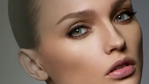
Retouching Workflow: Color Correction
Now I want to talk about evening on different colors let's say you have skin overall I think you know she doesn't have any color shifts a long face and long her body which is totally fine but I want to show you some tips that I do to fix color say that a model may have redskin model may have you know, yellow skin in different areas of her body it happens because typically blood flow changes through the model and you have to correct those things okay the couple ways I deal with this so let's go and set another folder and we will call this uh color correction and if you're from the uk sorry I spoke all wrong that's funny depending on where I work with I changed the way that I say color because if I'm right someone the uk I'll say color with a u and u s of the I don't even know why I said that but okay, now they're a couple of ways that we could do this traditionally what you would end up doing this say I'm going to select a color balance layer now with this color balance layer we're goin...
g to use this to even out shifts okay, so the way color balance works is over here you have areas humid challenger shadows, your highlights so based on the air that you're working on the color shift that you want to change you can go in and manually say, all right, I want more blue tones or more yellow, you can see the image actually change a little bit, hillary said you here and over here you'll see that on my slider is when I shift you khun see kind of like a white balance shift going on, right? The benefit of this is you can change whatever color that you like into whatever klar from whatever color that was there. So say, for example, that we have green along maybe some of the edges of the lip, which may not be so prominent from your feet or on tv. However, what I would do is I take away the green by adding more magenta, so what happens is, although everything turned room magenta, I'm going to go and click on my mask and click on invert, and then I'm going to slit my brush, set it to white and with a gentle flow, I'll just paint over the areas that were green, and what happens is a green tents will change to mohr of the neutral tones of the skin and essentially you'd go in and do that across the frame like under the eyes that happens, and I'm noticing that because one of the things that happened yesterday was after we applied the color tone uh, from the phase one from capture one it also applied green tends to her body and that's what that's what I am essentially neutralizing at the moment isla the green tents that air coming through the other way that I like to do it is by selecting a blank layer and setting into color and what this is going to do is if I have my brush and I'm going to set my flow a little bit higher say ten or twenty percent I'm going to sample a color which is next to a bad color coded the owner of place and I will see I don't have really anything but I will show you something just for kicks is our sample say on orange or here and if I brush here what happens is you'll notice that the color of that red change to the color of this of whatever is I picked it kept the luminosity values the same relatively speaking if it happens where it's too d saturated we can change it to hugh and what he does is essentially heaps a saturation of whatever whatever it was in that particular area but still change the color so in case you know you find that when you do is process things get oversaturated de saturated change it to hugh and see what happens most likely I all most of times always keep it color because it tends to work I find so if those two things don't work then you should probably revisit the tools because I do think they're quite encompassing of everything that you typically want to correct image now another thing that I wouldn't do to correct color tones maybe um not an interesting point of this moment because these two things really do take care of everything you do on a regular work for basic workflow basis however you can go in and also going to a hugh saturation so say you haven't over saturated color say that on the cheeks the reds oversaturated you can then go into this individual channel and de saturate the reds for instance and what happens is you can see the deciphering the lip and all the areas that are influence which is on the skin so you can do that and mask it in or you can shift the red to a more yellow color by moving left or right. And so the reason why this is probably better is it because it doesn't really care if you're in your shadows or highlights it just looks at the color itself and then you can go in and easily just over the image and remove any redness not that you would because that's typically something that is blush so you wouldn't be removing anything like that but you know it gives you these three options to do it accordingly ok last weekend lindsay's class she showed on the same panel how you can uh just like in the color picker on capture one kind of climb down the color traces air uh more defined your color palette that you're picking for example let me do this from scratch I'll shoot what she's referring to I'll tell you why I don't use that either. So say you have reds let me just over saturate this the three kind of showcase where is being affected? What she means is you khun, come over here and drag the sliders down to really pinpoint exactly where you're going to be affected with the problem with this is that you still have areas where their gaps in between the affected areas that you still want to target. Two it's not so much that you want to target just oversaturated runs, but you and uniformity across not just the affected area but around all the pixels together, which is why I keep a wider area and then I had a mask over everything and then blended in gently because with this you can see there's little spots going on dh when you start trying to define it more and more, it gets really difficult to get the exact amount that you want and sometimes with you know, extreme precise amounts, you can see it's not so great and I think it's probably even quicker just to have a wider area say like so and just inverted and then just gently with a low flow blended and because that's less steps also you can do it much were gradually as well without being automated that kind of makes sense actually tried that technique or we could go on thinking I could you know you'll save me time but at the end it didn't save me anything unfortunately okay now okay I'm going collapse out really quick so far we have our cleaning we have our lighting steps in regards to dodging, burning and the cherry on top nunzio frequency separation fall by uh color correction now those are the three main elements that I talked about initially where if you bring all these three things together you have really clean and beautiful image without overdoing it you know you don't want to reduce the unit approach it very gently so let's, take a look at what the before look like that's on before image and you can see it's quite a bit of work that we did, but it didn't feel like we do a lot of work, right? Like it didn't feel like we did so much when I bring it all back together, all the structure of her face is still retained and we have control over every single air they're working on because we did them at the individual times of they're supposed to be done at that's what happens is you're able to do this control and this beautiful natural skin texture should still have on every single image, like on this these images, for example, we did the same process, and this is the same technique, and we wanted to keep all that skin texture, and you'll notice if you go up on this on the canvas and look at the actual work, her skin textures all there but it's beautifully transitioned because we dodge and burn that really nicely, and you even doubt some of the color tones. That's what I'm also afraid to is whenever these images are printed out or used for the web, a lot of detail also gets crushed, so you don't you have too much you'd rather err on the side of keeping with more than necessary in regards to things that are flaws says you can see she's still excite herself on a good day that's what the intention is overall, the islamic sounds fantastic now keep in mind I do understand there's a little bit more color shift my anyone's going on everywhere, but what I would do to continue the process is the same steps, you know, how my blank there or a color bounce layer and individually just even things out to spec okay, so after color correction, which is what I save I'm going to go and do my extras now my extras include things like look five which is what we're going to next so I'm going to create another merge visible air now this will be essentially my liquefy aiken name this liquefy I'll put in a folder let's go and put this in say an excess folder and named us liquefy now would liquefy you're going to filter liquefy so everyone thinks that liquefies meant for slimming people down right and maybe so however I tend to use liquefy to compensate for different things for example her arm I was close to the camera therefore looks bigger just because of the relative distance because we're even using eighty millimeter therefore the compressions well different what I will do then is I will shrink or I'm just a little bit just to compensate for reality because it wasn't this big in your life how if it was a little bit smaller just a little affection but it's still a good area for me to demonstrate how would liquefy so I'll do it a bit see here, right? So first and foremost most the time I am going to be on my four ford work tool okay now here is where people have are really confused is because their pressure and density or density are wrong once you go into your advance mode you'll see brush pressure and density typically my brush pressure brushed entities around fifty which is kind of like your softness in a way your brush pressure dictates how quick it's gonna look if I I think by default is one hundred or something really high and what happens it's very hard to control as you can see is extremely difficult and she does not look fantastic so you wouldn't want to do that now. Yeah, typically what happens is they will be very gentle and people try liquefying but there's something much easier that we can do and that is change your pressure and that's like our flow. We want to change into something gentle like five between five or ten and what happens now is unfortunately that we have to use our bracket keys for brush size is weaken nicely and gradually adjust the area working in nice little nudges it's what happens then is you don't have to be very gentle you could be quite um quite abrasive but still the results will be much easier to handle and you can pop out here is like this so there's more fluted e c here and maybe even bring some of the chin and in just little bits it's not so strong also I got questions about what she could find what you liquefy again it's personal taste I don't think there's things you should and shouldn't liquefy it's just based on how cleaning fluid image looks for me personally, I liquefy things that I don't have any fluid in the lines so if if a model's pose a certain way and she has a particular fold that's being very looks very obviously look at it I'll make that transition smoother but I won't necessarily push it you know I won't necessarily use it to push in models to make them skin here okay that's something I would really advise against doing but making fluid lines and making them look their best is what is important without making them you know those fifty pounds or something because again it's all about anatomy anatomy you have to understand the principles of what looks right what doesn't that's what happens whenever you see a lot of campaigns with head is too much bigger than the body for example um I won't necessarily do much with uh facial features expressions people tried to looks really obvious because they'll try to give a smart or something with like and that is really, really bad, don't you that uh maybe adjusting lip lines so it's more precise and that's pretty much it and again maybe tweaking things here and there so maybe the nostrils are more then to go um see here okay, now let me show the other tools liquefy house that's really important to know so aside from that ford work tool, I don't do anything else in particular there's another really cool options his show backdrop well, the show backdrop does they say that? Let me give you a great example say that I liquefy a lot do you see that ghost thing that's happening? It shows you where you came from so another cool fact about this is if you have a layer set with guidelines like if you have individual layer that you've drawn on its has liquefied to here you can then bring that just that particular into this folder or into this liquefy menu and you can overlay it with your liquefy you can look to the exact point that you have your given. So phoenix says that if I hear well then just load that layer and pushed that point and the way that you do this is when you click on show backdrop you can say youse and just whatever particular earlier that you're on, that is awesome yeah, so I usually do this process much earlier because if I want to back off on any of my mask players that I'm not worried that I have to redo all of my masks. Okay, so the reason why do you look so fine now is because I find that liquefy something that people are more subjective to when it comes to work for so say for example, of completing my image and then have delivered to my client they'll say could you please unlock riff I that and then under stuck however, if it's something that they say could you please undo you're a frequency mask? I could just quickly do it liquefy because the look by itself doesn't take time plus it saves a mesh we could fight when you save seconds reload liquefy again and it does it for you just fantastic um because over here you could say save mesh and then it's like a safe thing where if you have to you have to do it then go back, fix your mask and then just hit load mesh and then you do so I think as work for, uh incentive it worked out better then doing everything else, which is why I also yur color to the end because if someone says can you show me color now can you undo the colors and I can't I'm stuck, so that makes sense. And lastly, here's a really cool function that I think you're gonna love let's see that I will go ahead and do something really destructive like this and I don't want that to happen there is this thing called a reconstructed over here and what it does is in gradual steps if I hover over it it kind of starts undoing what I did to a certain degree till it gets back to its original point that's amazing lastly, I never used any of these little twirly tools or here twelve yes, a patrol cop world clockwise end of the day I'm sorry. Theworld clockwise tool or this little bloke and pucker option I tend to man you like to disperse them out? I think that's a little bit better and more control and again, easier to use as well. Last thing about liquefy it is really cool if you don't know, it has this freeze mask option and this has saved me so many times. So let's pretend that we want to make her eyebrows much larger or wider. She's really excited she's excited to be here today I'm going to take really bad humor on we'll take my freeze tool on dh make sure my brush pressure on dh then city are said two hundred you could also keep that at fifty. I don't think it really matters and I'm going to go ahead and freeze eyeball and I take my little work tool here and I am going to liquefy right over the eye but you can see the eyes not moving eyebrow that's moving so what that means is now whenever a race which I hope it does it's the island stays intact, you can see that when I go back and start undoing everything, it stayed exactly how it wass, which is fantastic, right? I definitely would recommend, though I think it did something very funky would keep your brunt brush density the same because started making edges or something really weird just never really happened to me before next um is the thought of so if you ever free something, you go the thought tool and basically removed that from having another really cool use for this is if you're working in fashion, if you have garments that are really close the body, you can freeze the body and then extend the garment or bring in the garment push in the arms and the whole body won't be modified that makes sense you can bring in hair and take out here bring hair closer inside the face and the face could still stay the same. So it's a lot of options for this and it's fantastic. All right um and again this restore all function basically goes back to default in case you wanted how the default settings work in liquefied, but the main thing about liquefy is under here the ford work tool make sure pressure's set to fight five to ten because that is ultimately how you control liquefy because otherwise pretty really difficult to control by default and love will don't know that you can actually go into advanced mode and adjust accordingly I don't really use any of the mask options, but I will use show backdrop just to see where I liquefied it did it okay, so what I'm gonna do is, uh, stop here for today because I think one or two small things to cover, but I wantto wait because not as imperative and then in the day with, uh, anything that you want to go over the questions yeah. So would you like to talk about the difference of using puppet war upon selected areas of an advantage versus liquefy? Sure, I typically never used puppet work just because I think that if I get the job done accordingly I think poppet work is great if, um actually I'd never used public work, maybe it's just personal taste, but I think liquefy tends to do everything that I like and the reason for this I think is very simple whenever I use liquefied it's a nudge things very gently and it's never toe alter something completely with points and drag is collectively so my purpose of liquefy it's probably different and it's very minimal and very intuitive to keep things natural. I realize a lot of my world was very organic where people will still like this image and say there's so much wrong with it. But the reality is all these things that are wrong is because you've seen that before, when someone sees this image it looks extremely beautiful thing it looks like theirselves and it looks everything's there naturally so I think that kind of flows along with that whole philosophy so popular why don't people use it very much but it's really fun to play with sometimes if you're trying to people's arms around that's a lot of fun well the reason I ask is because particularly on the face it khun soften the sharpness and all of the work you were doing to preserve that sugar of the skin and liquefy can very quickly lose that sharpness even in a nagy that issue I think I haven't noticed that as much maybe I think I haven't played all poppy moore puppet work as much too so do you think keep sharpness will be better than you do ms fantastic so it's a good option to explore to see how much energon siri's it's just a it's a it's a greater mesh scales so I think it preserves the sharp is a traitor I haven't tried it as much as you have probably excellent thanks checking on a couple different things that people are asking do you plan to talk at all about radiant maps for your skin? I do and I purposely decided that I could have talked about great naps in regards to correcting color but I realized at the end of the day people are kind of really tired so I figured let's put that at the start of the day tomorrow and keep that under our, you know, color toning section because we have that section to cover and I'll put that in there and then a couple of the things that I just want to check on, like sharpening and output so we can talk about that tomorrow as well that's exact stuff I didn't do today that would be covered the first thing tomorrow, perfect and then one more and I don't actually know that we too are well, two more first of all, are we going to do a full body tomorrow full body, as in like arms or legs or anything like that? I'm potentially, however we will be focusing on the male model primarily, however, if we don't cover the full body is because the steps of the steam and if there are particular steps that I find you still need to know they're different. I will cover them specifically or include that as a full psd for you guys great! And then maybe one more thing. Can you talk a little bit about keeping image you're re touches consistent from image to image within a siri's of shots. Yeah, now I think one of the main difference is that happens inconsistencies between shot to shot is actually the color temperature in tone whenever you work on an image and you have color tony at the end that is the thing that particularly seems to shift more than anything else more than the skin work, because I think with retouching, the way you approach skin is very unique from person to person. For example, my my choices were very deliberate and much a reflection of my own taste, a reflection of the taste of my clients, so that won't change very much a cz long as you stick to whatever it is that you're doing, goes the guidelines, however, the color tony's what changes mostly so what I recommend is again keeping your color ching's at the end so you could take this loaf older and drag and drop it on every single image and then adjust it manually to make sure they look identical. But make sure that before you say it to the client, opened everything image together and look at it in photo shop and see that it's consistent from one place another. If you find that with this image, you didn't work on the under eyes as much as this one, fix that because you have your layers and then sent it off. So that's what I recommend keep everything open together, keep it in layers and you should be safe.
Class Materials
bonus material with purchase
Ratings and Reviews
Valentina
Pratik has been a revelation and a revolution at the same time, even kinda a benediction because of its huge generosity to show us such an efficient and powerful workflow. His genial approach turns impossible things into possible. What amazed me most, was Pratik ability to see further the shot and take the best of it to reach the perfection. The original photo is still there, very recognizable, but through a precise and meaningful workflow, it becomes eye-catching, high quality, high impact. Pratik is a wonderful person, very genuine, high talented, with a sophisticated sense of the aesthetics and arts. This course changed drastically my way to look at photoshop and at the retouching techniques. Thank you!!
peter
Really wonderful course, thanks. May I suggest a fantastic idea for maybe those who purchase the course? It would be extremely useful to be provided with a summary of the content of each video segment, perhaps a 30-60 second video with written 'dot-point' sheet at the end of each segment, to be reviewed at a later time. It just takes too long to replay each video to get the important messages. The notes provided by Pratik were a step in the right direction but they need more detail of what was presented, including tips and tricks, in each segment. In this way, once having watched the entire course, you could go back and review the nitty-gritty aspects of each segment quickly and efficiently. These quick 'summary' clips could make up a separate 15 minute video, recapping in detail the hard-core content of the course, without interruptions from questions. This would be extremely useful and hopefully not take the presenter too long to film. I feel this would be a wonderful 'added value' aspect of buying the course, as it would not be available for for free viewing. It would certainly encourage me to buy more of the available courses. Keep up the great work at Creative Live! I have stopped my Kelby subscription and just watch you guys now!! Well done!! Peter Bourne Australia
user d3cdf7
I have been a retoucher since 1992 and a commercial photographer and I am amazed at the wealth of information Pratik is teaching us. Love his great sense of humor. Yes, retouching takes me way into the early part of the morning...up to 4 am. I've learned to listen to Books on DVD from the library which help my attitude much better. Several degrees behind me and I know I was meant to make a difference with portrait photography. NO ONE wants reality, especially at elder ages. So I continue to learn to retouch professionally and not use a quick retouch filter which renders a fake look. I may incorporate a light retouching filter, but I find I must always do some manual retouching first, in order to have the appearance look real. Which is the old first rule to retouching itself. In the film days, I use to make my own texture screens in order to create more beautiful faces. My photographer friends would ask for my help in using them, when they had blurred an important celebrity shot. The texture screen would help spread the dots and give the appearance of your digital noise now. The results were the image looked more focused Thank you Pratik Naik, for being so generous with your techniques. I am interested in how to price out retouching jobs, as I have been told I give my retouching away with my photography. Thanks,, Jeri Goodwin-Akari cherished moments photography in walla walla, WA
Student Work
Related Classes
Portrait Photography