Lesson Info
5. Optimize Individual Colors
Lessons
Define Your Folder Strategy
15:36 2Tips for Identifying Favorite Photos & Using Keywords
21:15 3Add Location Information to Photos
11:57 4Efficient Approach to Optimization & Basic Adjustments
04:26 5Optimize Individual Colors
05:33 6Understand Noise Reduction & Correct for Distortion
13:07 7Sophisticated Targeted Adjustments
06:00 8Maximize Template-Based Sharing
12:19Lesson Info
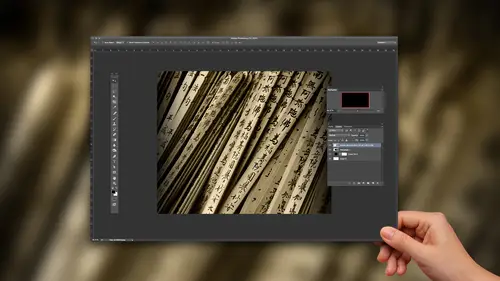
Optimize Individual Colors
take a look at this photo here and I'm actually so we can see a little better as we're working will hide some of these other panels and then we'll take a look at the H s L adjustments. Now, you might be most familiar with the HSE l sliders in the context of a black and white adjustment because with black and white, when we convert to black and white in light room, we can increase or decrease the brightness values for individual colors based on the original image. Like in Brighton, the areas that had been orange in the original photo Aiken dark in the areas that had been blue in the original photo. That's all well and good. But what about color image? Well, I love h s l, in part because Imagine, if you're let's say you're in a coffee shop working on some of your images and someone looks over your shoulder and they see all of those sliders. They're going to be very, very impressed with your advanced workflow in life because that is so many sliders and they're all color coded. And this is...
very sophisticated. Well, what this allows us to do these individual controls. We can adjust the hue, saturation and the lightness or the luminous or brightness values for individual ranges of colors within the photo so I can take those oranges. You know, they call this area like Red Rock, so let's take the oranges and make him a little more red. I don't feel like that worked very well, so maybe I'll double click on the slider handle to revert that back the way it waas. You can see that messing with the hue can be little bit troublesome. If you're making just a minor adjustment, though, this could be wonderful. Maybe I do want to take those values just a little toward red or just a little more toward jealous. You see a relatively subtle shift in colors, but I'm Onley, affecting the orange values in the image. Or maybe the greens need to be a little more yellow. So again, paying careful attention. Fact. Let's zoom in on some of the water areas of this photo, making those greens a little more scion versus a little bit more yellow. So we confined tune individual colors within the photo. Now, in some cases, you might actually really be working significantly going to switch to the library module here real quick. And let's take a look at an image that contains some or kind of primary colors. If we go into an image sort of like this, or at least you know some different colors here, we can see a little bit more dramatic examples. If I go back into the develop module and I take those reds and make them or pink or more kind of orange, or in this type of situation, I might take those yellows the greens rather and see how they're looking more yellow. If I go to the left, bring over to the right. That's a little bit more science. So I confined tune just the foliage to make those greens look a little bit better. Maybe tone down the saturation just a little bit, But again, I'm working on just an individual range of color values. This really enables me to exercise a lot more control. I got the color looking pretty good with temperature intent, but the greens air still looking a little bit odd. So let's shift on Lee. The greens coming back to are Southwest image here the Red Rock. There's another scenario where I will tend to use these individual sliders for color. The HSE l sliders. If you look closely in this background area, you might notice there's a fair amount of magenta back there. Now. This is due to a couple of things. In large part, it's just well, this is Red Rock after all. And so, of course, it's gonna be tilted toward those kind of red yellow types of tones, including, in this case, some magenta but also atmospheric haze. When you're looking off in the distance, that scatter of the light will shift those colors so you get this kind of pink haze off in the distance. That magenta haze that could be a little bit distracting. I don't really care for it. Yes, I know it's Red Rock. Yes, I know I'm looking at some tiny little area in the image, but to me, that's part of what makes an advanced workflow advanced. It's not so much necessarily about your skills or your technique. So much is your attention to detail, looking for every little thing in the image that could use a little bit of improvement. We start with the basic adjustments, and we work our way down and try to find anything else we can do to make this image look better. So here, I'm gonna just de saturate the purples and the magenta is. But first, I'm going to increase the saturation for the purples and the magenta so we can see where that color is. Zoom out. I want to make sure that I'm not causing other problems somewhere else. If we had some red roses in the foreground, this is probably not going to be a good adjustment because I'm working in a specific range of colors, not in a specific area of the photo. So those purple e areas not so good. But now we know that we're zeroing in on the problem areas. And if I reduce the saturation for those areas not all the way to Grey, because we don't want to take all of the color out altogether. But just toning down those areas a little bit right about there is looking pretty good to me where we've neutralized the effect little bit. Let me turn off the HS l adjustments. Turn them back on. It's not a huge dramatic change in the image, but even zooming out. If you look closely, I think you'll see that we've really gotten rid of what was kind of this pinkish magenta cast in the distance, and we've removed it so it's no longer essentially an eye catching blemish. You might say. We've just toned down the colors within that specific portion of the image.
Class Materials
Bonus Materials with Purchase
Ratings and Reviews
skip22037
The Advanced Workflow class was very helpful. I appreciate the extra material that come with the class, i.e. Tim's presets and the 8 lessons I have downloaded. However, I needed help with the downloading of the presets and there were no directions. I figured out how to download them to Dropbox and/or to a folder on my desktop, but I don't know how to install them in my current version of LR, which is Adobe Lightroom CC. I needed a help button, and there is none.
user 0d6f29
I found this class to be helpful with workflow techniques but it's almost identical in content to Tim Grey's Beginner Workflows and his other Lightroom courses. I would recommend the course but not to watch all of the courses as there's lots of overlap.