Lessons
How to Master Adobe Camera Raw
20:36 2Create Better Black and White Images
07:38 3Creative Color Adjustments
15:46 4Retouch Away Distractions
09:36 5Paint in Adjustments with Adjustment Brush
10:23 6Use Radial and Graduated Filters
13:59 7Batch Processing in Adobe Camera Raw
06:32Lesson Info
Use Radial and Graduated Filters
this is Julian cost. You guys know her? She's great, said Julian. Hold this clock up. And so I want to brighten up the face of the clock and that this tool that is a great to afford the radio filter, what it allows us to do is have the same controls. I'm going to click on the plus icon +20 everything out and then just click in this clock area here and drag out. So it's like I have this little spotlight here. Let me exaggerate it. So you guys can really see what we have going on here. And if we go down to our feather controls, you can see how we can have a really soft edge or really hard edge. And what I'm looking to do is to bring some light into the clock. If I go with a less of a feather, it really reaches that edge. So I need to find the right spot there, and I also need to be aware of how bright I'm making this go bright. I want a contrast. I want to lose the saturation, less color and their bring up the clarity and what I'm looking to do is just selectively add snap to an area whe...
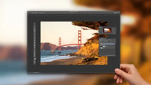
re I have a defined shape. Now you only have clocks. I'll show you other scenarios. But it's a perfect demo of how this tool gets in there. Yeah, so I have a question about the radio filter, which I use a lot, and I think I probably over use it. But I'm just wondering, you know, especially in, ah, natural light environment. You know where maybe somebody can tell where the sun's coming from. I mean, how much do we care about that? You know, obviously a stylistic thing. But I just wondered what your thoughts were on that. Yeah, that's where I think feathers so important, you know, to me, because light should be soft. And then what? I what I haven't gotten into which may be Let me let me do this year. Um, okay, is a couple of little tricks with this tool, which hopefully we'll get to answering yours. One is the X key flips it so we can see that because right now it's affecting everything but the shape inside. Now it's affecting inside the shape, right? So sometimes you'll make when you're like oh, it's backwards so you can flip flop that you can also click on this inside outside. But but X is a great shortcut for that. Then the other thing is using the brush. If I click on the brush, this is actually the adjustment brush inside of this filter. And so I could say, Hey, I want to subtract some of this from over here and maybe I want to do that in a lower flow with higher feather, and I want to make this look like that's really natural light fall off. So I'm using the shape where it's relevant, but then I'm customizing it. This is a goofy shape in the sky, but that's where really really matters. Because if you're seeing these radio shapes and your images, the user user doesn't like to see that shape of light that identifiable shape of light right there, something doesn't compute in your mind. So if you can kind of add a little variation and modify it, it becomes more interesting. Let me see if I have ah photograph here. Well, this is one where maybe just more for a fact, I grab the tool. I want to brighten something up click and drag over an area of the photograph, kind of bringing attention to our subject because it's such a dark day. This is out in the ocean. Brought this ladder on the ocean, climbed up on top. It was a ton of fun, but, um so my feather, when I bring the feather all the way up and if we look at her before and after even that high of a value, it's starting to look okay. Are you with me on that? But when I have the feather down, let me reactivate it. So I click on it, bring that down, and then look at the before and after. It's just looks goofy and strange. So again, trying to look at how are we using feather and then also intensity of it. And I think that's a trick with any kind of a lighting scenario, is really saying Okay, well, how far do we do go? How are we shaping these things? Where is the light coming from? In this case, maybe it's little more illustration. It is kind of like the oh, you know, type of light out there. Maybe add a little temperature to it. a little warm glow might be interesting to that kind of image. Guys lost their, but now he's coming back. It's a little bit hot for me, so I'm gonna bring it down even more. So I think your question is tacked on with all of these tools. The goal is that someone looks at it and they never think Ha, ha. You know how to use the radio filter? You know, once they've done that, you failed or we've failed. And so it's always about kind of hiding or tracks keeping it really clean and simple, that kind of answer it a little bit. Okay, let me do one more kind of just fun, crazy creative thing with us and talk about duplicating adjustments. Uh, let's see. Zero everything out here and what I'm gonna do is make an adjustment, has some yellow in it so we can see what's happened. Can't really see that. Okay, so we see that I'm trying to get a little bit of color in here, right? But it's not. It's not doing that much for me, but you have an option, which is a color chip. If you click on that, I could say, Hey, let's Ah, let's throw some Let's or some red in here and let me do this. Quick. One second. Do some yellow, my feather down. Who? We need to see a little more of this. Just stick with me. Stick with me. Trust me. Trust. Okay, so I have whatever my yellow is coming in. I'm trying to just find some kind of funky thing here. So point me and I have this this 11 adjustment where I have a certain color that I'm coming in and what I want to do is stack up and have a couple of them, some adding color creatively in camera using the tool. So one thing you can do is right. Click or control, click on adjustment and choose duplicate. So what that gives you the ability to do, whether it's light or color is say OK, now I have another one of these guys over here, right? So I have the same thing twice, This one I want to invert. So I hit the X key. And so this one, what it's gonna do is maybe, rather than read, I'm gonna have it Go, go yellow. So actually have these two adjustments is weird and increases. This seems one which is really working on outside of that centre space, another one which is working on the inside of the centre space. And what I'm able to do is by having these, you can start to create some do atones. It's kind of like split toning, but it's based on shape, and it can get really fun and interesting. I'm not totally digging my my color combo that I have here. Um, maybe I need to choose another one. Let me just see if I can find something kind of interesting for you guys. Well, you know, it's of course, like when I when I planned it out, I had a really fun, you know, look to it. But I'm just not I'm not nailing it right now, which is fine. But perhaps from a teaching perspective is this idea of duplicating the adjustment so that right click and choose duplicate can can really help out. Let me go to, um let's go back to this foot. This clock photo. If I have one adjustment where I'm bringing light and and I have that right here, right click duplicate that I bring another one down here to the rocks because I need to bring a little bit of light into this area. Obviously I need to modify the feather, but can you start to see how you can then say Okay, I'm putting in multiple lights and then I do another one right click and duplicate, and I say, Well, I want it like this rock a little bit less subtly over there, but with more clarity. And you can build up and even light photographs using using what we have here. So the duplicate thing was most important. But there are some kind of color, creativity, things we can do as well. All right, let's go to the graduated filter. Graduated filter. Uhm is really, really phenomenal tool. What? What it allows us to do is to make linear adjustments over areas of a photograph like this image. The top is too dark. So I grabbed the tool. I want to brighten up my exposure up here, and I'm just clicking and dragging from the top down. And what we can do is change where this is coming from. By clicking on these points the closer these two are together exaggerate for a moment so you can see it. The closer they are, the more defined the transition, the further away the two points are, the smoother the transition. So what I want to do is rather than dark in that I'm looking to just say I need a little more light up top. It was kind of top heavy as far as the photograph was concerned. And so I'm gonna bring up shadows and also bring up, um, the area in order to control that brushing. That would have been a pain, right? But this little sweep and hit that area saves the day. Let me show you another footer to up to other photographs. Three other photographs. So in this case, I'm gonna leave these settings as is Come in here, give me a little bit of transition. They're gonna brighten up my exposure in this area and shadows, and also maybe go a little more green, yellow. So just looking to change that, I'm gonna do one more a new one. And this time I'm going to go blue and come from the top down a little bit over the top. But you can see I have these two adjustments, right? One from the bottom of the picture. So it's correcting that dark shadow and kind of illuminating the wave and one from the top that made it bright blue and has all that kind of excitement to it. So we can do these things, whether it's a sky that's too bright, that needs to be dark or sky that's too dark, that needs to be bright. Or what? Adding a little tent of color into an area. The photograph mawr from a landscape perspective. In this case, let's do the same thing. So this time I want to bring up the foreground here. This is Joshua Tree in California. Foreground is a little bit lost down there, so I'm looking to bring up some warm lights in that desert area, so there's my adjustment down in that part of the frame. Then I'll create a new adjustment. Would be a little bit cooler, clarity and contrast up in the sky, And it isn't the point. Here isn't also, you know, follow the settings that I'm using with the the tool. It's really conceptually. How are we splitting images up and looking at how we can adjust a large area of a photograph in order to make that change. Let me show you a color example of this. You guys good with the speed of this catching all this stuff, it's interesting up. So this one's a color one. And I'm going to say I want toe warm this up and try to bring up some of my details and stuff San Francisco shot. But I want the I want that red sky or orange yellow sky or something. So again, reach for the tool which we've started to see we can use. I'm going to just look at adding a straight color across this and see how that does for me. So I'm looking to add some that yellow, maybe drop down to the color chip is we've seen before and try read out. Maybe that will be fun. Maybe yellow would be fun, Adam. Maybe somewhere in there, and then all of a sudden, we have this like, completely different look than we had. And so I'm adding these colors into it feels like that's too bright up in that area. So I'm gonna dark in my adjustment that I brought into the sky and part of the reason I'm going fast here is I feel like what's what's really important with this stuff is the concept and the getting exposure like, Wow, this is possible. The fine tuning it. That's just about you sitting there with your image and looking at How do I get the slider exactly where I want it. But this image, you see her before and after, and it's starting to have the vision that Oh, yeah, I can I can bring this image to that place. So therefore you capture you start to have the post production and intent in mind, right to have it done to apply that and yeah, questions. You take question right now. Yeah, I love questions. If you make the slider all the slider justice and raw than, say, moved a light room are the slider setting to remember is it does light room. I think that's the basic image and all the light room sliders are at their zero default position. So yeah, this is kind of like a light room camera raw workflow, I would say between between the Tuapse if if you're using DMG, there's some memory to what's happening Okay, if if you aren't Actually, I should even back up. I'm not sure because what I recommend, like a few you do a light room workflow. That's really probably I mean, that's the primary place you live in your not necessarily going back and forth between the two that are frequently, Um so, yeah, so that's maybe a cheap, cheap way to answer it. But I work, right? Yeah, I think it's It's just adopting the space urine and really sticking with it. Um, and part of reason. Maybe I don't know. The answer is because if my if I'm working on image and camera, I'm It's not necessarily coming back in light room. It's most of my stuff. Fight tend to be in light room. You know, it just depends on where we're at. With what tools were you part of that
Class Materials
Bonus Materials with Purchase
Ratings and Reviews
MikeD
This course is a follow-on to Chris Orwig's "Beginner RAW Processing" and you should watch them both, in order, the get the best value in using ACR CC (Adobe Camera RAW Creative Cloud) for it's full effect. I would also say it borders on the criminal that after all this time Adobe keeps ACR, Bridge and Lightroom alive simultaneously.. While there was a time when they made money selling multiple apps, recent subscription models make this a waste of time and money, both for Adobe and we users because they have to keep programming teams alive to keep them separate and there's very little return on that investment when not selling these apps separately. While it is true, these apps are not equivalent, the little differences they bring to the table could easily be combined into one app and drop the other two. However, I'll get off my soapbox and talk about this class. Chris has a terrific presentation style and provides some great personal insight into how and why you would use certain elements of the tool. It's that insight that makes this training better than just reading a book on how to use ACR. I honestly seldom used ACR. I would look for my files in LR and use that tool for all my touch up work. On iamges where I knew I would be performing a great deal of touch-up, compositing or the like in PS, I's browse for the image in Bridge, make some broad touch-ups on the folder and then just go straight into PS. Having watched this class, I am changing my thinking and running ACR as a separate app and doing most of my touch-up, even on JPGs using ACR. It has much finer control and still allows you to enter LR or PS if you want to get into more specialized touch-ups. This class will help you get the confidence where on many shoots you can go from camera to ACR to customer. The two classes are fairly inexpensive, although I would question they could be rolled into one 2 hour class instead of two 1-1/2 hour classes due to overlap, but they are worth watching to gain some great insight into how to use ACR and why.
Denise
LOVED this class! Lots of quick and easy-to-understand tips that are presented in a very clear, intentional and organized way. I found my jaw dropping open a lot because I couldn't believe how easy it is to make adjustments in ACR after I've been doing things the long and hard way for too long. This is worth its weight in gold. Really great tips.
Pamela Richardson
Highly recommended! Chris Orwig is an excellent teacher, and very generous in sharing his knowledge. For more details, please see my review on Mr Orwig's class on Beginner RAW Processing.