Lesson Info
2. Complex Selections: Background Eraser
Lessons
Lesson Info
Complex Selections: Background Eraser
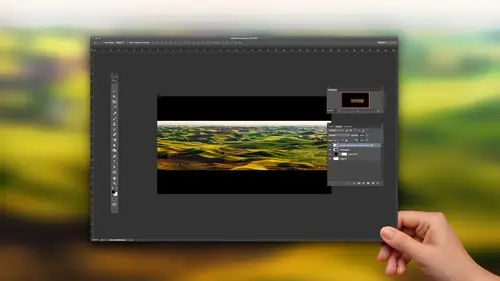
let's start just thinking about selections in general selections and masks. That's the theme of this kind of starting point here. And let's see if we can come up with how we can make more complex selections. Let's say that, um, this image I need to remove the background on the tree. I want to put maybe a different sky in something like that. Just think about how long that could take you to Dio. It's a rather complex background. Well, there are many different features we could use to accomplish it. But when it comes to trees, if there's ah, background that is quite a bit different in color from the tree itself, then there's usually one particular tool I seem Teoh head towards, and that's called the background eraser tool. It works great when you have a blue sky. In this case where we have white or gray on the side, it's not gonna be quite as effective in the main reason for that is the highlights on the tree there kind of grayish to meaning. They're similar in color to what's over here.
But anyway, let's try that if I come down here, there's the eraser tool right there. If I click and hold on it. There are three versions. There's a normal eraser where you have to do all the work yourself. There's the Magic Eraser, which has never been magical. It's it's the same as the magic wand tool. And then you hit the delete key. It's ah, in fact, that can't. I bet you I could think of a couple uses for it. But, boy, that they didn't really need to have that. And then I just chose the background eraser, which is what we're going to use with the background eraser tool. You're presented with a brush that has across here in the middle. When you click, a photo shop looks at what color is underneath the cross hair, and it will delete Onley that color from within the circle. So if you're not used to it, let me just put it over here, where the cross here is touching blue in when I click, watch what happens. You see how it only dealing and blue. If I start to move, it won't delete anything for a while because what's underneath the cross hair right now? Nothing right. That cross there has to touch something again in order for it to know what it should delete, and then it'll delete again, and so I could go over here and try to delete some of this. But if I ever let that cross there accidentally touch one of those branches, it's going to start deleting the color found in the branch. So I'm gonna choose, undo by typing commands E. And let's change up some settings. Let's see what happens if I come in here and put that little cross here. Uh, I don't run here. I'll zoom ups a little easier for you to see what's going on, but I'll put it right there. Now notice the area where the cross hair is, and if you can't see it easy, I'll press the space bar. It will turn into a hand tool just so you can kind of see that this is where the middle of my brushes, Um, when I click there, watch what happens if you noticed that it only got an isolated area it didn't delete from the entire circle, and that's because there's a setting near the top of my screen. That's the setting is called limits, and it's currently set to contiguous. And that's not a word that people use every day. But you've heard it before. Haven't you ever heard of the contiguous United States? And when they talk about contiguous U. S, that means we're ignoring Alaska and Hawaii. Why do you ignore those two? Because they're not part of the one unbroken chunk of the United States, which is the contiguous U S. So the opposite of contiguous she wanted to include Alaska and Hawaii would actually be called discontinuous. Start using that daily conversation. Discontinuous means that it doesn't have to be one unbroken chunk. So when you haven't such a discontinuous, when I click instead of gravity one unbroken chunk that's there, it can look through the entire circle and get multiple independently group chunks that don't all touch each other. So that's the first thing we wanted to. Dio is set the limits to discontinuous. Then I could do it with just that. I could try to get a large enough brush. I probably use a slightly soft edged one, so if it ever stops deleting, it's not such a blatant edge. And I just come in here and get this to touch the blue sky like it is right now, and I could click and you see how it's removed. A lot of the background that's there. Then I could move over here and get it against them Blue again and click again, can over here click again. Come over here, pick another blue spot Click. Oops! There. I must have touched a branch, right? So I need to be careful. Maybe I just move over a little bit here, where I'm nowhere near branch groups still got it. The other thing it could be is that there's a setting called tolerance right now, the tolerant settings and it's at the top of my screen. Intolerance means how much can it deviate from the color and clicking on? If you set the tolerance to the absolute lowest setting that it can't deviate and it will Onley delete the exact color that's underneath your mouse as you increase tolerance. Then it could go a little bit brighter and a little bit darker than what you're clicking on. And if the tolerance gets to be too high, then it's gonna think the tree in the sky if they're within the tolerance range are the same color. You can change the tolerance number either by moving your mouse up there or just use the number keys on your keyboard. I just brought it from 50 down to 30 and I'll try to click again. And you see how now it to lead so narrower range? The problem is, if you bring the tolerance down too far, you're gonna have to click a lot because it will think of everything being different. So you try to find the highest tolerance that works for you. Please start at 50 and only if it deletes too much. Do you think about lowering a bit? So then I can come over here, maybe get a slightly smaller brush just so I don't get too much. Overlap onto the trees just in case. There are colors that are similar to this within the trees, and I can try to click again and again, again and keep doing that. Is this making sense as far as it deletes the color from underneath across there, but it only does it within the circle, so therefore you can limit it, and this, if you have a blue sky, is usually relatively effective at removing the background. Now you'll have to look at that little checkerboard that's in there, which indicates there's an area that's empty because often times it will be slightly contaminated with stuff where it doesn't look like a pure checkerboard. I can see some of it right in here where just doesn't look like a clean checkerboard. It looks like it's being obscured by something. So I click there and just see if it cleans up and it did. And then we can try some of the rest of this now. The other thing I could do is be a little more careful when I'm clicking eso I don't delete any branches. Just remember, if you kiss, can't get it to not to leave branches. You need to adjust your tolerance, so I'll try here again. Yeah, but the other thing I could do is there's a setting at the top of my screen, and what it's called is it's actually three different settings. It's right here, this one here. If you hover over this you'll find is called sampling in a sense, it to continuous, and that means I drag across this image. It's constantly keeping an eye on what's underneath the cross hair. So if it changes what's under there, it changes what it's deleting. The middle choice is one that is called once, and if I use that, then it only pays attention to the color that's underneath the cross hair. At the moment I click. Then for as long as I paint. It's trying to delete the same color. So therefore I could find an area over here that might need to be cleaned up, click and then drag over the whole thing, which won't be very effective right now because we got rid of most of the background already. Then the third choice here is called background color, and that's for those times when you can't find a clean area to click on to tell it what color to delete. Like right now, I can see just a hint of blue just kind of hazing up the edge of these branches so I could click on my background color in visually guesstimating. The color that I see in there just come in here and say I think it's similar to that is what I'm just seeing a hint of on the edge of these branches. I don't know if you can see the same hint or not, but I get just a sense of it. And now when I click, it's not looking at what's underneath the cross hair at all. It's looking out with my background color. Is is saying, Let's try to delete that. I'm not sure if that will clean it up or not. But I did see, Yeah, I might need to go to a slightly different color for in here. But if I choose undo. Can you see how it cleaned up some of those edges? So sometimes when you get fine areas where you can't find a blatant, clean area of that code to click on, that's when you set it to background color, and then you come in here and dial in what you think you see in there and I think might see a slightly darker shade more bluish in here with see if that works and clean it up a little bit. Hey, if I choose, undo on if you can see just a little bit of clearing up all right now, darn it, I really wish I would have worked on a duplicate of this layer, and I would have used a mask in the end because then deleting the background wouldn't be permanent because that's like the way a lot of people like to work where you're working non destructively. Well, let's figure out how to do that here, a bunch of tips that will get us to their first. Here's how to get a selection out of this layer going to move my mouse onto the thumbnail image. The smaller version in my layers panel with my mouth's on top of it. I'm gonna hold down the command key controlling windows, and I'm gonna click on that, just a little mini preview. That's my layers panel that will give me a selection of everything that's in that layer. What it does is, it says, let's select everything that doesn't look like a checkerboard. So then I'm gonna click on the layer mask icon, which is right here, and when I do, it will convert the selection into a mask and attach it to this layer so that that mask would usually be used to hide the background that we have here. The problem is, when I look in my layers panel I can still see that over here it looks like a checkerboard, which means the original background just isn't in there. I wish this was the original background with a blue sky in it, so I'll click there and let's cheat. I'll go to the edit menu and I'm going to choose Phil. And in fill, a lot of people fill with their foreground color or their background color, or even seen. People fill with content aware, but you rarely see people fill with history. What does history mean? Well, what's before we do this? Click, cancel and find out. Isn't there a panel you can have open called the history panel? If you were to open the history panel, would it not list what you've done to your picture since you opened it? I used the background eraser a bunch of times in the last few things I did was I loaded a selection, somehow added a layer mask. Well, if you look at the History pound, there's something special. If you scroll all the way to the top, and that is, this right here at the top, always looks like whatever your picture looked like when you first opened it, and that's just in case you screw up it. Some point you could always choose a choice called Revert in Revert would bring you back to what this is in. This little icon over here means that it thinks of this is what's known as the history, the ultimate history, like if you went all the way back in time. So whichever step in here has that little icon next to it and you can change it by clicking here on very spots. But the default is up here the top. That's what it's gonna fill with. If you ever go up here to edit, choose Phil and say you want to fill from history so I click. OK, and now take a look at my layers panel. I'll choose undo before, after it filled that layer with whatever we had when we first opened the document. So now you could say that I have the original image sitting here and I now have a mask that is controlling where it shows up. But now I could refine this more blood to look at our mask. I'm gonna move my mouse on top of the mascot. Hold on the option key all time Windows and I'll click. There's my mask, and I can see some things that might need to be cleaned up. It looks to me like I didn't delete enough over here in the corner so I could grab my paintbrush tool and come over here and paint some of that in. But I don't about you. I don't want to be all that precise when I get up here near the actual branches. Do you want to sit there and go precisely in between every branch? But I can see that what's in there isn't perfectly black. There's some grayness in there, which means I should have gone in a little bit more with the background eraser tool. Well, if I just click, there is what happens. Let's see. We have a blending mode associated with this. What if I try some of those? Let's see what hard mix does. So weird hard mix seems to leave the areas that are solid white alone, and it only changes those areas that contain shades of gray. But it looks too aggressive. Well, if anything is too aggressive and Photoshopped and it's a tool, there's usually something you can change to make it less aggressive, and that's called the opacity. Let's bring the opacity down to 20%. Now. Let's come in here and try to touch this up and you see how it's less aggressive getting in there. It protects white, and as you lower the opacity, it's also gonna somewhat protect the brighter shades. So in this case, I might choose, undo and maybe even bring my opacity down to 10%. And now I can come in here and it's much easier to clean up in between those branches. If I need to clean up mawr, I just click more than once. If I need to clean up less, I bring my opacity even further down. So wherever I see, look over here, you see the gray that's they're coming here. I'm step to click a couple times because I'm only at what 10% opacity, so it's not very aggressive about it, but that makes it so. I can try to clean up this stuff without having to be so precise because it's win your precise when you have to be precise that it takes forever to clean things up here, I see some messed up stuff. So come in there and click a few times here. There's a little hints of grace I'll see about doing night now. You can also change the color you're painting with. So you're painting with white and now it's gonna protect Black. And therefore, if I look in the trunk of the tree and you see here this stuff, maybe I'll bring my opacity back up to 20%. So it's more aggressive, and I'll come in here just gonna clean that up. And if I happen to get some over, spray onto the background, watch what happens. It's not critical. Sure, it will change things, but black is protected. It protects the opposite of the color you're painting with, not truly the opposite. But when you're thinking of black and white it, that's the opposites. So I can come up there. And even though I'm getting over spray beyond the edge of the tree, it's not critical because it's protecting the areas that are really close to being black. Okay, a little more there to clean up. All right, for now, I'm going to say good enough, even though I bet you it could be cleaned up more, you know. But you getting the idea that this can say this time and things. It was a mode called hard mix. Usually set it back to normal and bring my opacity up when I'm done. Because otherwise it might be a day before I use the paintbrush tool again. And if I try to use it, I won't remember why. Haven't said, too, that it'll mess me up. I'm gonna option click on the mask to get out of that so I can view the end result. And now let's see what happens if we put a color back there or you could put a picture back there. Whatever. I'm gonna put a color because it's the MAWR most difficult thing. Because if you put something detailed back there, it's easy to have problems kind of disappear cause it's lost in the details. But a solid color there. And if there's any problems that will probably show up and I'm guessing we're gonna have some considerable problems. So I'm gonna go over here and say, I want a solid color. I'm gonna pick whatever I'd like here, darker version of that, and click. OK, I'm gonna then dragged that layer that I just created underneath and let's see what happens to the edges. You see that there's some it doesn't look quite right. Well, I could go back to my mask. I could go back to my paint brush tool, and I could use the exact same technique we just talked about. And it probably should and some of these where it's rather pronounced. But there are other things I could do that might help us. Why not take the layer that contains the tree and duplicated, if you remember from other sessions have done. But command J jumps things to a new layer. It makes a duplicate. I'll do that, Command J. Then I'm gonna set the duplicate to a mode called Multiply. Multiply means print like ink. If you were to print the picture of the tree like ink on top of that colored background, just imagine you sent a sheet of paper through a printer with the colored background on it first. Then you send the same sheet of paper through the printer again in your printed the tree. Well, all it would be able to do is dark and what's there? It would just add the ink that it would take to print the tree. It would add it to what's there? I'm gonna choose multiply, and I might move the one that set to multiply underneath. Let's see if that's doing anything. I'll turn it off and on. You see how it's thickening up some of the branches there. I could lower the opacity of that so a little bit too much. And the other thing that I could do is just work on the layer that is above Let's see what happens. I'm gonna create a brand new empty layer on top. And with that brand new empty layer, I'll grab my paintbrush tool. I could find it. I'll just be to find it. There it is. And I'm gonna use a soft edged brush, and you can choose a color from your image to paint with. If you hold down the option key, Ultimate does. And I'm just gonna grab a dark area like in here. And then I'm gonna paint out in where I can see color at the edge of the branches where it doesn't look like the color of the tree. There's gonna paint like this Well, the problem is, we're blatantly painting. And if we're gonna do it that way, we're gonna have to be very precise to get in there. There is a way to make it to this. Paint only shows up where the tree is, and you do that in many different ways. But one is to go to the layer menu and there's a choice called create clipping mask create clipping mask. If you watch the layer that I have active, watch what happens to it in the layers panel. Create clipping mask. Now it has this little down pointing arrow, and what that means is that this layer is only going to show up where this layer shows up. So anywhere where this layer doesn't show up, this can't show up. So now I can come in here and I can paint in those areas. What I'll do here is first clear my layer, I'll just select all and hit delete. So there's nothing in it. Then with my paint brush tool, I'm just gonna lower the opacity of my brush, maybe down to about 30%. And I'm just gonna paint out there where see those edges Still having some issues in all this is is some paint that's covering up the tree. And so instead of having those little areas where you could see a little hints of the background, I'm replacing it with whatever color it is I'm currently painting with. And I chose that color right out of the image by holding on the option key and clicking option clicking. When you're in the paint brush tool ends up grabbing a color right out of your image. Since I'm painting at 30% opacity, it's not completely replacing the things I paint on top of. Sometimes I might need to go across it twice, but I think it's healthy me to be able to shift the color of things to make it look better. And I'm not saying this is the best way. I'm just trying to add up a bunch of tips, you know, because this class is about tips, right? So you get the sense for how we could do some of them. But now let's try other types of selections. This isn't just for trees, it's any time the background contrasts quite a bit from the subject. So in this case, if you look at the background. Do you see the colors and brightness is of the background within the subject Very much? Not really. Maybe a teeny bit, but not much. So that's when the background eraser will probably work pretty well. I'll get its tolerance back up to 50. It's just the default setting, and I might set this to the choice called Once, which means only pay attention to the color I click on. At the moment I click and then think about the same color of the whole time you're deleting. I'll come down, maybe down here, where I see some blue in the sky. Click there and just kind of get in here about where his legs are. It's not even keeping up with me, but it'll eventually keep catch up. Let go. And then, if there's any residue left, it could be nice to just out of solid color behind it, to see if there's anything obstructing your view of it. But most of time I can just glance and say, Does the checkerboard look clear? If it doesn't, I'll click somewhere else and use that and then remember to turn into a mask. You command, click on the thumbnail for the layer that gives you the selection. You add a layer mask and then in your layers panel, click on this part not the mask but the original image. And that's where I choose Phil from history, which means filled with the original picture and therefore didn't have to work on a duplicate. It brought the original in. And then finally, I'm gonna go into that masked by option, clicking on it, and I probably didn't need to touch it up. And that's when again we grab our paint brush tool. Ah, here. I'm gonna want to paint with White. And didn't I use something called Hard Mix at around 20% opacity? And that allowed me to come in here and just kind of clean those things up and not be concerned if I get right to the edge? Because protecting black so I can relatively quickly clean that up? Ah, let's see if I need to clean this if it's gonna help. Sometimes some things you do have to do manually, you know you can't make it all fun and easy certainly is nice when it when you can, but and here I just have to click a few times because with an opacity of 20% it could only do so much. But come clean that up down there. I might have to manually do that, cause that's not just shades of gray. It's it's quite dark, but that's not a bad mask for the amount of time invested back around Eraser. It's been in photo shop since. I think butter shop version can remember It's been so long like Photoshopped five. I don't mean CS five I mean five been in there for ages, but I find that few people seem to use it. I find it's great any time the background contrast quite a bit, and you're really complex subject.
Ratings and Reviews
Frank Lombard
Ben, THANKS, you always make your classes a pleasure and informative opportunity, Keep them coming !!!
user-1c9a21
Ben is fantastic as always. Has a way of getting directly to the point and packs a lot of information in each of his classes. He's my favorite instructor.
Terri
Watched this cass live during Photoshop week. I think I'm going to have to buy it. Amazing stuff here.