Lessons
Lesson Info
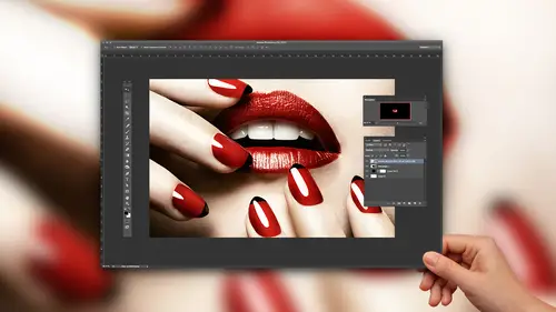
Frequency Separation
All right, so we are going to now talk about some different approaches because there are multiple ways to tackle this. So we're going to start off by talking about frequency separation, at this point and for the sake of not having a billion layers, I'm gonna flatten this, but I wouldn't. But I just don't wanna have too many confusing things up there, so we're just gonna flatten it. Okay, so, frequency separations. Frequency separation is a tool that advanced retouchers can use, but they often use it subtly or sparingly. I use it for short cuts and I use it to save myself time. Here's basically what it helps you do. Frequency Separation is what is going to allow me to even out the transitions that I was talking about before, or color, unevenness in color and do so without messing up texture. Because if I just went through here, right, and I was just cloning and blending away, you lose your texture and then then it's clear that you retouched, so by using frequency separation, what it doe...
s is it takes the skin texture, sucks it out and puts it up on a top layer. Then, the skin color and tone, lightness and darkness and color, puts on another layer, so what you have is you've got all of this skin texture, all of that beautiful skin texture here and then all of the color here, and so you can retouch, even out uneven colors, even out unevenness and the lightness and darkness. Retouch the crap out of it and then put the texture back on top. In truth, in high-end retouching, it is used very sparingly. But a lot of times I use it as a short cut and it makes life easier, so we're gonna take a look at that. First of all, I'm going to show you how to do it step by step to build a, to build an action yourself for it. I'm just gonna tell you, if you're not like a numbers techy person, the steps I'm gonna take right now, your brain's gonna be like what is going on? You don't have to know any of it, 'cause you hit play on the action and it does it. But I do want you to see what it's doing so that you know what the action's actually doing so you can always make changes and things like that. So here we go, with that little caveat. All right, so what I'm gonna do is I'm gonna duplicate my background twice. Once, and twice. And now what's going to happen is these two layers, one is gonna be all that texture from the skin, and then one is going to be the color and tone. So I'm gonna rename them so I know what the heck's going on because later on, it's gonna be kinda confusing. So the first layer, that one in the middle, this is going to be your low layer, and what low means is it's your color and tone. So I'm gonna label it as such, so you know. And then the next one, above it, is going to be your high layer, which is going to be your texture and if anyone has worked with High-pass or inverted High-pass, that's high, it's the high texture so that's kinda where that name comes from. Okay, so, so far, I've done nothing. Haven't touched anything. What I'm going to do, is I'm gonna turn off that top layer and I'm gonna turn off by turning off little eyeball there. And select low. Okay so here's something that seems counter-intuitive to what you would want to do for retouching. We're actually going to blur, but it's okay because we're gonna have the texture saved somewhere else, so this is one of the only times you would ever blur 'cause you're not really blurring the whole picture, it's blurring a piece of it. So, what we're gonna do, is we're going to go to Filter, Blur, and Gaussian Blur. Some people do Surface Blur, I'm gonna do Gaussian Blur. Just know that there are different approaches to this, it depends on who you're working with. So I'm gonna do Gaussian Blur. All right, when you run your action, this is the one step of the process you do have to actually know kinda what's going on. Here's what's happening at this step of the process. Right now, what it's saying is okay, I'm going to blur, how much do I blur? And you need to make a decision for the photo of how much to blur. Here's what's happening. Whatever you blur, when you have the texture and the color separated out, all of your information has to exist somewhere. None of it disappears. So you're deciding how much goes on the high layer and how much goes into the low, so how much texture gets sucked out and how much of the color and tone stays. So what this is really deciding is how much texture goes to texture and how much color stays. It's the balance, that's what this is. So the more that I blur at this step, the more, basically when you blur it, that texture, that information's gotta go somewhere, so the more you blur here, the more information gets kicked up to the high layer. That's what's happening. The more you blur, it's basically getting rid of all that texture information so that's what'll go up to the high layer. Well, it sounds like, for me, I'm thinking, I wanna blur a lot. Like I wanna kick as much texture up there. I wanna protect all my texture. The problem is, it's an equilibrium because at some point, the texture kicks over and becomes color. So what that means is you'd be like smoothing things out, evening things out, you add the texture back in, but unfortunately it kicks some color up too so that the weird colors problems come back. That makes sense? It's kind of a balance there? So you have to figure out what the right amount is. So we're going to discuss a couple ways to kind of figure that out. One way to do this, what I'll do is I'll put my little square on eyelashes, okay. So click on the eyelashes. And what I'll do, is I'll start from zero, for the radius, and I'll blur, I'll like pick two eyelashes. They need to be side by side. Like maybe these two. And what I'll do is I'll blur. And so you can't really tell the difference between the two, like the two become one. So I often start at like 2.5 pixels for images. That's one way to do it, another way is to pick, pick an area with a lot of texture on the skin, like big pores. Let's find some big pores here. And when I can no longer see individual pores and it just becomes a color blur, basically what that means is I've kicked up the texture, and went with just a color blur. So right now I'm around 2.5. I'm gonna tell you how to tell if you did it right or wrong at the end, there's a check to see if your number was made up, like if it was messed up or not. So, hold on to that. So we're gonna say 2.5 for now. So, I'm gonna hit okay. So, so far, what would have happened, is you hit play in the action, and it would have said how much do you wanna blur and you would have put that in, so that's all you would have done, so far. Okay, all right, so what I'm gonna do is the next step. I'm gonna click on my high layer and turn it back on. All right, so this is the part where the numbers are all like what, okay, they just are what they are. We're going to go, click on the High Layer, go to Image, Apply Image. And we're going to put a couple different values in here, and so this thing is, they just are what they are. Like, don't worry about it. Like this is the numbers that go there, don't freak, it's cool. And I'm giving you the information for 16 bit because we're going to be working in 16 bit, so you need to have layer be low. You're applying the high to the low layer. Okay, that's what it is. You wanna click on Invert, you wanna be Add, Scale 2, Offset 0. Just, that's what it is. When you did it right, or like kind of right, this is what'll happen, you'll see this. The picture goes to gray, it looks like a High Pass layer. And so I'm going to hit OK. And so what you see when I zoom in, is what you see. You see texture. So if I go up to the eye, and the hair it kicks texture up onto that layer. Now here's the part where you can tell if you blurred too much or too little. Ideally, what you see at this point should only be really texture. If you start to see color or too much color, that means you blurred too much. 'Cause it means you blurred too much so then some of the color got kicked up to the texture. If you don't see any texture, it means you blurred too little. So this is where you can kind of see. And so looking at this, I'm seeing a little bit of color, so I might have blurred a little too much. Maybe I need to back off to 2.2 instead of 2.5. When you have an action, you just undo and type in a different number. So it's not like, it's not difficult. It's not like you need to do so many steps. All right, so one last step before you're like ready to go retouch. The last step here is where you have the high layer, you need to change the blend mode. Basically you wanna get it looking like a normal photo, right now, it's not. So you're gonna change your blend mode to Linear Light, because that's what it is. Don't worry about it. That's what it is, so, what you will see now, is, watch my before and after, ready? I'm doing here's before, here's after. Before after, okay what changed? Nothing answers your question. Okay, nothing's supposed to change. If you do this before and after and something changed, you did it wrong. Because all I did was separate out the texture from the color and tone. If something changed, then I changed my photo. I was just trying to separate it. So nothing should have changed. So, here for those of you that want to make your own action, what you would do in the future, is you would do Action, like Window, Action, and then in the bottom here, you're going to record an action, or you can create a new action and run through those steps that I just did and then at the end of it, hit stop. So I have it pre-made here. For frequency separation, so watch what it does. I hit play, and it says, okay, how much do you wanna blur? I think I'll back off a tiny bit, let's do 2.3. Okay. And then it's done. So that whole thing, that whole number and duplicant and blur, and apply image, you don't ever have to know that, you set it up once and it's golden, and then you're done. So it's not as scary as it seems, but it still sounds scary. So, just know that you can either download an action that I have, you can look up frequency separation online or you can follow the steps, make your own, whatever you'd like. Okay, so after all that, is now when we're actually ready to do some retouching. Here are some theories and some approaches and you pick what is appropriate for you. One of the things that you can do is you can, I'm gonna duplicate the low layer and you can clone on this layer to even out tonalities and even out transitions. Here's kind of how I think of it. Let's picture her entire face as if it were makeup. Like this is all foundation on her face. Okay, every shadow, every highlight. It's not actually her skin, it's makeup. So what would you do, for example, in this area, where it's like a little darker? What I would probably do, I know nothing about makeup, as far as, I don't apply makeup, but just conceptually, if there's foundation that's lighter below and above and there's this little darker area, I'd probably take some of the lighter area and like smooth it down, right? Like I'd just try to smooth out that darker area. Or, if there was like a bright highlight, you know, like a bright area of lighter foundation in the middle, it's too bright. Maybe I'd take some of the slightly darker and maybe smooth it over, or maybe you prefer to think of it more like an oil painting. You're just trying to even out those tones. So you could do that with cloning and so I would use Clone Stamp and just try to even out transitions and tonalities and try to just smooth it out thinking of it like makeup. That is one approach, so let me just show you kinda how that plays out. If you did this approach, I'm going to use Flow, and let me address this while we're on this point here. Okay, Opacity versus Flow. Here's the difference. It depends on what retoucher you talk to, I prefer Flow. If, right now, I am on 100% Opacity and 100% Flow with the brush. Okay, 100%, solid black, right? 'Cause I've got a black brush. If I back off my Opacity to, let's say, I don't know, 30% right? What I'm gonna do, without lifting my mouse, I'm gonna just paint, I'm gonna keep going over, okay. Without lifting my mouse, so here's what happened. Opacity is a ceiling. It will, at most, get 30% of it's darkness. Okay, that's what that means. All right, now I'm just gonna switch this. Flow, if I do 30%, means it puts 30% down each time I pass over. Even if I don't lift my brush, so watch. 30% and so it's like as I'm doing this. So it depends on if you're using a tablet, your brush pressure, like you can set the ways in which it builds, but it kind of depends on how you have things set. But notice, it builds quickly. So what I like to do, is when I'm retouching, I like to use a low Flow and then like, build, because for me, it's more like shading would be with a pencil, right, as I push harder, as I layer on top of each other, it builds, so it gives me smoother transitions and I don't have to keep clicking and lifting up and clicking again in order to slowly blend things. I think I do it with a lighter hand when I do Flow because I can build the effect. So you can also combine it, for example, putting a ceiling. You can put a ceiling of 30% with a building level of 1%, so even if I build over and over and over again, it'll top out at 30. But it does it at 1% increments. So that's kind of how it works. Flow is for building, Opacity is your ceiling. And for Opacity, you have to lift up and put down again for it to build. So just so everyone knows why I'm using that particular tool. So, okay so for this, I'm going to use my clone stamp and I'm going to use a low Flow so that I can build, you know. Keep it a little bit more subtle. And so what I would do, is I could say, okay so this dark area here, let me set my clone stamp back to normal and I can click and drag and smooth that out. So all I did is I clicked from below samples and pulled it up, so just watch the difference. See how it got rid of that unevenness and it smoothed out the transition? So, the problem is that when you do this, there are good shadows and there are good transitions, so what ends up happening, that people make mistakes, is they'll be like, oh this cheek, and then, she has no more cheek shape. Because they would, you know, perhaps you would think, oh shadow, I need to fill that in. There are good shadows and transitions, so it's kinda your job to figure out what is a shadow for sculpting and dimension versus what is a bad transition shadow or highlight. So that's something that kind of comes with practice. So, if I do, kind of quickly, I would look for things like, see on her forehead, right here. Like that area, that's a little bit of a, like a little bit of a darker area of transition that I don't like. How about here, it'd a little bit darker, so I can kinda try to smooth that and I'm thinking of it like the makeup that I'm blending. Could also fill in under the eyes a little bit, and I'm gonna up my Flow just to make this go faster, but I would work, probably like 3 to 5%. Let's see. And so what's nice is this whole time, as I do this, it doesn't get rid of texture. The thing that you should know though, is that sometimes texture, the reason you see the texture in this is a shadow, so if you smooth it out too much, it's not that you got rid of the texture, you just got rid of the depth. So it's like, you can overdo it, really easily. So that's why this is a tool that's used last by high-end retouchers or just used sparingly, and I use this when an image is not going to be a high-end beauty image, or when I need something that's going to be time saving. Or, honestly, if I just I can use it lightly to kind of even things out, so let me just show you, real quick, like I don't know how many minutes that was, it was not very long. See if I can show this without the mouse on it, there we go. So see how it just kind of like starts to even things out? Like on the chin here, this unevenness. Scroll down so you can see that. So I'm thinking of it, like how can I even out some of these tonalities. You see how much smoother this line is? Right there, that shadow. Watch the before and after. Just trying to like even it out and look a little bit more even. A little bit more of a smooth transition. One other thing that you can do, and you can do this for bright highlights or dark shadows and you can do this subtly is you can create an empty layer, so I'll create a new layer. Underneath the high, notice everything I'm doing is on the low layer, so that I don't mess up the high layer. Okay, so I'm gonna create an empty layer. One of the other things you can do is you can fix color issues or tone issues here by sampling colors and painting. So what I mean by that, is you can take your eye picker, your color picker, your eye dropper here, and I could select a color, so let's say this area of the chin here. Let's say there's a discoloration. I can grab my brush on a super duper low Flow and I can kind of paint and build it slowly. And so you can even out, if there's redness in the skin there, just by painting, by selecting the right color and then painting it in there. If you do this above the high layer, if you do this on a normal photo and just paint, it messes up the texture, like it just fills it in and it just kind of paints it over top. So by doing it underneath the high and doing it at this step, it just allows you to even out some problem areas, so maybe I'll just kinda smooth some of this, it helps me with transitions. You see how it just kind of evens it out a bit. So just know that that is another approach is actually painting colors, specifically if there's just a weird color cast or maybe there's redness in the skin, or something like that. So, let me see if I can zoom out enough so you can kind of see. So see how that lets you smooth it out? And it can give much nicer transitions to the face. So that is the idea behind frequency separation. Smoothing things out. Evening out transitions in a faster way. So that is what I do a lot of the time because it is much faster and I can very quickly even out some pretty blotchy skin. Okay, so, if you want to see what a high-end retoucher would do, I'm going to give you a brief sample of that. Because an average image with this next step, somebody would probably spend an hour on this next step, so that being said, that's what we're going to jump on to next. So this is frequency separation. I am going to show you again, before and after. I'm gonna flatten this. Okay, here's one of the reasons why. Just for this, let's say later on, I'm trying to do some cloning and stuff. Right now, my texture's separated from my color and like it just, it's all disjointed and it becomes problematic. So there's a short cut that I basically call hit everything plus E. You click on the top layer, and you hit Command + Option + Shift + E and it takes everything below, squishes it, puts it into one layer, and then puts it on top. So you don't technically have to flatten everything. It keeps all those layers in case you need them later and then gives you a flattened layer up top. For cleanliness here, I'm gonna flatten it, so that you all just see it, but it's Command + Option + Shift + E Everything plus E, basically. Okay, so let me flatten this for now.
Class Materials
Bonus Materials with Purchase
Ratings and Reviews
CPR Photography
One of my favorite instructors. Lindsay Adler is an excellent instructor, great personality, incredibly talented. This edited-down video "Advanced Photo Retouching" (watched several times live and non-live), is great, because all the unnecessary pauses and down-time are edited out. Cutting down the time commitment to a more manageable block of time. It's hard to dedicate 9-5 online live classes without compromising your own work schedule. So, I appreciate very much being able to watch these edited videos. Thanks Lindsay and Creative Live!
user-36c31f
This course has an abundance of extremely useful information. I learned so much. I do need to keep going over certain sections so it sinks in, but Lindsey does a wonderful job explaining in detail what all the important things are and leaves out what she knows just isn't necessary to get into. That leaves us with a very useful course that doesn't have drawn out parts that seem time wasting. Lindsey gets straight to the point. And I so appreciate that. She really is an amazing teacher.
Rachel Taylor
Well worth the price of the class! This course goes into more detail than her Advanced Beauty Retouching class. I would recommend a good working knowledge of layers & masks before doing this kind of retouching, but Lindsay makes it very easy to understand.