Lessons
Introduction to the Catalog Style System
23:54 2File Location and Methods
41:25 3Main Structure of Adobe Lightroom CC 2017
18:09 4Importing A to Z
27:26 5Image Selection Made Quick and Easy
12:34 6Methods of Image Organization
29:26 7Preferences in Adobe Lightroom CC
28:30 8Library, Develop and Map Modules
10:58Book and Slideshow Modules
07:50 10Print and Web Modules
13:08 11Developing Techniques
16:51 12Synchronizing Adjustments
23:05 13Additional Editing Tricks
13:13 14Fast Editing Presets
24:18 15Quick Develop Tool
06:57 16Using Local Adjustments
31:58 17Retouching Tools for Landscapes
22:45 18Dodging and Burning with Landscape Images
19:11 19Additional Landscaping Tools
07:30 20Retouching Tools for Portraits
28:17 21Create an HDR and Panorama
16:00 22Manipulating Image Structures
11:24 23Module Presets and Hidden Presets
18:37 24How to Create a Portfolio
26:06 25Connecting Your Portfolio With Lightroom Mobile
12:22 26Using Adobe Stock
29:58 27Publishing Images to Social Media
28:16 28Creating a Layout for Books
26:56 29Exporting a Book and Beyond
19:11Lesson Info
Fast Editing Presets
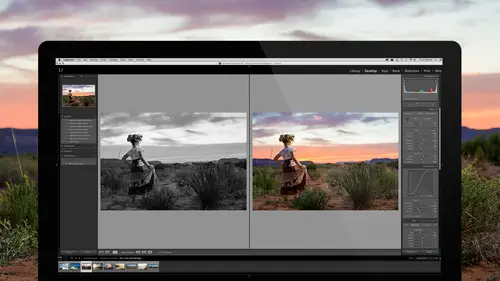
Now, we need to save time because it is an absolute pain for me to have to go through every image and work on this and then go to the tone curve and do all of that, and then go to the split tones and do all of that, and then go to the detail and sharpen it, and then, all of that stuff takes a lot of time, so instead, what I'm gonna do is once I like something, and I like the way it looks, let's say I like this contrast level, I like this black and white look, so what I'm gonna do is I'm gonna go to the preset area, and I'm going to click on the plus button. There's the plus button next to the Presets, and I'm gonna click on it, and now I need to decide what I'm gonna call it, where I'm gonna put it, and what goes into it. Now, we all have to put our thinking caps on. Let's talk about what went into this. First thing we do is we check None. Now, the Process Version is always gonna stay checked. Process Version simply means what version of Lightroom are you in? What kind of math are you ...
using to create this? Leave it checked unless you want your preset to specifically work on every version of Lightroom, all the way back to version Lightroom one. Then you uncheck that, and it won't change the process version. However, that means that it won't work the same in all versions of Lightroom, because for instance, dehaze was not in Lightroom three, and if you use dehaze, and you don't update the process version, they'll be using a non-dehaze option. Does that make sense? Okay. Process version is left on. The first thing that we know is that this is a black and white treatment. We put on black and white. Now, the black and white mix may be involved in that, and let's look at it. If we come here, the black and white mix is right down below the tone curve, and it allows you to change basically the colors as to how bright does a color get, how dark does a color get? This is all orange. Everything in here is orange, so if I take the orange up, see how the orange gets really bright? If I were doing something like my son here, so let's just take this image here, if I were in here, and I turned it to black and white, then if I took the orange up, watch what happens to his face. I can take the orange up. See how his face is orange? It's gonna bring up the orange area. If I wanted to make a black and white mix, and by the way, whenever you click on BW inside of this color tone area, the HSL black and white mix area, it's always gonna auto do this. I don't want it to do that, so I'm just gonna hit Option, which allows me to reset that. Every time you hit the Option key, these things turn to reset. I'm gonna click on Reset. (mouse clicking) Oh, that's interesting; it's not doing it. We're gonna reset it by doing this then 'cause it's supposed to zero, zero, zero, zero, zero (mumbles). There, okay, so now we're reset. By the way, if you just hit the V key to turn something to black and white, it won't auto do that. Alright, now I'm just gonna take my orange up. See that? See how his face gets brighter? I'm gonna take red up a little bit and yellow up a little bit, and then I'm gonna take aqua and blue down. Watch what happens to the sky when I take the blue down, and his blue jeans, see that? I'm gonna take those down just a little bit. See how I've created a nice little S curve there? That's a really good contrast assist for portraits because everybody's skin tones, no matter who they are, have a little bit of warmth in the skin tones, and then generally, you have something like leaves, green leaves, blue sky, whatever, behind them, and so by doing that, by making that little S curve, the person pops out, and everything else goes back into the background. I'm just using this black and white mix in order to create extra contrast inside of the black and white because when you lose color, you also lose contrast because color in itself is a contrast. Blue versus orange is a very big contrast. As soon as I go black and white (whistles), now it's just tones. There's no contrast there. Then I need to increase the contrast between the two through the black and white mix. I've just done that. Then let's say that I wanted to go into the tone curve, and I wanted to do a little something here, just inside of the RGB tone curve to make this a subtler black and white. By the way, this is the kind of thing that I'm doing inside of all these presets that you get as part of having owning this Lightroom course. I go in here, and I want to make this a subtle black and white, so the first thing I'm gonna do is I'm gonna click here, and I'm gonna drag the black point up. Let's zoom in here just a little bit, so we can see it, and I'm gonna take this and just drag it up a little bit. What happens, see, now it's saying black is 7.8%, which means that instead of black equals black, now it's black equals dark gray. Now, if I come over here, and I look at all black, see, there's still a rich black look there, but it's not actually real black. It can't equal black; there's no way. In fact, the darkest, darkest black that we can get is 8%, which then gives us more of a look of that film because film never really got black. You had to super contrast in order to get some black. You had to go get very interesting contrasty paper in order to get really dark, dark blacks. Otherwise, it was kind of a thinner black. I like it, so we'll do that. Now, I've got that black to where I want it, and I can do the same thing for the white and bring the white down so that I don't ever get pure white. I get kind of a subtle white. Then I can add a little bit more contrast to the entire image, just to make up for the fact that I'm gonna have these kind of not so contrasty blacks and whites, so that I have nice contrast level. I like the way it looks. Then I'm going to make a preset, and I'm gonna click on plus, and now we're gonna make the preset. Check None. We're gonna say we did make a black and white. We used the black and white treatment or the black and white mix in order to create that, so this is going to be a portrait type of black and white, and then what else did we do? You did your basic tones, right? Okay, so we obviously did basic tones, but the question is, do I want to include the basic tones in a preset that I'm gonna use on other images that don't have that same tone need? Yeah, you don't wanna check that. Okay, but here's where most people go wrong in their presets, is they like something they did, and they just check everything and go. The problem is then they choose a different image that was shot in bright sunlight instead of at sunset, and they click it, and it ruins the image instead of fixing it. We want, when we make our presets, them to be very targeted presets, so they're very, very specific in the way that they're made. We're choosing only the things that are necessary to create this specific black and white. Will your name kinda coincide with that type of scene? How are you naming it? Yes. It won't be the scene; it'll be what's in the preset. We'll name it as soon as we know what's in the preset. One of the things that's in there is the tone curve. The tone curve is very specific to the way this black and white looks because I went in, and I played around with what I could make black is not black and white is not white, so I'm gonna click on Tone Curve. Is there anything else in this image that we really have to work with in order to make this look? We didn't add any grain on this particular image, so we don't need to, but if I had, there's an argument against putting grain in because maybe you don't want grain on every image that you tone. If you had made grain, you could make two presets for the price of one. You could make a tone, like a black and white toning one, and then you could make a preset for grain, and you could put them together, so that you could just click on the type of black and white you want and the type of grain you want, and it's two clicks, and you're done. I'm going to not put anything in there but the black and white treatment, and then I'm gonna go in, I'm gonna give it a name. Notice over here, on this side here, they're named with these codes at the beginning. The codes keep them in position because it's an alphabetical list. You couldn't have Negative Film Color and Soft Color right next to each other. I want them in a particular order, so it's easy to click on them. What I'm gonna do is I'm gonna say we're going to go in, and this the, this one's the curve collection, what you're getting with this class is the black and white collection. Let's put it in the black and white collection. We have to choose and say we're gonna put this in the black and white collection. I'm just gonna put it at the very bottom. I'm gonna put 99. I don't know exactly what number to put it, so I'm gonna put it at the bottom and then later on, all I have to do is rename it and change the 99 to wherever I want it to fall in the structure, and it'll just sit there. I'm gonna do 99, and them I'm gonna do three spaces to give it some space between the name and the code, and then I'm gonna name it. We're gonna call it Black and White Portrait Classic Thin Film. How's that sound? Do you know what it's gonna do now? Okay, so it's four portraits, it's classic black and white film with kind of a thinness to it, just a little bit. That's it; that's all I have to do; and I'm gonna hit Create. Now, it's made; now look, I actually have a lot more, so there's a lot more presets there. You can see that it's a basic classic. Now I can go to any image I want, and it doesn't have to be this. It could be let's go to, say, this image, which is not a portrait, but still, this image is adjusted. See, the adjustments are already made. Everything looks nice, and if I go over and click on that classic portrait, there we go. Do you see how all the warm things brightened up and the cool things darkened down? It works on any image you try it on. It doesn't matter what image you go to, it's gonna work on it because you didn't change exposures and temperatures and whatever. All you did was put in what was critical to the actual effect. This one was made for portraits, so if we go and find a portrait, so let's just do this one here, and let's go back and that right there, and we wanna add that to our portrait, so we're gonna go here and click on it, and voilà. See that? See it brightens, they look great, it's kinda glowy and so that's it. That's how we use presets to... Now, if you do what I've told you then, if you go in, and you say, "All right, "I'm gonna make my defaults "so that I don't have to really do all the stuff "I'm always doing," and for most people, it's not gonna be things like adding curves and grain and stuff like that. It's gonna be, "I always put my black point here, "and I always put my exposure here to start with, "and I always have my contrast to this level, "and I always have a little clarity, "and I bring the saturation down a little bit." That's pretty much what it's gonna be. Some people, if they're shooting with a specific camera that has too much magenta, they'll go down to the camera calibration at the very bottom here, and they'll pull out magenta in the shadows. Then they'll set that default. If you set the default so that you're doing most of the things that you always do, and then you turn yourself into auto sync, and you highlight big, bulky sets of images and adjust those for what needs to be done, like bring the exposure up and add a little contrast, and change the temperature so it's perfect, then, if you have any styles you wanna add, there's no reason for you to go into any of these areas, like effects, I shouldn't go to the effects to add any kind of grain to here. I should just do it from a preset. Let's just assume then I came in, and I like this image, and I started playing around with it, and I adjusted the warmth so it was perfect, and I brought the contrast down just a little bit, and I brought the clarity up just a little bit, brought the black points down so that I really kinda liked what was happening with the image, bring the temperature up, I want the saturation down just a little bit. Okay, so I like what's going on with the image. I think it's fine. Now, I'm gonna go in, into my black and whites, and I'm gonna choose the appropriate black and white for this. I'm gonna go in, and I'm gonna say, "Well, I want my basic black and white "standard with skin stone," so I'm gonna click on that. That gives me the basics, and then after that, I think, "Oh, you know what? I think I would like to add "a bit of tone to it, so I'm gonna go down "to "my sepia basics and click on that one, "and that adds the sepia tone to it," and all that did is just target the sepia tone. It's rocket science. It went over here, it opened up sepia tone, and it added the sepia tone that I like and put it into the image, but it was only that one checkbox. Yeah? This all is happening on top of itself-- Yeah, it's all happening on top of itself. Then, I'm gonna go from the sepia tone basics, and I go, "Oh, you know what though? "I want some nice, subtle, rough grain," so I'm just gonna click on Grain Rough Subtle, and that adds the grain so that when I go in, you can see this is what the grain looks like. It's really a nice kind of ISO level grain, and then I'm gonna go and add just a little extra clarity so we're gonna go to, actually we don't need any extra clarity, but if I wanted to, I could take the clarity to zero, or I could add clarity to 25, and then once I'm done with that, then... I start at the top of whatever set of presets I wanna go through, and I just add pieces, click, click, click, click, and we're done. The idea is that you are now free to add only portions of the preset. You can add this bit or that bit, or this bit. I don't have to add it to black and white. I can add my sepia tone to a color image because it's not tied to a black and white 'cause all I'm doing when I create those presets, if I like this image, and I created a preset for it, I would come in and say, "Check None," and then I would say, "I wanna make a sepia tone preset," so all I do is click Sepia Tone. If I wanna create a clarity preset, all I do is click Clarity. Now, if I wanna do something tricky, then sometimes, it's like I'm doing tone curve, clarity and split toning and grain, or something like that. That might be a tricky one, but it's specific to a look. If you're doing all of that inside of your auto-synchronization, then all the images that you have selected get that already applied to them, and so then that chore is done as well. We're talking about the idea of doing things quickly and consistently, and it's easy to do it. I'm never gonna have a different sepia tone either. Too many people adjust it and adjust it and adjust it, and then when they look back at their work over the last two months, everybody's got a different sepia tone, everybody's got a different black and white look, everybody's got a different, and you have no style. Right. You've just, you got no style because you don't have anything consistent. No one can trust what you're gonna come up with because every time you take a picture, it looks different. What we're doing is we're solidifying a style and saying, "This is what I want to do all the time." Just to confirm, if I added three presets, they would all add and not just the last preset that I hit? I was under the assumption before that if I ran down through something presets, the last one that I hit, that's what would be applied only. It depends on how your presets were made. If you made your presets so that every time you put something together, you clicked all of the check boxes, then it would overwrite all of the other check boxes, and so whatever you clicked last would be applied. If you make them in such a way that each one is targeted to only very specific check boxes, then it will apply it over the top of whatever... If I have a sepia tone preset, and all it does is apply on sepia tone, like for instance, here, we have sepia tone right here of 40 and 24. If I come into my black and white settings, and I look for my, let's just say I do a cool tone. I click on that, see that? It did overwrite it. That's because I wanted a different tone, so it's overwriting the tone, but it hasn't overwritten the black and white, the curves, the exposure, the saturation, it hasn't done any of that because it's targeted. It's like you have about 150 layers, and each layer is a slider, and you get to have all of those targeted specifically to different items. The check boxes are access to those layers. You adjust a layer, you make a specific check box preset to that layer, and now that layer's independent from all other layers. It will overwrite some things, but if you develop your presets in a way that's rational, like I do, then you'll just go through and click this, and you notice how I wasn't clicking, I wasn't saying, "Oh, I want, "I wanna start here; let's restore it. "Let's go to classic black and white reset." There's my class black and white. I wasn't then changing it to mix auto, and then I wasn't clicking right there. I wasn't doing this because each little area is its own set. That's why the naming convention is useful because when you have a naming convention that's set well, then you go in, and you say, "I want a black and white, and I want to add "some deep blue sky to it," so we're gonna go, and you can see how it's operating right up here, so I'm just gonna go in and just click that. See how it darkens things, well, there, darkens things down, and then I'm gonna go over here to my I'm gonna do a classic bright blues. You see how that changes that? Then I'm gonna go and add a little grain, and then I'm gonna go down here and add some clarity. I'm doing sections. Then once you find that you have a specific thing that you're constantly doing, then you'll take those, and you can take any preset that you want and make a favorites folder, so that you would come in here and say, just make a folder, go here to the, go into the preset creator, click here, make a new folder, and call it Favorites, create that folder; then cancel out of there. Now you have a favorites folder. Where are you? Right there. Now, any time you have a favorite thing that you use, you simply grab it and drag it into the favorites, and then you just start using only your favorites folder here, and so it's like 30 presets that you use instead of hundreds of presets 'cause presets are made to make things faster, regardless of whether you bought the presets from someone or whether you made them yourself. The key is here, hopefully you understand how to make your presets so that you can make your own as well, but we're giving you a whole set of these black and white presets, so you can play around with those. The organization is really up to you. Mine start organized, but you need to organize them in a way that makes it easy for you to find them, access them and use them because if you're wasting time scrolling through presets trying to find them, then they're not doing you any good. Yeah? Once you kind of go through the steps of just being real subtle with your additions to your image you're working on, can you save that preset and say, "Outdoor wedding "preset that I usually use," or... Yeah. Yeah. If you like a specific preset, let's say you like the preset that you clicked, and you're like, "Oh, that's pretty good, "but I wanna adjust it a little bit" then you would just simply go back to your preset area here, and you could just hit Plus, rename a new preset right next to it, and just make sure that you tag the right things, and then hit Save, and you would have a secondary preset just like it, but it would be subtly different. Just name it something else, like number two or number three, or whatever. Yeah, or if it was a particular preset you used for a wedding last year, you could put the day, something you couldn't forget about maybe? I wouldn't do it based on a wedding or a portrait shoot or something like that. I would always name it based on what it did. If it was the same as classic black and white with extra grain, or whatever, I would just add the with something. I would just put a W and then whatever it is that I'm adding to it because that way, you can... What you wanna do is make your presets in a way that anyone could figure out what they were doing. That way, you always know, this one does this. This one does that. Naming it Crazy Harry is a bad name for a preset 'cause no one knows what it does. You would have to click it to figure it out. I suppose it's a good way to name something if you want to play a joke on somebody 'cause then you'd have to figure out what it does and click on it. Yeah, I guess I was just thinking that say you're like, "What was that preset I used "way back "for this one job?" Yeah, I promise, you're not gonna remember it based on that job. Yeah, you're right. But you are gonna remember it based on the name and what it says it does. Extra contrast or super sharp, or something like that. You'll remember that better.
Class Materials
Bonus Materials with RSVP
Bonus Materials with Purchase
Ratings and Reviews
Melissa Maxwell
Worth every penny. I am completely new to Lightroom and it really is like learning a new language. Jared Platt did a great job explaining the most efficient ways to utilize Lightroom. There's a lot of technical jargon that can often make creatives lose interest, but it's important and useful information. I've watched several segments again and again. He's added years to my life and I am grateful. He's not my favorite instructor on this site, though, and I made good use of the 2x button on the screen.
Kat Jones
Well, I've been a Photoshop girl since the beginning and have dabbled with LR and thought I knew quite a bit about it!! It turns out I've just been playing with bits of it! This is an amazing course. I will need to buy it for all the tricky bits that I just haven't quite grasped. Jared is amazing. Clear, concise, methodical, smashing. Thank you, Creative Live. What a service! Cat Jones Wormit Fife Scotland PS - Delightful to see Jared's Scottish piccies - very familiar, although not with the model!!!
Jo Wilkens
Really amazing class. Incredibly informative. Mr. Platt is incredibly accessible and easy to understand. The course is thorough and I can't begin to tell you how helpful this class has been!!!! I fumbled around in LR but couldn't get half of it to do what I wanted, thought it should be able to do, and thought it probably did do (to live up to all the accolades I hear from other photographers).... I'm so happy I'm just about in tears to see what I'm going to be able to do going forward. Thank you, thank you, thank you!