Why Use Vintage & Distressed Effects?
Lesson 1 from: Adding Vintage and Distressed Effects with PhotoshopBrandon Rike
Why Use Vintage & Distressed Effects?
Lesson 1 from: Adding Vintage and Distressed Effects with PhotoshopBrandon Rike
Lessons
Lesson Info
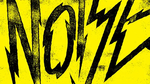
Why Use Vintage & Distressed Effects?
now there's so many little things that I dio inside my basic workflow that I realize I've created a little method and a little repetition of way. I do that all the time, and I found that over the years that I've accumulated this method of applying vintage and distress effects to my work kind of end up doing it on all of my work. So in the same way that we design stuff that's supposed to look like it's from another time, another era, well, I think we should start thinking about how that would have faded over time. So if we're designing something from the fifties, well, what happened between now and then? Not only the great fonts and the great scripts that they used in the fifties, but what has happened to that work overtime. So was this. Painted on a sign was a painting on a wall. Was it a neon sign? Was it a sign made out of metal that rusted over time? Was it on a menu inside a restaurant? Was it, um, you know, on a T shirt? Was it wherever So there's all these different ways that you...
have to think of what the medium waas what it was printed on the time it was made. So in the same way that you want to use retro fonts and vintage fonts and vintage styles, I think you should also think about how those things distress and fade. Now Distress gets a bad rap because we have had errors where our genes just got out of control with the stress. Or we've had eras where we just tried to use the craziest, most destroyed fonts possible or whatever, so distress, you know. There's plenty of corny ways to look at that word, but I don't look at the stress corny. I look at it like how things have faded over time. So I like to use subtle ways of doing this distress, because if you do it too much, it gets crazy. But maybe too much is perfect for the application that we want to use, so I want to teach you the tasteful way of doing it. Um, you guys can probably understand a way to do it really messy and really destructively, and if you want to be destructive, I can teach you the tasteful way of being destructive. But if you want. Apply these vintage effects. I want you to know there still some I hate this word, but sophistication, too distressing stuff. So after my course, or have a better understanding of when to be subtle when to be destructive And how to really think about things fading over time and how to just kind of give your work a story, a story that maybe not everyone is gonna understand are gonna pick up on. But at least you know why you made the decisions that you made. So, uh, restraint or destruction. So this is you being taste with this? You know, this is something you're gonna learn over time. As you find that you do your thing for a long time, you're gonna gain more wisdom, and you probably have a little more strength unused, Teoh. But as you get that restraint, don't be afraid to be too cool to just destroy stuff, cause I really, really, really want to destroy stuff, too. Like I said, let's make this historically accurate. So let's think about all of the different time periods, you know, from Victorian to Prohibition to Western to whatever you know, there's a way like ah, Western wanted poster must have faded, You know, you got to think of the way it was printed and what it went through and how that's gonna fade. So observe how everything fades So when you walk around town and you see a painted sign on the side of a building, you got to think about the way they painted that. So when they painted, they probably outlined the shape first, right? They outlined the shape first, probably the whole word, and outlined it, and they went back to fill in all of those things. So that means that over time, um, as the weather hits it, and as air hits it, and as time and sun and everything hits it, the middle interior area is probably gonna fade out quicker than the exterior area. Because in theory, the exterior outline has two coats on the inside has one coat, so it's gonna fade naturally inside. And then in another class, we talked about different brushes and then pulling brushes from different things. So maybe if a paint job was done really poorly and it was painted on top, well, we're going to see the way that corrodes over time. So in my other course on brushes, we understood layer mask. So we understand that we take an item and we can pull away from that item so we can pull things out of it and leave things in it. So I want to show you, you know, obviously, over my time being a graph designer, I've designed T shirts for a ton of bands and T shirts and screen printing that seems to dictate my work most of the time. So I want you to see some of the work that I've done. Um, and I want you to see all these different distress effects that I've applied to this work. So, Gary Clark Jr. Um you can see that the outside edge is intact on Gary Clark Jr and the same thing goes for the fray. So none of that distress screws up the outside edge. All of the stress happens on the inside. So maybe this stuff was printed like, for instance, the fray. Maybe this was printed with, uh, Maybe these were heat pressed. Maybe these letters were he pressed on. So if the letters were he pressed on the outside edges, probably little stickier and then once you rub it over time, the interior of it is going to fade away. And there's something about going all the way to the edge with your distress with your distress, that sort of takes away from the integrity of the whole thing. So if you have decided the letter forms that you want, we'll keep those letter forms intact. And, um, you can still distress everything but only distress on the interior. So I would call that method interior wear and tear. Gary Clark is the same way. It's got a little bit of 1/2 tone thing there. So maybe this is something that was printed in a newspaper with half tone process or something like that. Maybe it's been sitting somewhere over time. It was old newspaper. It got worn down. So with this Eric Church skull shirt, well, I wanted to think about how something wears on a T shirt. So, you know, like we talked about before and another course on brushes. Well, I started thinking about using the actual T shirt fabric as a brush, and I use the texture to go over top of it and let it wear away over time, so the natural T shirt texture seems to make sense to me for that shirt. So that works for merchandise. But maybe the biker has has a printed on a T shirt, and it's been on his back with a lot of jacket around it and worn it all down over time. Paul McCartney This is just some basic vintage effects apply to something in This is what I like about the Paul McCartney style. Here is this Israel subtle texture. It's real settle in almost the subtlety is what makes it cool. It doesn't look like it's destroyed. It just looks like that's the best. They could have printed it with the materials that they had on hand. So whether that was a screen printed poster or whatever, maybe that ink was starting to wear off, and the last few prints didn't get full coverage. But I think about that sort of thing. When I distress this stuff, I don't haphazardly do it. I try to think of what the story is behind all of this. So this fall out boy design is a good example of what I call total destruction. So whatever the original style or the You know, maybe this is just an aerial or Helvetica font or birth hold accidents grotesque or whatever the fuck is. It's just something really basic that I have destroyed. So all those tight little corners that were on those letters are on the shapes. They're gone because I have completely destroyed them. So if you think about how it gets completely destroyed, maybe I guess if you make a stamp out of that, you know, you think about the rubber on the stand that's gonna get that's gonna wear off over time. So if you get a brand spanking new stamp out of the box made, it looks good. But if you use that stamp, you know, thousands of times it's gonna end up looking that way that rubber is gonna break. So I naturally, when I submitted that designer called it Fall out boy stamp design because that was just naturally what I thought that ended up looking like. So the total destruction is a fun way toe Make the things that you make an illustrator look completely different by the time we take it through photo shop and just destroy it. So the same way with this corn design, you can see that the exterior line is really strong. And then the inside gets faded out. And now sometimes it's just a pleasant texture. Look at I think so. Like the way the corn stuff is distressed. It just kind of has a neat fade to it. It has this, like, speckled look throughout everything. Every little Grady int had some noise added to it. And so we we cranked up contrasts on that noise and all those Grady INTs became black and white cause like we've talked about before in T shirt printing, we don't want Teoh uh, used radiance. So I know that this shirt has four colors and it could be three colors. There's red, there's blue, there's off white. And then there's white. And if I would print that shirt and probably what ended up happening, they would probably make corn in the paradigm shift the same color, because that would be a cheaper way to print. So you have to think about that sort of thing. So I've gotten used to not using colors need to breathe. I have another course about hand drawn type and need to breathe. Is hand drawn type. So if you want to learn more about doing the hand drone type, you can take my hand drawn lettering course, So this need to breathe. Headdress design has completely been destroyed. It probably wasn't printed very well in the first place, and over time it got completely destroyed. Now this shirt was printed way, way back in 2014. But the story that I want to give it comes from maybe fifties or sixties or something like that. So I want to think about what happens to it over time. I see that on a girl's shirt and I see that just getting really faded and it's all that's left. I just There's something beautiful to me about how things fade. You know, there's something beautiful to me about the natural way that things corrode. There's something that fades away, but there's also the edges that stay strong. There's some parts of it that will stand the test of time. So inside that graphic they stuck with it, and somehow these guys faded away, and I think there's something beautiful about that, and again, I just have to put a story to this stuff and It makes me feel better about the stuff that I send out, and it makes me have a motivator inside of my work, and I want to continue loving what I dio. So I allow myself to get wrapped up in these little stories. And when we go for more of the athletic style stuff, you know, I would say that the 30 seconds to Mars outline designed well that has maybe that was printed with very thick plastic saw eq, and it broke. So if you have a very thick plastic, sell ink on a very thin heather T shirt, well, that's that's gonna break over time because the shirt is extremely flexible and the ink isn't flexible at all, so there's no choice for that other than to break. So that's why there's only tiny little breaks. There isn't one big area that got destroyed. It's just tiny little breaks inside and again. This shirt was printed way, way, way back in 2013 so I put my own story to it, and I like to think of how it breaks Gavin DeGraw. We're going back to the interior wear and tear, so these are just a few of my methods that I use
Class Materials
Bonus Materials with Purchase
Ratings and Reviews
Rebecca Pike
It is so great when a class is instantly helpful in advancing your workflow and getting the results you are looking for. He provides tips and examples and introduced me to functionality in photoshop that I hadn't previously taken advantage of, particularly the legacy brightness/contrast function. He does his designing in Illustrator and these designs seem to have been detailed in another one of his classes. This course focuses on bringing those designs into Photoshop and do the distressing in Photoshop. Like other reviewers mentioned, if you only have photoshop, you can just use that to make you design and do everything in photoshop. I would definitely be interested in his other classes.
a Creativelive Student
Great course! Simple process with HIGHLY effective methods. This will be one of my "go to" courses. Thanks Brandon
Student Work
Related Classes
Design Projects